The "Rainbow Trap": Why Amateurs Use Too Many Colors (and How AI Restrains You)
Color is the most immediate, emotional, and persuasive element in visual communication. It attracts attention, evokes feeling, and guides the eye. Yet, in the hands of an untrained creator, this power often manifests as a common, visually catastrophic pitfall: the “Rainbow Trap.” This is the compulsion to use too many colors, often at high saturation, in a single composition. Driven by a desire to be vibrant, exciting, or to “use all the tools in the box,” the amateur designer succumbs to chromatic chaos. The result is a visual that is exhausting to look at, lacks hierarchy, appears cheap and unprofessional, and fails to communicate a clear message. In the age of digital design tools that offer infinite color palettes, this trap is easier than ever to fall into. However, the same technological evolution that provided endless color also offers a sophisticated solution: intelligent constraint. AI design platforms like Lovart, through their Design Agent and structured workflows, inherently guide users away from the Rainbow Trap and towards professional color discipline. They do this not by limiting choice, but by embedding principles of harmony, brand consistency, and visual hierarchy into the very process of creation. This essay explores the psychology behind amateur color overuse, outlines the principles of professional color strategy, and demonstrates how Lovart’s tools actively mentor users towards creating cohesive, sophisticated, and effective color palettes from their very first prompt [[AI设计†19]].
The Psychology of the Rainbow: Why Amateurs Overcolor
Understanding the impulse is key to overcoming it. Several cognitive and experiential factors drive the Rainbow Trap.
-
The “More is More” Fallacy: Beginners often equate visual impact with quantity. If one bright color is eye-catching, surely five will be five times more effective? This ignores the principle of visual competition, where multiple strong elements cancel each other out, leaving the viewer overwhelmed and unsure where to look.
-
Fear of “Boring” Neutrals: Without training, neutral tones (black, white, grey, beige, taupe) can seem “safe” or “dull.” The amateur seeks to inject “personality” through bold color, not realizing that personality is conveyed through the relationship and restraint of color, not its sheer volume. A sophisticated brand like Aesop or Aera uses a restrained, warm neutral palette to convey elegance and calm—a far more powerful personality statement than a rainbow [[AI设计†21]].
-
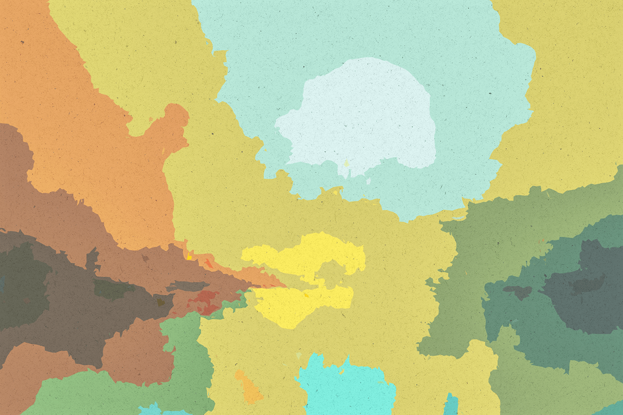
Lack of a Governing System: Professional designers work within systems: a primary brand color, a secondary palette, and accent colors with defined roles (60-30-10 rule). Amateurs approach each element in isolation: “The headline should be red to stand out. The button should be green to mean ‘go.’ The background should be blue because it’s calming.” This creates a disharmonious patchwork without a unifying logic.
-
Software Defaults and Template Influence: Many basic templates or default settings in entry-level tools use high-contrast, saturated color schemes to appear “fun” and “engaging,” setting a misleading precedent for what looks “professional.”
The Pillars of Professional Color Strategy
AI tools like Lovart are programmed with an understanding of these principles, which they apply when interpreting prompts.
- Limited Palette with Defined Roles (The 60-30-10 Rule): A professional palette is not a collection of equals. It has a dominant color (-60% of the visual space), a secondary color (-30%), and an accent color (-10%). This creates rhythm and guides the viewer’s eye logically. When you prompt Lovart to create a brand kit for “Aera” with “warm neutrals and soft blush,” it inherently applies this kind of proportional thinking to the generated visuals [[AI设计†21]].
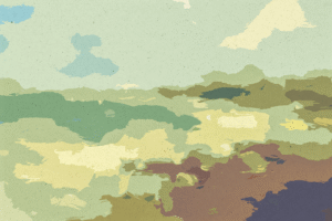
- Harmony Over Shock: Professionals use color theory (complementary, analogous, triadic schemes) to create pleasing relationships. AI models are trained on millions of harmonious images and apply this understanding. A prompt for a “coffee shop menu with earthy tones” will yield a harmonious analogous palette of browns, tans, and creams, not a jarring mix of neon green and purple [[AI设计†19]].
- Color for Hierarchy, Not Decoration: Color is used to signal importance. The most important action (a “Buy” button) or headline gets the highest-contrast, most saturated color. Less important elements are in quieter tones. Lovart’s Design Agent, when generating a social media graphic, will use color contrast to make the call-to-action pop, applying professional hierarchy automatically [[AI设计†21]].
- Brand Consistency as a Non-Negotiable: Once a palette is established, it becomes a rule. Every asset must adhere to it. This consistency builds recognition and trust. Lovart’s ChatCanvas allows users to save and apply “Brand Kits,” enforcing this consistency across all generated content, preventing the ad-hoc color choices that lead to the Rainbow Trap [[AI设计†21]].
How Lovart’s AI Actively Restrains and Educates
The platform doesn’t just allow good color; it makes bad color harder to achieve and guides users toward best practices.
-
Prompt-Driven Color Definition: The system encourages users to define color upfront as part of the style, rather than as an afterthought. A prompt like “Design a poster using a minimalist style with a navy blue, white, and gold palette” sets a professional constraint from the start. The AI then executes within this defined color space, generating a cohesive design [[AI设计†19]].
-
Generating with Cohesive Palettes: When you ask Lovart to generate a “photorealistic summer beverage ad,” it doesn’t just throw random tropical colors at the image. It generates with an internally coherent palette—perhaps vibrant oranges, greens, and yellows that work together—applying the harmony it learned from training data. The output is vibrant but controlled, not chaotic [[AI设计†20]].
-
The “Touch Edit” Constraint for Recoloring: If a user wants to change a color, they don’t just pick a new one from a wheel. They use Touch Edit with a descriptive command: “Change the background to a muted sage green.” This language-based approach subtly encourages thoughtful, descriptive color choices (“muted sage”) over arbitrary picks. The AI then ensures the new color integrates naturally with the existing palette, maintaining harmony [[AI设计†20]].
-
Batch Generation Enforces Consistency: When creating a series (e.g., 5 Instagram posts), the AI applies the same color logic across all generations, ensuring visual consistency. It’s much harder to accidentally make each post a different color scheme when the AI is generating them as a unified set from a single style prompt [[AI设计†5]].
The Transformative Effect: From Chromatic Chaos to Brand Authority
Escaping the Rainbow Trap has a profound impact on perceived brand value.
-
Instant Professionalism: A limited, harmonious palette immediately signals design competence and intentionality. It makes a brand look established and trustworthy [[AI设计†19]].
-
Enhanced Communication: When color is used strategically for hierarchy, the message is clearer and the desired action more obvious. This improves conversion rates for marketing materials.
-
Stronger Memorability: A consistent color scheme makes a brand instantly recognizable, even without its logo. Think of Tiffany Blue or Coca-Cola Red. Lovart helps small brands build this kind of visual equity from day one [[AI设计†21]].
-
Scalability and Cohesion: A defined palette ensures that every new asset—from a product mockup to a business card—fits seamlessly into the brand’s visual world, creating a powerful, unified presence across all touchpoints [[AI设计†19]].
Conclusion: The Disciplined Palette
The “Rainbow Trap” is the symptom of a creative process without constraints—a belief that freedom lies in infinite choice. True creative freedom, however, is often found within well-chosen limitations. Lovart’s AI doesn’t just generate images; it imposes the intelligent constraints of professional design thinking.
By guiding users to define color intentionally through language, by generating within harmonious palettes by default, and by enforcing consistency across assets, the platform acts as a mentor. It restrains the impulsive, amateur urge to overcolor and instills the discipline of the professional palette. In doing so, it transforms users from creators of chromatic noise into architects of coherent, authoritative, and beautiful visual brands. The future of design isn’t about having every color; it’s about knowing exactly which ones to use.