How Lovart Automatically Crops Images for Maximum Impact

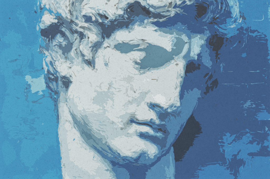
The Rule of Thirds: How Lovart Automatically Crops Images for Maximum Impact The human eye is not a passive scanner; it is dynamically drawn to specific points of tension, balance, and narrative within a visual frame. For centuries, artists, photographers, and designers have harnessed this innate instinct through foundational compositional guidelines, the most essential of which is the Rule of Thirds. This principle mentally overlays a 3×3 grid on any image, suggesting that placing key subjects or lines of interest along these gridlines or, more powerfully, at their intersections, creates a composition that is more dynamic, engaging, and naturally pleasing than centering the subject [[AI设计†21]]. Yet, for busy professionals tasked with creating marketing visuals under constant time pressure, consciously applying this rule is often the first casualty in the rush to publish. The result is a digital landscape saturated with static, centrally-composed images that fail to capture wandering attention. This is precisely where intelligent automation becomes a transformative force. AI design agents like Lovart are not mere image generators; they are intelligent composers. By embedding principles like the Rule of Thirds into the core of their generative and editing logic, they ensure that every visual asset—from a social media graphic to a product scene—is inherently structured for impact from the moment of creation [[AI设计†21]]. This deep dive explains the psychological efficacy of the Rule of Thirds, illustrates how Lovart’s Design Agent and features like Touch Edit automate its application, and demonstrates how this built-in design intelligence systematically elevates the effectiveness of a business’s visual content, requiring no technical expertise from the user [[AI设计†21]]. The Science of Sight: Unpacking Why the Rule of Thirds Works The Rule of Thirds is not an arbitrary aesthetic preference; it is a heuristic deeply aligned with human cognitive and perceptual processing. Creating Dynamic Tension vs. Static Symmetry: A subject placed dead-center creates perfect symmetry, which can feel stable, formal, and, in a marketing context, predictable and dull [[AI设计†21]]. Positioning the subject off-center, along a vertical or horizontal third, introduces visual tension. The viewer’s eye must actively move across the frame, engaging with negative space and creating an implicit sense of movement, story, or energy. This dynamic imbalance is inherently more interesting and memorable to the human brain [[AI设计†21]]. Guiding the Eye and Establishing Instant Hierarchy: The four points where the gridlines intersect are often called “power points” or “crash points.” Placing the most critical element—a product, a model’s eyes, a key headline—on or near one of these points instantly directs the viewer’s gaze to the focal point of the message [[AI设计†21]]. This automatic visual hierarchy is crucial in marketing, where you have milliseconds to communicate primary value. The supporting elements then naturally fall into place, guiding the viewer through the intended narrative flow. Mastering Balance and the Strategic Use of Negative Space: The gridlines provide a framework for balancing multiple elements. For example, in a landscape shot, placing the horizon on the top third line emphasizes the land, while placing it on the bottom third emphasizes the sky, creating more intentionality than a dead-center split [[AI设计†21]]. This also encourages the effective use of negative space, which can convey a sense of premium quality, clarity, and sophistication, preventing the visual clutter that often plagues amateur designs. An Antidote to the “AI Look”: A common hallmark of poorly composed, early-generation AI images is an awkward, unintentional central composition that feels artificial and stiff [[AI设计†21]]. By automatically applying the Rule of Thirds during the image generation process, Lovart’s AI ensures that outputs possess a professional, photographic baseline composition. This avoids the synthetic, “amateurish” feel and imbues generated visuals with an immediate sense of crafted intentionality [[AI设计†21]]. For a small business owner without formal design training, manually applying this compositional rule to every image, chart, and graphic is an impractical demand on time and mental energy. Lovart integrates this expert knowledge directly into the fabric of its creation process, making professional composition a default characteristic, not an optional skill [[AI设计†21]]. The AI as a Master Composer: Automation in Generation and Editing Lovart’s system applies compositional intelligence at multiple stages: when generating new images from scratch, and when editing or refining existing visuals. Intelligent Composition at the Point of Generation: When you prompt Lovart’s Design Agent to create an image, it doesn’t just render objects randomly within the frame. It actively composes them according to learned principles of good design [[AI设计†21]]. For a prompt like “A minimalist photo of a single, elegant vase on a wooden shelf,” the AI is inherently likely to position the vase at the intersection of the right vertical third and lower horizontal third, with the shelf line aligning with a horizontal third. This happens not because the user requested it, but as a result of the AI’s training on millions of well-composed photographs and artworks. The user receives a professionally composed image without ever needing to conceptualize or draw a grid [[AI设计†21]]. “Touch Edit” and Context-Aware Recomposing: This is where automation becomes explicitly powerful. The Edit Elements feature allows for precise, localized adjustments [[AI设计†21]]. A frequent application is intelligent cropping and reframing. For instance, if a user uploads a product photo where the item is centered, they can use Touch Edit to command a recomposition. By selecting the subject and instructing, “Reposition this to follow the rule of thirds,” the AI will intelligently crop the image and shift the subject, often generating new, contextually appropriate background content to fill the space seamlessly. This transforms a static, catalog-style shot into a dynamic, lifestyle-oriented image with a single conversational command [[AI设计†21]]. Automatic Enhancement for Generated Assets: Even after an image is generated, Lovart’s systems can analyze and suggest—or automatically apply—optimal crops that enhance composition. This ensures that even if a first-generation result is close, the final output is refined and optimized for visual impact according to established design principles, elevating quality consistently [[AI设计†21]]. Batch Processing with Inherent Compositional Logic: When utilizing batch generation for a suite of social media graphics or campaign assets, the AI applies consistent compositional logic across the entire set [[AI设计†21]]. This means a week’s worth of Instagram posts will not only share a cohesive brand style but will each exhibit a balanced,
The “Erase” vs “Replace” Function – Knowing When to Remove and When to Fix

In the intricate dance of image editing, two fundamental actions govern the remediation of any flaw: the decision to Erase or to Replace. At first glance, they may seem like variations of the same goal—making something unwanted disappear. However, in the nuanced world of professional visual creation, particularly with the advent of intelligent AI design agents like Lovart’s, understanding the distinction between these functions is not a matter of semantics; it is the core of strategic, efficient, and high-fidelity editing. Choosing incorrectly can mean the difference between a seamless, believable fix and an awkward, telltale patch that screams “edited.” The traditional toolkit often conflates these actions, offering a blunt "heal" or "clone" tool that guesses at the user’s intent. Advanced platforms like Lovart’s ChatCanvas, however, empower users with distinct, intelligent functions: a pure Erase (or removal) for when an object should be gone entirely, and a precise Replace (or inpainting/regeneration) for when an object should be transformed into something else that belongs. Mastering this dichotomy is what separates amateur retouching from professional visual problem-solving. This guide deconstructs the "Erase vs. Replace" decision matrix, illustrating when and how to deploy each function within Lovart’s ecosystem to achieve flawless, context-aware edits that preserve the integrity and story of the original image . Defining the Battlefield: The Core Difference Between Erasure and Replacement The choice hinges on a simple question: Should the object be absent, or should it be different? The "Erase" Function (Removal): The goal is complete, context-aware deletion. The objective is to make it appear as if the offending element never existed in the scene. The AI’s task is to analyze the surrounding pixels (texture, color, pattern, lighting) and generate new background content that plausibly continues the existing environment, filling the void as if the object had been digitally airbrushed from reality. Examples include removing a stray power line from a landscape, erasing a photobomber from a group shot, or deleting a modern trash can from a period scene. The success metric is invisibility; the edit should be undetectable . The "Replace" Function (Inpainting/Regeneration): The goal is transformation. The object should stay, but change its properties. This is where the AI’s understanding of object semantics and physics is critical. The function isn’t about deleting but about reconstituting an element with new attributes while respecting its structural role and interaction with the scene. Examples include changing the color of a car, replacing a logo on a t-shirt, turning a frown into a smile, or swapping a summer tree for an autumn one. The success metric is natural integration; the new object must look like it belongs, with correct lighting, shadows, and perspective . Confusing these intents leads to poor outcomes. Using “Erase” on a logo you want to change leaves a blank patch on the shirt, breaking the fabric’s continuity. Using “Replace” to remove a large, distinct object often results in the AI generating a different object in its place, not a clean background. The Strategic Decision Matrix: When to Erase, When to Replace The choice is guided by the nature of the flaw and the desired narrative of the final image. Scenario 1: Unwanted Foreign Object (e.g., a littered soda can in a forest photo). Action: ERASE. The can is not part of the intended scene. The goal is photographic truth (the forest as it should be), not to transform the can into something else. The AI should analyze the moss, leaves, and dirt around the can and generate a continuation of that forest floor, making the can vanish as if picked up by a conscientious hiker . Using “Replace” might instruct the AI to “change the can into a mushroom,” which is an unnecessary and potentially unnatural complication. Scenario 2: Flaw on a Product or Model (e.g., a scratch on a smartphone screen, a pimple on a face). Action: REPLACE (with context of “fix” or “heal”). The object (the phone, the face) is essential. The goal is to correct an imperfection, not remove the object itself. The AI must understand the local texture (glass, skin) and regenerate it in its ideal, unmarred state, blending perfectly with the surrounding area. A pure “Erase” would create a hole in the screen or a patch of blank skin, violating the object’s integrity . Scenario 3: Changing an Element’s Properties (e.g., making a grey sweater blue). Action: REPLACE. This is the quintessential use case. The sweater is a key component. The instruction is not “remove grey” but “transform this garment’s color to blue, adjusting highlights and shadows accordingly.” The AI must recognize the fabric folds, maintain the knit texture, and re-render the color while preserving the garment’s form and the scene’s lighting . Scenario 4: Removing a Person to Isolate a Subject (e.g., taking a tourist out of a monument shot). Action: ERASE. The person is an obstruction to the primary subject (the monument). The AI must analyze the architecture behind the person—the stonework, arches, shadows—and reconstruct it convincingly. Using “Replace” with a prompt like “change the person into a statue” would alter the scene’s fundamental nature and likely create visual dissonance . Scenario 5: Correcting a Text Error (e.g., wrong date on a poster). Action: REPLACE (powered by “Live Text” understanding). This is a specialized, high-level form of replacement. The AI must first recognize the text block as editable data, extract its stylistic properties (font, color, effects), allow the content change, and then regenerate the text with the original style applied to the new words, seamlessly integrating it into the background . A simple “Erase” of the text would leave a rectangular void in the poster’s design. The Lovart Implementation: Intelligent Tools for Each Intent Lovart’s ChatCanvas and Design Agent provide distinct pathways aligned with each intent, often through the same interface but with different conversational cues. Executing "Erase" with Precision: The user leverages Touch Edit or Edit Elements to select the unwanted object. The key is the follow-up instruction focused on removal and background continuation. Prompts like: “Remove this person completely,
AI-Powered Background Swap Teleport Subjects Without Masking

Background Swap: Keep the Subject, Teleport the Location (No Masking Needed) One of the most common and tedious tasks in image editing is isolating a subject from its background. Whether it’s a product for an e-commerce site, a person for a composite image, or a logo for a new scene, the traditional method involves meticulous masking—using tools like the pen tool or complex selection algorithms to manually trace the edges of the subject, a process prone to error, especially with fine details like hair, fur, or translucent edges. This creates a significant bottleneck in creative workflows. The dream is simple: to magically lift a subject from one environment and place it seamlessly into another, without the manual labor of cutting it out. Lovart’s Design Agent, within the intelligent workspace of the ChatCanvas, turns this dream into a conversational command. Through its core understanding of Edit Elements and Touch Edit, it enables a Background Swap—the ability to teleport a subject to a new location while perfectly preserving its integrity, all without requiring the user to manually create a mask. This is not just a faster way to do an old task; it’s a reimagining of compositional possibility, allowing creators to explore “what if” scenarios with their subjects in real-time, dramatically accelerating concepts for marketing, storytelling, and design . The Masking Bottleneck: Why Traditional Methods Fail Manual or semi-automated masking is a fragile process. Time-Consuming: For complex subjects, it can take minutes to hours per image. Skill-Dependent: Achieving a clean, believable cut-out requires significant expertise in tools like Photoshop. Detail-Loss: Automated tools (like “Select Subject”) often struggle with soft edges, fine strands, or complex overlaps, resulting in a choppy, artificial look that requires manual cleanup. Contextual Rigidity: The subject is fused with its original lighting and color context. Simply placing a mask-cut subject into a new scene often results in a glaring mismatch—a subject lit from the left placed in a scene lit from the right. The goal of a true background swap is not just extraction, but intelligent re-contextualization. The AI-Powered Swap: A Semantic, Not Pixel-Based, Process Lovart’s approach transcends pixel selection. It understands the image semantically. Subject Recognition: The AI doesn’t just see edges; it identifies what the subject is. “This is a person,” “This is a ceramic mug,” “This is a dog.” This semantic understanding allows it to separate the subject from the background based on meaning, not just color contrast . Structural Decomposition via “Edit Elements”: This is the core mechanism. When you command Edit Elements on an image, the AI performs a non-destructive analysis, identifying distinct layers: “Subject Layer,” “Background Layer,” “Foreground Object Layer.” It understands that the person is a separate entity from the wall behind them. It doesn’t just create a mask; it conceptually separates the scene into editable components . Background Generation/Insertion: With the subject isolated as a conceptual layer, you can now command a new background. Generate New: “Replace the background with a sunny beach at sunset.” Use Existing: “Swap the background with this uploaded image of a modern cafe.” Intelligent Compositing & Relighting: This is where Lovart surpasses simple masking. The AI doesn’t just paste the subject. It can attempt to adjust the subject’s lighting and color temperature to better match the new environment. Using Touch Edit, you can fine-tune this: “Make the subject look like it’s lit by the warm sunset light from the left.” This goes beyond mask-based compositing towards integrated scene generation . Practical Workflow: The Conversational Background Swap The process in the ChatCanvas is intuitive and conversational. Scenario: You have a photo of a model in a plain studio. You want to place her in a futuristic cityscape for an ad campaign. Step 1 – Upload & Analyze: Upload the studio photo. Command: “Use Edit Elements to separate the model from the studio background.” Step 2 – Subject Isolation: The AI processes the image, presenting you with the isolated model on a transparent layer and the removed background as a separate layer. The isolation is clean, handling hair and clothing edges intelligently . Step 3 – New Scene Command: With the model layer active, you prompt: “Generate a photorealistic background of a neon-lit, rainy futuristic city at night. Then composite the model into this scene, adjusting her lighting to match the neon glow and wet pavement reflections.” Step 4 – Refinement: Review the composite. Use Touch Edit for final tweaks. “Add a subtle reflection of the city lights in her eyes.” or “Adjust the model’s skin tones to better match the cool blue ambient light of the city.” This workflow achieves in minutes what would take an expert editor using traditional tools an hour or more, with potentially superior integration. Strategic Applications Across Industries E-commerce & Product Photography: Instantly swap the background of a product mockup from white to a lifestyle setting (a kitchen, an office, outdoors). This allows for infinite contextual variations without reshoots, perfect for A/B testing product presentations . Real Estate & Architecture: Take an interior photo and swap the view outside the window—from a dull parking lot to a scenic mountain vista or a bustling cityscape—instantly enhancing the perceived value of a property. Marketing & Advertising: Create multiple campaign variants from a single hero shot. Place your spokesperson in a desert, a forest, an urban rooftop, or a surreal landscape, all from one original photo shoot. Content Creation & Entertainment: For filmmakers or game developers, quickly prototype scenes by swapping backgrounds behind character plates, exploring different visual worlds without rebuilding sets. The Distinction: Swap vs. Simple Replacement A true Background Swap involves more than replacement; it involves integration. Simple Replacement (Masking): Cuts out subject, places on new backdrop. Subject may look pasted on if lighting/color mismatch. AI-Powered Swap (Lovart): Isolates subject, generates/inserts new background, and can apply contextual adjustments (lighting, color cast, atmospheric effects) to blend the subject into the new environment as if it were originally there. This is enabled by the Design Agent’s understanding of scene semantics and its ability to
5 Essentials for High-Conversion Flyer Design

Street Marketing: 5 Essentials for High-Conversion Flyer Design In the digital age’s cacophony of pop-ups, push notifications, and infinite scrolling feeds, the physical flyer remains a surprisingly potent weapon in the marketer’s arsenal. When executed with precision, a flyer is not just a piece of paper; it is a tangible, targeted, and highly personal invitation that cuts through the digital noise. It lands directly in someone’s hand, occupies their physical space, and demands a moment of attention that a fleeting pixel often cannot. However, this very tangibility is a double-edged sword. A poorly designed flyer isn’t just ignored—it’s crumpled, discarded, and becomes a negative brand impression littering the sidewalk. The difference between a high-conversion tool and wasteful clutter lies in a foundational understanding of psychology, design hierarchy, and strategic intent. This is where the integration of an AI design agent transforms the craft. Platforms like Lovart move beyond basic templates, empowering businesses to generate professional flyers that are scientifically structured for impact, not just aesthetic appeal . This deep dive deconstructs the anatomy of a high-performing flyer into five non-negotiable essentials and illustrates how AI acts as a force multiplier in mastering each one, ensuring your street marketing campaign yields maximum returns. Essential #1: The One-Second Hook – Mastering Visual Hierarchy and Focal Point A flyer has, at best, one to two seconds to arrest the attention of someone in motion. This “one-second hook” is determined entirely by visual hierarchy—the arrangement of elements in a way that implicitly guides the viewer’s eye in order of importance. The Problem with Amateur Design: DIY flyers often suffer from “visual chaos.” Multiple fonts, competing images, clashing colors, and text blocks of equal weight scatter the viewer’s gaze. There is no clear entry point, leading to instant cognitive overload and dismissal. The key information is lost in a sea of noise. The AI-Powered Solution: An advanced AI design agent is engineered with an innate understanding of visual hierarchy. When given a prompt, it doesn’t just place elements; it composes them. For a restaurant promoting a “Seafood Festival,” a human might struggle to balance a food image, headline, date, and logo. The AI, however, can be directed to create a composition where a stunning, high-fidelity image of fresh oysters becomes the dominant focal point, with the headline “Ocean’s Bounty” strategically overlaid in a contrasting, bold font, and secondary details like date and location clearly subordinate . This is not guesswork; it’s applied design intelligence. Practical Implementation with Lovart: In the ChatCanvas, the command isn’t “make a flyer.” It’s a strategic brief: “Design a flyer for ‘The Catch’ seafood festival. The primary focal point must be a vibrant, photorealistic image of grilled lobster and lemons. The headline ‘SEAFOOD FESTIVAL’ should be the second most dominant element, using a bold, modern font. Ensure the date (Oct 15-17) and location (Pier 45) are clearly readable but secondary. Use a color palette of deep blues and bright whites to evoke the ocean.” The AI generates a layout where this hierarchy is executed professionally, ensuring the one-second hook is unmissable . Essential #2: Clarity is King – The Unbeatable Combination of Concise Copy and Legible Typography Once hooked, the viewer’s brain seeks to efficiently answer: “What is this for me?” Ambiguity is the enemy of conversion. The message must be distilled to its absolute essence and presented with typographic clarity. The Problem with Amateur Design: Common failures include verbose paragraphs, jargon, and font choices that prioritize style over readability. A flyer for a real estate open house that uses a delicate script font for the address or buries key selling points in long sentences will fail to communicate quickly to potential buyers . The AI-Powered Solution: AI excels at processing information and suggesting concise, benefit-driven copy. More crucially, it pairs this copy with typographic systems that enhance comprehension. It understands that a heavyweight font for the headline, a clean sans-serif for bullet points, and a simple font for details create a readable flow. It automatically ensures sufficient contrast between text and background, which is critical for readability in various lighting conditions . Practical Implementation with Lovart: The process becomes collaborative. A user can input raw information: “Grand Opening, ‘Zenith Spa,’ 50% off all massages for first-time clients, this weekend only, 123 Wellness Blvd.” The AI can then refine and structure this into compelling copy. Furthermore, when prompted to design the flyer, it will apply a professional typographic treatment, selecting and pairing fonts that not only reflect the spa’s luxurious brand (e.g., a sleek serif for “Zenith”) but also guarantee that the offer (“50% OFF”) is instantly legible from a distance, leveraging size, weight, and color to guide the eye through the offer’s logic . Essential #3: The Irresistible Call-to-Action (CTA) – Driving Immediate Response A flyer that informs but doesn’t instruct is a wasted opportunity. The CTA is the engine of conversion. It must be unambiguous, easy to execute, and communicate clear value for the user’s action. The Problem with Amateur Design: Weak CTAs like “Learn More,” “Contact Us,” or “Visit Our Website” are passive and low-value. They don’t answer “Why should I do this now?” Furthermore, they are often visually lost, presented as a small text link rather than a dominant button or graphic element. The AI-Powered Solution: An intelligent design agent can be prompted to generate and emphasize CTAs that are specific and urgent. It understands the psychological principles behind effective CTAs. When designing, it will treat the CTA as a primary visual component. It can generate a prominent button, a bold arrow, or a stylized graphic that contains the instruction, making it the obvious next step for the viewer . Practical Implementation with Lovart: For a street marketing campaign promoting a new bubble tea shop, the command would be precise: “The primary CTA is ‘SCAN FOR FREE DRINK.’ Design the flyer so this CTA is visually dominant—create a prominent QR code integrated with a stylized button graphic. Use a bright, contrasting color for the CTA area
Enhancing Your Lesson Plans with AI Design

Structured Learning: Enhancing Your Lesson Plans with AI Design The most effective lesson plans are not just sequences of activities; they are carefully structured learning journeys. They map a path from prior knowledge to new understanding, scaffold complex skills, and provide multiple avenues for engagement and assessment. Visually, this structure should be clear not only in the teacher’s mind but also in the materials presented to students. A disorganized handout or a cluttered slide deck can obscure the learning path, increasing cognitive load and confusing learners. Traditionally, giving this structure a clear, consistent, and engaging visual form required significant design skill and time—resources most teachers lack. This is where AI design agents like Lovart move from being mere content generators to becoming essential partners in structured learning. By acting as an instant visual architect, AI can help educators translate the logical flow of their pedagogy into cohesive, visually-scaffolded materials that guide students step-by-step towards mastery. This deep dive explores the principles of visual structure in education, demonstrates how AI can automate and enhance this process, and provides a comprehensive framework for teachers to systematically upgrade their lesson plans with intelligent design. Part I: The Architecture of Learning – Why Visual Structure Matters Cognitive science and educational research highlight how the visual organization of information directly impacts learning outcomes. A well-structured visual framework reduces extraneous cognitive load, clarifies relationships, and supports memory. Reducing Cognitive Load: When information is presented in a chaotic or poorly organized manner, the brain must expend effort simply to decode the layout before it can process the content. Clear visual hierarchies (headings, subheadings), consistent placement of key information, and the strategic use of white space help direct attention efficiently, freeing mental resources for deeper understanding and application. Scaffolding Complex Processes: Learning often involves multi-step processes (e.g., the scientific method, solving an equation, writing an essay). Visual flowcharts, step-by-step diagrams, or process infographics make these sequences explicit and manageable. They act as external cognitive scaffolds that students can refer to, internalize, and eventually execute independently. Making Connections Explicit: A core goal of education is to help students see how concepts interrelate. Visual tools like concept maps, Venn diagrams, comparison matrices, and cause-and-effect charts transform abstract relationships into tangible, spatial representations. This aids in synthesis and critical thinking. Supporting Differentiation & UDL: The Universal Design for Learning (UDL) framework emphasizes providing multiple means of representation. A single concept can be represented through a text summary, a visual diagram, and a graphic organizer. Creating these varied representations manually is prohibitive, but they are essential for reaching all learners. Teachers are experts in pedagogical structure, but they are often forced to use generic templates (bulleted lists in PowerPoint, plain text documents) that do not reflect the sophistication of their instructional design. The gap between a teacher’s internal, structured plan and the flat, linear format of most teaching materials is where confusion sets in for students. An AI design agent functions to close this gap by providing the technical ability to give appropriate visual form to pedagogical structure [[AI设计†21]]. Part II: The AI Instructional Designer – Translating Pedagogy into Visual Systems Lovart’s Design Agent, accessed through the conversational ChatCanvas, allows educators to build lesson materials as integrated visual systems, not just collections of slides or pages. Generating Cohesive Visual Systems from a Brief: Instead of creating assets one by one, a teacher can describe the entire learning module. Prompt: "I’m teaching a 5-day unit on ecosystems for 7th grade. Develop a cohesive visual system for the student workbook. Include: a cover page with key vocabulary, a daily agenda template, a graphic organizer for comparing biomes, a step-by-step flowchart for the ‘Design an Ecosystem’ project, and a self-assessment checklist for the final presentation. Use a nature-inspired color palette and clean, readable fonts." The AI generates a suite of interconnected, consistently styled documents that form a complete learning package [[AI设计†21]]. Automating Repetitive Structures: Many lesson components are repetitive: warm-up activities, exit tickets, group role cards, station instructions. Teachers can prompt the AI to create a set of templates for these recurring structures. "Design a set of 4 different ‘Do Now’ activity templates for math class, each with a space for the problem, student work, and a learning target." Once created, these can be reused and quickly customized for different lessons, ensuring consistency and saving immense time. Creating Interactive & Sequential Graphics: For processes or timelines, the AI can generate sequential graphics that unfold. "Create a 6-panel storyboard showing the key events of the water cycle, with simple illustrations and one sentence per panel." This sequential visual structure is far more effective than a paragraph of text for teaching processes or narratives. Building Assessment Tools with Visual Clarity: Rubrics, scoring guides, and peer review forms benefit enormously from clear visual design. The AI can take a list of criteria and performance levels and format them into an easy-to-read table or chart, making expectations transparent for students. "Turn this list of essay criteria into a simple, 4-point rubric with clear descriptors for each level." The Power of "Edit Elements" for Customization: If a teacher has a complex diagram from a textbook but wants to simplify it or highlight a specific part, they can upload it and use Edit Elements to deconstruct and modify it. This allows for perfect alignment between the visual aid and the specific point being taught in that lesson [[AI设计†21]]. This transforms the teacher from a content assembler into a learning experience architect, with AI handling the technical drafting of the visual blueprints. Part III: The Structured Lesson Plan Blueprint – An AI-Integrated Design Process Here is a step-by-step methodology for designing or redesigning a lesson plan with integrated, AI-generated visual structure. Phase 1: Deconstruct & Map the Learning Journey Identify Core Learning Objectives & Standards: What is the essential understanding or skill? Outline the Pedagogical Sequence: Break the lesson into its core phases: Hook/Engagement, Direct Instruction/Modeling, Guided Practice, Independent Practice, Assessment/Closure. Define the Visual Need for Each Phase: Hook: Needs an
Instantly Beautify Your Presentations with AI – No More Ugly Slides

No More Ugly Slides: Instantly Beautify Your Presentations with AI The familiar sense of dread is universal. You’re in a meeting, a conference, or a classroom, and the presenter clicks to a new slide. A wall of text in a tiny font appears, punctuated by a blurry, irrelevant image and a garish pie chart that defies comprehension. Attention evaporates. The message, no matter how important, is lost in a sea of visual noise. For decades, the “ugly slide” has been a silent killer of ideas, a symbol of lost opportunities and disengaged audiences. The root cause is rarely a lack of valuable content, but a profound gap between the presenter’s expertise and the specialized skills of visual design, information hierarchy, and aesthetic composition. Professionals are experts in their field, not in the nuances of PowerPoint. This mismatch forces a compromise: spend countless frustrating hours trying to design (often with poor results), or outsource to a costly designer for every deck. This paradigm is now obsolete. The advent of sophisticated AI design agents like Lovart heralds a new era where creating beautiful, impactful presentations is not a technical chore, but a natural extension of thinking. By acting as an intelligent co-pilot, AI can transform raw ideas and data into visually compelling narratives instantly, democratizing high-quality design and allowing the substance of the message to finally shine through . This comprehensive guide diagnoses the chronic ailments of the traditional slide, explores the transformative capabilities of AI-driven presentation design, and provides a practical framework for leveraging tools like Lovart to create slides that captivate, clarify, and convince. Part I: Diagnosing the “Ugly Slide” – The Five Chronic Ailments To appreciate the cure, we must first understand the disease. Ugly slides are not random; they are the predictable result of specific, common failures in visual communication. Ailment 1: Cognitive Overload (The “Wall of Text”): This is the most fatal flaw. Slides crammed with full sentences and paragraphs force the audience to read while trying to listen—an impossible cognitive task. The slide becomes a teleprompter for the presenter, not an aid for the audience. It signals a lack of preparation and respect for the audience’s attention. Ailment 2: Hierarchical Chaos (The “Everything is Important” Syndrome): When every element on a slide—headline, sub-points, image, logo—competes for equal visual weight, the eye has nowhere to rest. There is no guided path. This chaos obscures the core message and makes information difficult to retain. It stems from an inability to distill and prioritize . Ailment 3: Visual-Concept Dissonance (The “Generic Stock Photo”): Using a cliché stock image that tangentially relates to the topic (e.g., a handshake for “partnership,” a puzzle for “solution”) creates a weak, often laughable, association. It feels lazy and inauthentic, undermining the credibility of the content. The visual does not enhance understanding; it merely decorates . Ailment 4: Data Obscurity (The “Unreadable Chart”): Complex data presented in default, cluttered charts with poor color choices, missing labels, and overwhelming detail fails to communicate insight. The audience sees a graphic, but the “so what?” is missing. The data’s story remains buried under poor design choices. Ailment 5: Inconsistent Branding (The “Frankenstein Deck”): A presentation assembled from slides made by different people, at different times, using different templates, fonts, and color palettes looks unprofessional and disjointed. It erodes brand trust and makes the presentation feel haphazard, regardless of the quality of individual ideas . These ailments persist because the traditional tool—presentation software—provides the canvas but not the intelligence. It offers endless options without guidance, placing the entire burden of design literacy on the user. The solution requires embedding that design intelligence directly into the creation process, which is precisely the function of an AI design agent . Part II: The AI Design Co-Pilot – How It Transforms Ideas into Visual Narratives Lovart’s Design Agent, accessed through the multimodal ChatCanvas, redefines presentation building from the ground up. It functions not as a tool to be operated, but as a collaborator that understands both content and form. From Linear Document to Spatial Storyboard: Instead of opening a blank slide, you begin in the ChatCanvas. Here, you can map out your entire presentation spatially. Dump your research, key points, and data into the canvas. Then, converse with the AI to structure it: “I have these three main case studies, this market data, and a concluding recommendation. Help me organize these into a compelling narrative flow for a 20-minute presentation to potential investors.” The AI can suggest a structure and begin generating visual frames for each section, turning your raw materials into a storyboard on a single, infinite canvas . Automated Visual Composition and Layout: This is the core magic. You provide a point, and the AI composes a slide. For a slide about “Market Growth Trends,” a human might struggle with placing a chart, a key statistic, and an icon. The AI, prompted with the content, will generate a balanced layout: a clean, data-driven chart on one side, a large, bold statistic as a visual anchor, and supportive icons, all arranged with professional spacing and alignment . It applies the rule of thirds and other compositional principles automatically, ensuring each slide is inherently well-designed . Dynamic Data Visualization: AI can transform raw numbers into insightful graphics. Instead of pasting an Excel chart, you command: “Visualize this quarterly sales data to highlight the Q4 surge. Use a bar chart with our brand colors, and isolate the Q4 bar with a contrasting highlight.” The AI generates a chart that is both on-brand and engineered for clarity, telling the data’s story at a glance . Intelligent Asset Generation: Need an icon, a diagram, or a conceptual illustration? The AI generates it in context. For a slide explaining a “circular economy model,” you can prompt: *“Create a simple, elegant circular diagram with icons representing ‘Design,’ ‘Use,’ ‘Recycle,’ and ‘Reinvent.’ Use a light green and blue color scheme.”*Instantly, you have a custom graphic that perfectly fits your narrative, eliminating time spent searching icon libraries . Cohesive Theming and Brand Enforcement: Once you establish a presentation’s theme—colors, fonts, visual style—the AI applies it consistently to every new slide. It ensures typographic hierarchy
Hair & Fur Detail-Fixing Messy Edges on AI Animals and Portraits

Hair & Fur Detail: Fixing Messy Edges on AI Animals and Portraits One of the most persistent and revealing tells of an AI-generated image, particularly in portraits or depictions of animals, lies in the intricate, chaotic frontier where a subject meets its background: the delicate hairline, the stray wisps of fur, the feathered edges of a beard or mane. Early and even many contemporary AI models grapple profoundly with the complex, semi-transparent geometry of hair. The result is often a fuzzy, blended, or unnaturally hard edge that conspicuously signals “synthetic” to the viewer’s eye [[AI设计†21]]. For businesses leveraging AI to create compelling commercial visuals—whether for a pet food advertisement featuring a golden retouching, a beauty salon promotion, or a corporate brand portrait—these flawed micro-details can critically undermine the credibility and perceived quality of the entire image [[AI设计†19]]. The promising reality is that the technology is rapidly evolving to meet this specific challenge. Advanced AI design agents like Lovart incorporate sophisticated inpainting, layer-aware editing, and detail-regeneration capabilities that grant users surgical control to fix these problematic areas with precision [[AI设计†21]]. This guide delves into the technical reasons AI traditionally stumbles with hair, explores the next-generation solutions embedded within platforms like Lovart, and provides a step-by-step, practical methodology for achieving photorealistic, natural-looking hair and fur details in AI-generated visuals. This ensures that the final assets meet the stringent scrutiny required for professional marketing use, from Amazon listings to high-end advertising graphics [[AI设计†21]]. The Tangled Problem: Why AI Historically Struggles with Hair and Fur To effectively address the issue, we must first diagnose its root causes. Hair and fur represent a perfect storm of interconnected challenges for generative AI models. The Overwhelming Complexity of Micro-Structures: A single head of hair comprises tens of thousands of individual strands, each with distinct orientation, curvature, thickness, and interaction with light and adjacent strands [[AI设计†21]]. Modeling this with pixel-level accuracy demands immense computational precision and vast, high-fidelity training data. AI models often approximate this complexity with textures that appear convincing at a distance but disintegrate upon closer inspection, particularly at the edges where the model must deterministically decide where a strand terminates and the background begins [[AI设计†21]]. Semi-Transparency, Alpha Channels, and Sub-Surface Scattering: Hair, especially fine baby hairs, flyaways, or the tips of fur, is not opaque. It requires the AI to understand and simulate semi-transparency, managing alpha channels (gradients of visibility) and the subtle way light scatters within and through hair fibers [[AI设计†21]]. Many models are predominantly trained on datasets of solid, opaque objects, leading them to generate hair edges that are either too solid and helmet-like or a messy, unconvincing translucent blur, lacking the delicate realism of real hair [[AI设计†21]]. Contextual Ambiguity at Organic Boundaries: The boundary of a hairstyle or an animal’s coat is not a clean, mathematical line. It is a probabilistic zone where individual strands may extend, curl, separate, or be influenced by factors like wind or moisture [[AI设计†21]]. When generating an image, the AI must infer this complex boundary from its training. If the prompt is vague or the background is visually busy, the model can become “uncertain,” resulting in a blended, smudged, or artifact-ridden edge—a classic signature of the undesirable “AI look.” [[AI设计†21]]. Inconsistency in Lighting, Shadow, and Physical Interaction: Hair casts subtle, intricate shadows and captures highlights in specific ways. An AI might generate beautiful internal detail for a subject’s hair but fail to render the soft, credible shadow it casts on the neck or shoulder, or the way ambient light catches the very tips of the fur [[AI设计†21]]. This disconnect between the subject’s intrinsic lighting and its physical interaction with the environment is a major perceptual giveaway of a generated image. These multifaceted challenges mean that even with a strong base generation, the final 5-10% of polish—specifically fixing the hair and fur edges—is often the decisive factor between an image that is “almost convincing” and one that achieves true photorealistic integrity for commercial use. Lovart’s advanced toolkit is explicitly designed to bridge this final, critical gap [[AI设计†21]]. The Precision Fix: Lovart’s Advanced Tools for Detail Perfection Lovart addresses the hair and fur dilemma not with a single, simplistic button, but through a suite of interactive, AI-powered editing features that provide the user with granular, surgical control. “Edit Elements” and Intelligent Semantic Masking: The cornerstone is the Edit Elements feature [[AI设计†21]]. When activated on an image, the AI performs a semantic analysis, recognizing objects not just as clusters of pixels but as distinct components with identity. The user can select the “Hair” or “Fur” element with a single click or a quick brush stroke. This generates a precise, intelligent mask that cleanly separates the problematic area from the background for targeted editing, far surpassing the accuracy and ease of manual lasso or pen tools in traditional software [[AI设计†21]]. Context-Aware Inpainting and Detail Regeneration: Once the hair edge is cleanly isolated, the user can command the AI to regenerate it with enhanced realism [[AI设计†21]]. This is not a basic clone stamp. The AI uses the full context of the existing hair (its color, texture, flow direction) and the surrounding environment to synthesize new, plausible strands that blend naturally into the scene. The specificity of the follow-up prompt is key: “Refine the hairline to include softer, more natural baby hairs,” or “Generate cleaner, more defined individual fur strands along the dog’s back, especially where it meets the grass.” [[AI设计†21]]. The AI then repaints that specific area with a higher degree of physical accuracy, resolving transparency and blending issues that plagued the initial generation [[AI设计†21]]. “Touch Edit” for Micro-Adjustments and Artifact Removal: For the finest level of control, the Touch Editfunction allows users to point directly at a specific problematic clump, a blurry strand, or an odd color halo [[AI设计†21]]. Instructions can be highly localized: “Sharpen these three hair strands,” “Add more separation and volume here,” or “Remove this unnatural green tint on this edge.” [[AI设计†21]]. The AI interprets these precise commands and adjusts only the selected pixels, preserving the integrity of the rest of the image. This capability is invaluable for eradicating small but glaring flaws that detract from overall realism [[AI设计†21]]. Background
Solving Bad Lighting, Color Overload, and the Limits of Traditional Tools

Bad Lighting: Why You Should Fix the Light on Your Product Before Background Removal In the high-stakes world of e-commerce and digital marketing, the product image is the first and often only physical interaction a customer has with your brand before making a purchase decision. In the quest for a pristine, versatile presentation, the instinct is to reach for the background removal tool—to strip away the distracting environment and present the product in glorious isolation. However, this instinct can lead to a critical, costly oversight if performed on an image with poor or inconsistent lighting. A flawed lighting setup, once the background is removed, becomes an immutable, glaring defect that no amount of digital editing can fully correct. The shadow cast on a wooden table becomes a disembodied, unnatural dark halo. Harsh highlights turn into inexplicable white blobs with no surrounding context to justify them. Uneven illumination creates a product that looks flat, cheap, or digitally pasted, destroying the very credibility that background removal seeks to enhance. This is not a limitation of the editing tool, but a fundamental principle of visual physics: light defines form, texture, and believability. Lovart’s ChatCanvas, with its advanced Edit Elements and Touch Edit capabilities, provides powerful tools for isolation and compositing, but its outputs are only as professional as the inputs it receives [[AI设计†20]]. The most sophisticated AI cannot retroactively fix bad lighting; it can only work with the visual information provided. Therefore, the most crucial step in creating a professional product image occurs not in software, but in the physical setup, before the shutter clicks. This guide explores why lighting is the non-negotiable foundation of any successful product image destined for background removal, detailing the problems caused by poor light and providing a framework for getting it right from the start, ensuring your isolated product looks integrated, expensive, and irresistibly real [[AI设计†19]]. The Physics of Perception: How Light Sells Your Product Light is not merely illumination; it is information. The human brain interprets light and shadow to understand an object’s shape, material, quality, and even its desirability. In e-commerce, where touch is impossible, light must communicate these attributes flawlessly. Shape and Dimension: Directional light creates shadows that reveal an object’s contours, curves, and depth. A product lit with flat, frontal light (like an on-camera flash) loses all sense of volume, appearing as a two-dimensional cutout. Once the background is removed, this lack of dimension becomes starkly obvious, making the product look fake and unconvincing [[AI设计†19]]. Texture and Materiality: The quality of light defines texture. A soft, diffused light gently reveals the weave of fabric or the grain of leather. A hard, direct light can over-emphasize texture, making it look rough or unappealing. For glossy surfaces, light creates specular highlights that signal polish and finish. If this highlight is blown out or poorly placed, the product looks plastic or poorly manufactured. When isolated, a bad highlight becomes a permanent flaw with no environmental context to soften it [[AI设计†5]]. Perceived Value and Trust: Professional, controlled lighting is subconsciously associated with high-end brands and quality. It conveys that care was taken in the presentation, which the viewer extends to the product itself. Poor, amateur lighting—with multiple conflicting shadows, strange color casts, or uneven exposure—immediately signals a lack of professionalism, eroding trust before a single feature is read [[AI设计†19]]. Background removal on a well-lit product amplifies its quality. On a poorly lit product, it magnifies its flaws, creating an asset that is technically “clean” but perceptually inferior. The Catalogue of Lighting Sins: Flaws That Background Removal Cannot Hide When you remove the background, you are left with the product and its attached lighting artifacts. Here are common lighting problems that become permanent after isolation: The “Disembodied Shadow” Problem: A product casts a shadow onto its surface (e.g., a perfume bottle onto a table). When you remove the table, the shadow remains, clinging to the bottom of the product with no surface to justify its existence. It looks like a dark stain or an error in the cut-out, breaking the illusion of a professionally isolated object. No AI tool, not even Lovart’s sophisticated Touch Edit, can convincingly remove a baked-in shadow without also altering the product’s base color and form [[AI设计†20]]. Harsh, Uncontextualized Highlights: A metallic trim or a glass surface may have a bright, sharp highlight from a studio light. In the original scene, this makes sense. On a transparent background, that highlight looks like a random white blob, disconnected from any light source. It screams “digital edit” rather than “photographic capture.” Inconsistent Light Direction and Color Temperature: Using multiple light sources (e.g., a window on the left and a warm lamp on the right) creates two sets of shadows and color tones. After background removal, this inconsistency is baked into the product. It looks unnatural, as if the object exists in two different lighting worlds simultaneously. This is particularly damaging when trying to composite the product into a new, uniformly lit scene, as it will never match [[AI设计†20]]. Spill and Reflections: A colored wall or a reflective surface can cast a color tint (spill) onto the product. A bright logo or object in the room can create a reflection. Once the background is gone, these colored tints and reflections become mysterious, unremovable color patches that cannot be explained, degrading the product’s true color and finish. These issues cannot be fixed in post-production with magic AI tools. They must be prevented at the source. A tool like Lovart’s Design Agent excels at generating perfect product shots from a prompt, or editing well-lit images, but it cannot perform miracles on flawed source material [[AI设计†21]]. The Pre-Removal Lighting Protocol: Setting the Stage for Success The goal is to create a product image where the lighting on the subject is so self-contained and flattering that removing the background feels like removing a curtain to reveal a perfect sculpture. Here’s how to achieve it: 1. Embrace Soft, Directional Light (The Single Source Principle): Goal: Create one primary, soft shadow to
Why Amateurs Use Too Many Colors (and How AI Restrains You)

The "Rainbow Trap": Why Amateurs Use Too Many Colors (and How AI Restrains You) Color is the most immediate, emotional, and persuasive element in visual communication. It attracts attention, evokes feeling, and guides the eye. Yet, in the hands of an untrained creator, this power often manifests as a common, visually catastrophic pitfall: the “Rainbow Trap.” This is the compulsion to use too many colors, often at high saturation, in a single composition. Driven by a desire to be vibrant, exciting, or to “use all the tools in the box,” the amateur designer succumbs to chromatic chaos. The result is a visual that is exhausting to look at, lacks hierarchy, appears cheap and unprofessional, and fails to communicate a clear message. In the age of digital design tools that offer infinite color palettes, this trap is easier than ever to fall into. However, the same technological evolution that provided endless color also offers a sophisticated solution: intelligent constraint. AI design platforms like Lovart, through their Design Agent and structured workflows, inherently guide users away from the Rainbow Trap and towards professional color discipline. They do this not by limiting choice, but by embedding principles of harmony, brand consistency, and visual hierarchy into the very process of creation. This essay explores the psychology behind amateur color overuse, outlines the principles of professional color strategy, and demonstrates how Lovart’s tools actively mentor users towards creating cohesive, sophisticated, and effective color palettes from their very first prompt [[AI设计†19]]. The Psychology of the Rainbow: Why Amateurs Overcolor Understanding the impulse is key to overcoming it. Several cognitive and experiential factors drive the Rainbow Trap. The “More is More” Fallacy: Beginners often equate visual impact with quantity. If one bright color is eye-catching, surely five will be five times more effective? This ignores the principle of visual competition, where multiple strong elements cancel each other out, leaving the viewer overwhelmed and unsure where to look. Fear of “Boring” Neutrals: Without training, neutral tones (black, white, grey, beige, taupe) can seem “safe” or “dull.” The amateur seeks to inject “personality” through bold color, not realizing that personality is conveyed through the relationship and restraint of color, not its sheer volume. A sophisticated brand like Aesop or Aera uses a restrained, warm neutral palette to convey elegance and calm—a far more powerful personality statement than a rainbow [[AI设计†21]]. Lack of a Governing System: Professional designers work within systems: a primary brand color, a secondary palette, and accent colors with defined roles (60-30-10 rule). Amateurs approach each element in isolation: “The headline should be red to stand out. The button should be green to mean ‘go.’ The background should be blue because it’s calming.” This creates a disharmonious patchwork without a unifying logic. Software Defaults and Template Influence: Many basic templates or default settings in entry-level tools use high-contrast, saturated color schemes to appear “fun” and “engaging,” setting a misleading precedent for what looks “professional.” The Pillars of Professional Color Strategy AI tools like Lovart are programmed with an understanding of these principles, which they apply when interpreting prompts. Limited Palette with Defined Roles (The 60-30-10 Rule): A professional palette is not a collection of equals. It has a dominant color (-60% of the visual space), a secondary color (-30%), and an accent color (-10%). This creates rhythm and guides the viewer’s eye logically. When you prompt Lovart to create a brand kit for “Aera” with “warm neutrals and soft blush,” it inherently applies this kind of proportional thinking to the generated visuals [[AI设计†21]]. Harmony Over Shock: Professionals use color theory (complementary, analogous, triadic schemes) to create pleasing relationships. AI models are trained on millions of harmonious images and apply this understanding. A prompt for a “coffee shop menu with earthy tones” will yield a harmonious analogous palette of browns, tans, and creams, not a jarring mix of neon green and purple [[AI设计†19]]. Color for Hierarchy, Not Decoration: Color is used to signal importance. The most important action (a “Buy” button) or headline gets the highest-contrast, most saturated color. Less important elements are in quieter tones. Lovart’s Design Agent, when generating a social media graphic, will use color contrast to make the call-to-action pop, applying professional hierarchy automatically [[AI设计†21]]. Brand Consistency as a Non-Negotiable: Once a palette is established, it becomes a rule. Every asset must adhere to it. This consistency builds recognition and trust. Lovart’s ChatCanvas allows users to save and apply “Brand Kits,” enforcing this consistency across all generated content, preventing the ad-hoc color choices that lead to the Rainbow Trap [[AI设计†21]]. How Lovart’s AI Actively Restrains and Educates The platform doesn’t just allow good color; it makes bad color harder to achieve and guides users toward best practices. Prompt-Driven Color Definition: The system encourages users to define color upfront as part of the style, rather than as an afterthought. A prompt like “Design a poster using a minimalist style with a navy blue, white, and gold palette” sets a professional constraint from the start. The AI then executes within this defined color space, generating a cohesive design [[AI设计†19]]. Generating with Cohesive Palettes: When you ask Lovart to generate a “photorealistic summer beverage ad,” it doesn’t just throw random tropical colors at the image. It generates with an internally coherent palette—perhaps vibrant oranges, greens, and yellows that work together—applying the harmony it learned from training data. The output is vibrant but controlled, not chaotic [[AI设计†20]]. The “Touch Edit” Constraint for Recoloring: If a user wants to change a color, they don’t just pick a new one from a wheel. They use Touch Edit with a descriptive command: “Change the background to a muted sage green.” This language-based approach subtly encourages thoughtful, descriptive color choices (“muted sage”) over arbitrary picks. The AI then ensures the new color integrates naturally with the existing palette, maintaining harmony [[AI设计†20]]. Batch Generation Enforces Consistency: When creating a series (e.g., 5 Instagram posts), the AI applies the same color logic across all generations, ensuring visual consistency. It’s much harder to accidentally
Why Mixing AI Styles Hurts Your Instagram Grid

The "Ransom Note" Effect: Why Mixing AI Styles Hurts Your Instagram Grid In the visual economy of social media, particularly on Instagram, consistency is currency. A cohesive, recognizable grid acts as a silent brand ambassador, building trust, aesthetic appeal, and a reason for followers to return. The rise of accessible AI art generators has unleashed a wave of creative possibility, but with it comes a new and pervasive visual pitfall: the “Ransom Note Effect.” This term describes the jarring, amateurish look that results from mixing incompatible artistic styles within a single feed or even a single image. One post is a photorealistic product shot; the next is a gritty street art graphic; another is a soft watercolor painting; a fourth is a sleek vector illustration. Individually, each image might be striking. Viewed together on a profile grid, they clash, creating a sense of chaos, indecision, and a lack of professional curation. This effect is particularly damaging because it undermines the very purpose of a social media presence: to communicate a clear, stable brand identity. Lovart’s Design Agent, operating within the ChatCanvas, offers a powerful solution to this problem, not by limiting creativity, but by providing the tools to enforce a consistent visual language across all generated content. Understanding and avoiding the Ransom Note Effect is essential for anyone using AI to build a professional online presence . The Psychology of the Cohesive Grid: Why Consistency Matters A visually unified Instagram grid is not merely an aesthetic preference; it’s a cognitive and branding imperative. Reduces Cognitive Load: A consistent style (e.g., a specific color palette, lighting mood, or compositional approach) allows the viewer to quickly understand and appreciate the content without having to constantly re-calibrate their visual expectations. It creates a sense of order and professionalism. Builds Brand Recognition: When every post shares a common visual DNA, the profile itself becomes a recognizable asset. Followers begin to associate that specific look and feel with your brand, even before reading the caption. Enhances Perceived Value: A curated, consistent grid signals effort, intention, and expertise. It tells the audience that you understand visual communication, which elevates the perceived quality of your brand, products, or services. Encourages Engagement and Follows: People are drawn to aesthetically pleasing, harmonious feeds. A cohesive grid is more likely to be followed and explored than a chaotic one, as it promises a reliable and enjoyable visual experience. The Ransom Note Effect directly attacks these principles, making a profile look like a collage of unrelated, outsourced work rather than a deliberate brand expression. How AI Amplifies the Risk: The Allure of Infinite Styles Before AI, creating multiple high-quality styles required different skill sets or hiring multiple artists. AI lowers the barrier to generating any style instantly, which paradoxically increases the risk of style mixing. The “Style Picker” Trap: It’s tempting to use a different, trendy style for each post: one day anime, the next cinematic realism, then Bold Minimalism. Each prompt is a separate experiment, with no governing style guide. The grid becomes a showcase of the AI’s range, not your brand’s focus. Lack of a Governing “Art Director”: When generating in isolation, each prompt lacks the context of the previous posts. There is no overarching directive like, “All images must use a desaturated palette and soft, directional light.” Without this, the AI will simply fulfill each prompt’s stylistic request independently. In-Image Style Clashes: The effect can occur within a single graphic. A prompt like “a watercolor background with a photorealistic dragon and 8-bit pixel art text” can produce a visually confusing “ransom note” within one frame, as the AI attempts to blend fundamentally clashing aesthetics. The Lovart Solution: Enforcing a Visual Language Lovart’s platform provides the framework to generate variety without sacrificing consistency. Defining a “Brand Kit” within the ChatCanvas: Before generating content, you can establish style parameters. This could be a saved prompt fragment or a set of instructions to the Design Agent: “For all images for our brand ‘Aera,’ use the following style rules: palette = warm neutrals (cream, taupe, soft blush); lighting = soft, diffused, editorial; typography = classic serif fonts; overall mood = elegant and serene.” This acts as a creative brief for every subsequent generation . Generating Series with Unified Prompts: Instead of prompting for one-off images, prompt for a series that shares a stylistic foundation. Prompt: “Generate a set of 6 Instagram post graphics for our coffee shop’s ‘Autumn Blend’ launch. All images must share: a warm, earthy color palette (burnt orange, brown, cream); photorealistic close-ups of coffee beans, steam, and autumn leaves; and a clean layout with space for text in the bottom third. Vary the composition within these constraints.” Result: You get six unique images that look like they belong to the same campaign and brand, eliminating the Ransom Note Effect across your grid. Using “Touch Edit” to Harmonize Off-Brand Elements: If an otherwise good image has a style clash (e.g., a too-vibrant color), you can use Touch Edit to correct it toward your brand style. “Take this image and adjust the color grade to match our brand’s muted, warm palette.” This allows you to salvage content and align it with your grid’s aesthetic . Applying “Edit Elements” for Consistent Composites: You can generate background textures and foreground objects in your brand style separately, then composite them using a consistent lighting and color treatment, ensuring all elements speak the same visual language. Practical Grid-Building Strategy with AI To build a cohesive Instagram presence with AI, follow this disciplined approach: Phase 1: Style Discovery & Definition. Use Lovart to generate 10-20 images exploring different styles that could fit your brand. Choose the one that best represents you. Document its key characteristics (colors, lighting keywords, compositional habits). Phase 2: Batch Generation of Core Content. Write a master prompt that encapsulates this style. Use it to generate a batch of 15-30 images for future posts, ensuring they all derive from the same stylistic root. Store these in a Lovart project as your content
Line Weight How Bold Lines vs. Thin Lines Affect the AI Output

Line Weight: How Bold Lines vs. Thin Lines Affect the AI Output In the visual language of design, line weight is a fundamental dialect. It is the thickness or thinness of a stroke, a seemingly simple attribute that carries profound communicative power. A bold, heavy line conveys strength, stability, and prominence; a thin, delicate line suggests elegance, precision, and lightness. For human artists, choosing a line weight is an intuitive decision that defines the character of an illustration, logo, or graphic. When collaborating with generative AI, this intuitive choice must become an explicit instruction. The AI has no inherent preference; it will generate based on statistical patterns in its training data, which includes everything from children’s book cartoons with thick outlines to technical engravings with hairline details. Therefore, the specific command regarding line weight becomes a critical lever for controlling the style, mood, and professional application of the output. A prompt for a logo that omits line weight specification might yield a result unsuitable for its intended use—a thick, playful mark when you needed a refined, scalable symbol. Lovart’s ChatCanvas and its Design Agent are highly responsive to these stylistic directives. Understanding how to command “bold lines” versus “thin lines” is not a minor detail; it is the difference between generating a children’s toy mascot and a corporate insignia, between a comic book panel and an architectural sketch. This guide explores the semantic and practical impact of line weight in AI generation, providing a framework for using this parameter to reliably achieve specific aesthetic and functional outcomes . The Semantics of Stroke: What Line Weight Communicates Before issuing commands, you must understand what you’re asking for. Line weight is rarely just a technical specification; it’s a carrier of meaning. Bold/Thick/Heavy Lines: Visual Impact: High contrast, strong presence, commands attention. Emotional Tone: Confidence, solidity, friendliness (in cartooning), power, durability. Common Associations: Children’s illustrations, comic art, street art, bold logos, posters meant to be seen from a distance. Functional Trait: Can simplify forms and reduce fine detail, aiding in clarity at small sizes but potentially appearing clumsy if overdone. Thin/Fine/Delicate Lines: Visual Impact: Subtlety, refinement, intricate detail. Emotional Tone: Elegance, sophistication, precision, fragility, high value. Common Associations: Technical drawings, fashion illustrations, luxury branding, detailed maps, engraved patterns. Functional Trait: Allows for high complexity and detail, but can become visually lost or reproduce poorly at very small scales if not handled carefully. The AI, when prompted with these terms, pulls from datasets tagged with similar descriptions, invoking entire genres of art. Commanding Line Weight for Specific Outcomes The key is to integrate line weight commands into your prompt’s stylistic clause. 1. For a Playful, Friendly Character or Logo: Prompt: “Design a cartoon mascot for a kids’ fruit snack brand. Use simple, bold black outlines, flat colors, and a cheerful expression. Line weight should be consistently thick to create a sturdy, friendly feel.” AI Interpretation: This directs the model towards styles like cel animation or modern vector cartooning, where thick outlines define forms clearly and create a jovial, accessible character. It avoids the model defaulting to a more realistic, shaded rendering. 2. For an Elegant, Luxury Brand Mark: Prompt: “Create a monogram logo for a high-end jewelry brand. Use thin, precise linework to form interlocking letters. The style should be minimalist and delicate, evoking craftsmanship and refinement. Avoid any bold strokes.” AI Interpretation: This pushes the model towards inspiration from engraving, fine line drawing, and luxury typography. The “thin, precise” descriptor is crucial to prevent the AI from generating a typical weight block letter monogram. 3. For a Technical or Architectural Illustration: Prompt: “Generate an exploded-view diagram of a mechanical watch movement. Use uniform, thin line weights for all components, with clean hatches for shading. Style: technical illustration, isometric perspective, highly detailed.” AI Interpretation: This aligns the output with blueprint and technical manual aesthetics, where line consistency and clarity of information are paramount. The command “uniform, thin line weights” is a specific constraint that overrides any artistic variation. 4. For a Dynamic Comic Book or Poster Art: Prompt: “Illustrate a superhero in a dynamic pose, ready for action. Use varying line weights—thicker lines on the downward side and shadow areas, thinner lines for details and highlights. Style: cel-shaded comic art with dramatic lighting.” AI Interpretation: This more advanced command asks for a professional illustration technique where line weight is used to simulate depth and lighting, not just define edges. It guides the AI to a more sophisticated, animated style. The Interaction with Other Style Tokens Line weight commands must be consistent with other style descriptors in your prompt, or they will be ignored or create conflict. Consistent Prompt: “A line art tattoo design of a dragon, using bold, flowing lines and dotwork shading.” (The style “line art” and “bold lines” are harmonious). Conflicting Prompt: “A watercolor painting of a flower, with bold black outlines.” (This creates a mixed-style request. The AI might produce a watercolor with outlines, but it could also prioritize one style over the other, leading to unpredictable results). For a pure watercolor, you’d want “soft, blurred edges, no outlines.” Functional Implications: Scalability and Reproduction Your line weight choice has direct practical consequences. Bold Lines for Scalability: A logo with bold lines will remain clearly visible and retain its form when scaled down for a business card or app icon. It reproduces well in single-color printing (e.g., for a stamp or embroidery). This is a key consideration for brand assets. Thin Lines for Detail and Premium Print: Thin lines are ideal for detailed patterns, fine typography, and applications where the viewer can appreciate intricacy up close, such as on print-ready stationery or high-resolution product packaging. They may require high-quality printing methods to reproduce accurately. AI Generation Tip: If you need a scalable logo, explicitly command: “Design a logo with bold, uniform line weights that will remain clear when printed very small or in a single color.” This functional instruction guides the AI’s approach beyond mere aesthetics. Iterative Refinement of Line Weight
Raster (PNG) vs. Vector (SVG) When to Use Which

Raster (PNG) vs. Vector (SVG): When to Use Which In the digital realm, every image is encoded in one of two fundamental languages: the language of pixels or the language of mathematics. These correspond to the two primary graphic file formats: raster (exemplified by PNG, JPEG, GIF) and vector (exemplified by SVG, EPS, AI). Choosing the wrong language for a task leads to the digital equivalent of a mistranslation: pixelation, bloated file sizes, or loss of functionality. A PNG of a logo becomes a blurry mess on a large banner. An SVG of a photorealistic photograph is an inefficient, overly complex failure. The choice is not about quality in the abstract, but about fitness for purpose. Understanding the inherent properties, strengths, and limitations of each format is a fundamental literacy for anyone who creates, uses, or manages digital visuals. This guide provides a clear, actionable framework for selecting the right format, moving beyond vague advice to concrete principles based on the nature of the image content and its intended use. Furthermore, it examines how next-generation AI design platforms like Lovart are beginning to blur these traditional lines, offering intelligent workflows that provide the right output for the context, whether the need is for a richly detailed photorealistic scene or a crisp, infinitely scalable logo . Raster (PNG, JPEG): The Language of Pixels A raster image is a grid, a bitmap. It defines a visual space by assigning a color value to each cell (pixel) in a fixed, rectangular array. Think of it as a digital mosaic or a photograph. Key Properties: Resolution-Dependent: Quality is tied to pixel dimensions (e.g., 1920×1080). Enlarging beyond these dimensions forces interpolation, causing blurriness and pixelation. Photorealistic Detail: Excels at representing complex, non-geometric scenes with subtle gradients, textures, and color variations—anything captured by a camera or painted by a brush. Fixed Appearance: The image is a snapshot. Editing often involves altering or painting over pixels, which can degrade quality. Common Formats: JPEG (lossy compression, small size, good for photos), PNG (lossless compression, supports transparency, good for web graphics), GIF (limited color, supports animation), TIFF (high quality, large size, used in print). When to Use Raster (PNG/JPEG): Photographs and Photo-Realistic Art: Any image captured by a camera or generated by AI to mimic reality. This is the native domain of raster formats [[AI设计†21]]. Complex Digital Paintings and Textures: Artwork with brush strokes, smoke, water, hair, fur—where detail is organic and not based on simple shapes. Web Graphics where Scale is Fixed: Images for websites, social media posts, and digital ads that will be displayed at a predictable, limited size. PNG is ideal for logos on websites when you need transparency [[AI设计†7]]. Screenshots and Interface Mockups: Capturing the exact pixel arrangement of a screen. Vector (SVG, EPS): The Language of Mathematics A vector image is a set of instructions. It defines a visual space by describing geometric primitives—points, lines, curves, polygons—with mathematical equations. Think of it as a blueprint or a font. Key Properties: Resolution-Independent: Can be scaled to any size without loss of quality. The rendering engine simply recalculates the math. Geometric and Stylized: Excels at representing logos, icons, typography, diagrams, and illustrations based on clean shapes and solid colors or smooth gradients. Infinitely Editable: Since the image is made of objects, you can modify shapes, colors, and strokes without degradation. It is composed of distinct, selectable elements. Common Formats: SVG (Scalable Vector Graphics, web-standard), EPS (Encapsulated PostScript, traditional print standard), AI (Adobe Illustrator native file), PDF (can contain vector data). When to Use Vector (SVG/EPS): Logos and Brand Marks: Must remain sharp on a business card and a billboard. The primary use case for vectors [[AI设计†19]]. Icons and User Interface Elements: Need to be crisp at various screen resolutions and sizes. Typography and Lettering: Text is inherently vector; keeping it as vectors ensures perfect edges. Technical Illustrations, Diagrams, and Infographics: Require clean lines, scalability, and often, editability for revisions. Any Design that Requires Physical Production: Print-ready files for signage, apparel (screen printing, embroidery), vinyl cutting, and large-format printing must be vector-based to ensure quality [[AI设计†7]]. The Critical Misapplication and Its Consequences Using Raster (PNG) for a Scalable Logo: This is the most common and damaging error. It leads directly to pixelation when enlarged, forcing expensive redesigns or resulting in unprofessional marketing materials. The logo becomes a liability. Using Vector (SVG) for a Photograph: This is technically possible but highly inefficient. A vector file attempting to describe every nuance of a photo becomes astronomically complex, with millions of anchor points, resulting in a huge file size that is impractical for web use and impossible to edit meaningfully. The wrong tool for the job. The Lovart Synthesis: Intelligent Format Output Modern AI design platforms like Lovart are evolving to understand context and deliver the appropriately formatted asset. This is not just about generating an image; it’s about understanding its ultimate purpose. Context-Aware Generation: When you prompt Lovart’s Design Agent for a “logo,” the system inherently understands that the output must be scalable. Its workflow is geared towards creating clean, geometric forms that are vector-friendly, even if the initial preview is a raster render [[AI设计†21]]. Integrated Vectorization: The platform includes or is designed for functionality that bridges the AI generation and vector production. After creating a design, a process (conceptualized as a “Vectorize” function) can interpret the visual concept and output a clean SVG file, translating the AI’s idea into mathematical paths. This turns an AI concept directly into a print-ready vector asset [[AI设计†19]]. Purpose-Built Outputs: Lovart can generate different outputs for the same concept based on need. For example, from a single brand design session, it can provide: 1) A PNG of a product mockup for a website (fixed size), and 2) An EPS/SVG of the core logo for print and signage. The AI assists in producing the right format for the right job [[AI设计†7]]. Decision Framework: A Simple Checklist Ask these questions to choose the format: Does the image need to scale to any size without