Creating "Negative Space": How to Tell AI to Leave Room for Your Text
One of the most jarring transitions in the AI design workflow occurs when a beautiful, intricate generated image meets the practical need to overlay text. The scene is stunning—a photorealistic product shot, an epic fantasy landscape, a detailed character portrait—but it’s also visually dense, with details, colors, and textures filling every corner of the frame. When you attempt to place a headline, date, or call-to-action, the text fights for visibility, becoming lost in the visual noise or requiring opaque backgrounds that ruin the aesthetic. This common frustration stems from a fundamental oversight in the prompting phase: the failure to design for negative space. In design theory, negative space (or white space) is the empty area around and between subjects. It is not merely “blank”; it is an active compositional element that provides balance, improves readability, and directs focus. When generating images for practical use like posters, social media graphics, or advertisements, you are not just creating art; you are creating a template. The AI, left to its own devices, will naturally compose to fill the frame, prioritizing subject detail over functional layout. Therefore, you must explicitly command it to think like a graphic designer from the very first prompt. Lovart’s ChatCanvas and its Design Agent are capable of understanding and executing these compositional directives, but you must learn the language to ask effectively. This guide will teach you how to proactively engineer negative space into your AI generations, ensuring every output is born ready to be a clear, compelling, and professionally laid-out design .
Why AI Defaults to “Busy”: The Statistical Bias of Training Data
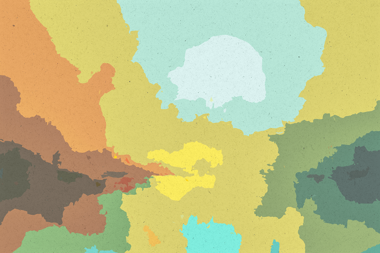
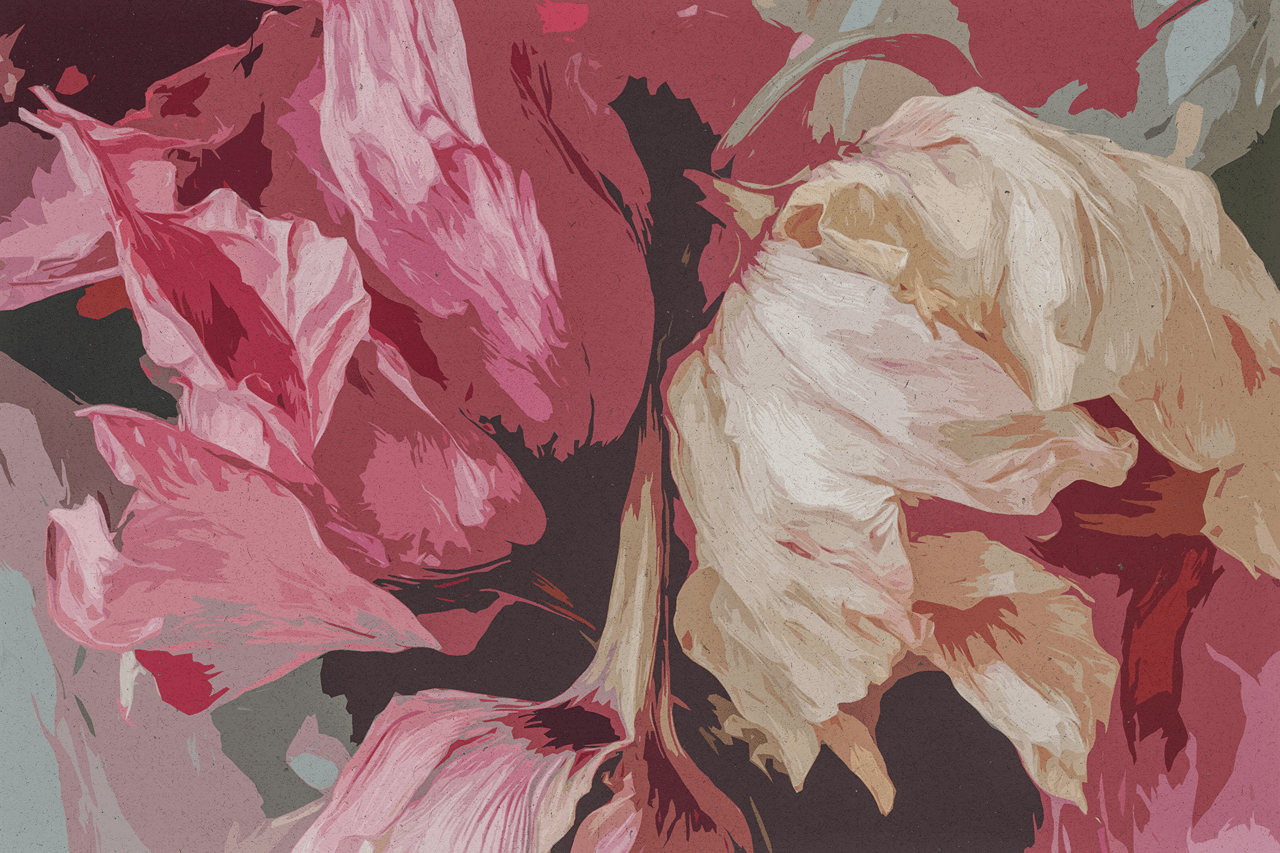
To command effectively, you must understand the AI’s default behavior. Generative models are trained on vast datasets of images—art, photos, illustrations—where the most common composition is a centered subject filling much of the frame. The model learns that “a portrait” statistically correlates with “a face occupying most of the image area.” It has no inherent understanding that you intend to use this image as a background for text. Without explicit instruction, it optimizes for visual richness and detail, not for functional typographic integration. This is why a prompt like “a majestic eagle in flight against a mountain sky” will likely generate an image where the eagle’s wingspan stretches across the entire canvas, leaving no calm area for your event details. You must override this statistical bias with strategic direction.
The Core Command: Explicitly Reserving Space in Your Prompt
The most effective method is to treat space as a primary element of your design request.
-
Basic Command: “Create an image of a [subject]. Compose the shot with the subject on the [left/right] side, leaving the [opposite side] as a clean, simple background with plenty of negative space for text.”
- Example: “Create an image of a vintage typewriter on a wooden desk. Compose the shot with the typewriter on the left third of the frame, leaving the right two-thirds as a soft-focus, blurry background with plenty of negative space for a book title and author name.”
This simple instruction forces the AI to consider layout first, creating a natural text zone.
- Example: “Create an image of a vintage typewriter on a wooden desk. Compose the shot with the typewriter on the left third of the frame, leaving the right two-thirds as a soft-focus, blurry background with plenty of negative space for a book title and author name.”
Advanced Techniques for Engineering Negative Space
Beyond the basic command, several proven techniques can sculpt the perfect space for your content.
-
The “Rule of Thirds” Directive: This classic compositional rule is easily understood by AI. It involves dividing the image into a 3×3 grid and placing key elements along the lines or intersections.
- Prompt: “Generate a background for a tech webinar. Show an abstract, glowing circuit pattern. Apply the rule of thirds: place the most complex cluster of circuits at the bottom-left intersection, and keep the top-right two-thirds of the image as a dark, smooth gradient with very subtle texture, creating a clear zone for headline text.”
-
Controlling Depth of Field: This photographic technique blurs the background (or foreground) to isolate the subject, automatically creating soft, non-distracting areas perfect for text.
- Prompt: “A photorealistic headshot of a confident businesswoman, studio lighting, shallow depth of field, neutral gray background.” The shallow depth of field ensures the background is a smooth, uniform blur, offering an ideal text canvas. This is a common technique for professional portraits where text overlay is expected .
-
Directing the “Gaze” or “Flow”:
-
For Portraits: “A portrait of a person looking toward the right side of the frame, leaving implied space in their gaze for text to be placed.”
-
For Action Shots: “A runner sprinting from left to right, with motion blur trailing behind them. The space ahead of them (to the right) should be open and clear for a motivational quote.”
This uses the subject’s orientation to naturally define where the viewer’s eye should travel, reserving the logical area for information.
-
-
Specifying Color and Simplicity in the Background Zone: Don’t just ask for space; define its properties.
-
“…leaving the right half as a minimalist background in a solid, light pastel blue from our brand palette.”
-
“…ensure the upper portion of the image is a clean, gradient sky without clouds or objects.”
-
-
Using Aspect Ratio Strategically: A 16:9 widescreen format naturally has more horizontal space for text banners at the top or bottom. A 4:5 or 2:3 portrait aspect ratio lends itself to text along one side. Mention the aspect ratio to guide the AI’s spatial planning .
Prompt Templates for Common Use Cases
Apply these templates directly in your ChatCanvas for reliable results.
For a Event Poster or Flyer:
“Design a poster background for a ‘Summer Jazz Festival.’ The visual should be a silhouette of a saxophonist against a vibrant sunset. Compose the shot with the musician on the left third. The sunset should fill the center and right, with the upper-right quadrant being a smooth gradient of orange to purple, providing ample negative space for the event title, date, and lineup in large, white text.”
For a Product Promotion Graphic:
“Create a product mockup image for our new ceramic coffee mug. Place the mug on a rustic wooden table. Use shallow depth of field so the table texture is slightly blurred. Position the mug slightly off-center to the left. The background and the space to the right of the mug must be a soft, light, and uniform neutral color to serve as a clean text area for the promo code and tagline.”
For a Book Cover or Album Art:
“Generate a cover image for a mystery novel. Show a lone, foggy streetlamp on a cobblestone street at night. The lamp should be in the lower-left corner. The majority of the image (the top and right) should be deep, dark blue fog with no distinct details, creating a large, dark negative space where the title and author name in a stark, serif font can be prominently placed.”
The Iterative Safety Net: Using “Touch Edit” to Carve Out Space
Even with a good prompt, you may need to adjust. Never delete. Use Lovart’s editing tools to refine the space.
-
Scenario: Your generated image has a beautiful subject but the reserved “space” is still too textured.
-
Action: Use Touch Edit. Click on the area intended for text and command: “Simplify this area further. Reduce texture, smooth out the gradient, and lower the contrast to create a more uniform background for text overlay.”
-
Why it Works: It allows for surgical correction without altering the successful parts of the image, making the generation perfect for its intended use.
The Strategic Impact: From Image to Ready-to-Use Asset
Mastering negative space commands transforms your relationship with AI from creating pictures to producing designs.
-
Professional Workflow Integration: Assets are generated “pre-formatted” for their final use, drastically reducing post-processing time in other software. The design is essentially complete upon generation.
-
Guaranteed Readability and Impact: Text and message become the undisputed heroes of the visual. The design communicates with clarity and force, fulfilling its core marketing purpose.
-
Elevated Perceived Quality: A layout that thoughtfully balances subject and space inherently looks more professional, intentional, and credible than a cluttered image.
-
Empowerment of Non-Designers: It provides a simple, formulaic way to achieve professional layout principles without formal training, democratizing high-quality design execution.
Conclusion: Designing with the End in Mind
The most powerful AI prompt is one that envisions the final product, not just the central subject. By learning to command negative space, you instruct the AI to wear the hat of a layout artist from the very beginning.
Lovart’s Design Agent is fully capable of executing these compositional briefs within the ChatCanvas. When you explicitly define where emptiness should live, you transform the generative process from an artistic gamble into a precise engineering task. The result is no longer just a generated image; it is a purpose-built, professionally balanced design asset, arriving with the text already in mind—and the perfect place for it to shine.