Extracting Color Palettes: How to Generate a Brand Scheme from a Photo You Love
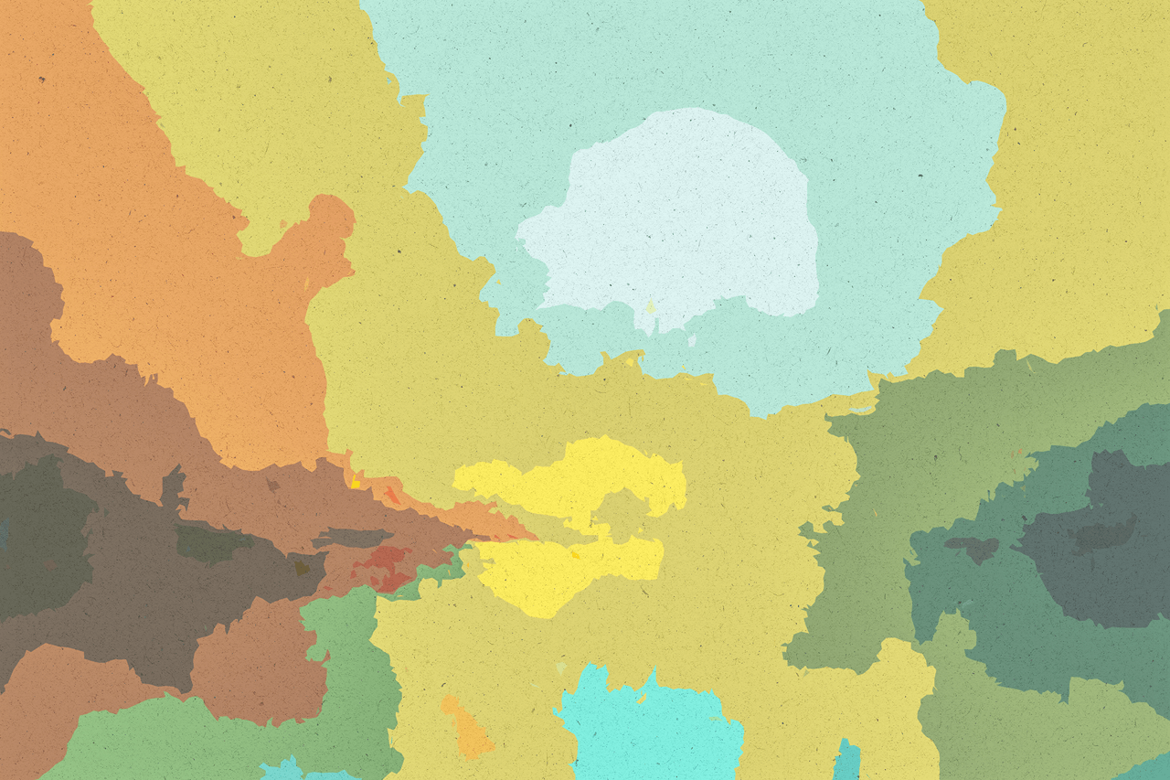
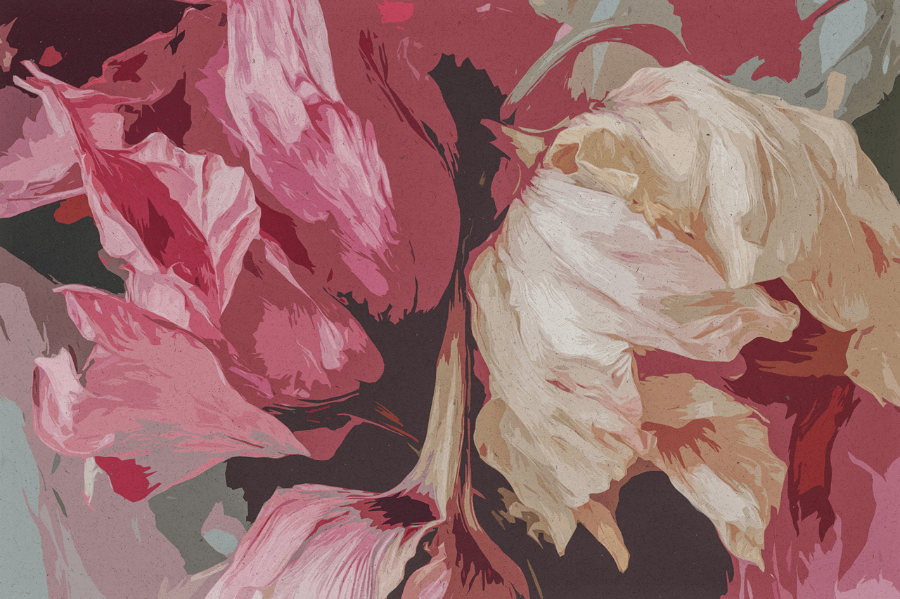
Color is the silent ambassador of your brand. It evokes emotion, shapes perception, and creates immediate, subconscious connections long before a customer reads a word. Selecting the right color palette is one of the most critical—and often daunting—decisions in building a brand identity. While color theory provides a framework, the most resonant palettes often come not from a textbook, but from the world around us: the serene blues and grays of a misty coastline, the vibrant, earthy tones of a Moroccan market, the sophisticated neutrals of a modernist interior. The challenge has always been translating the ephemeral beauty of a beloved photograph into a structured, usable brand color scheme. Traditional methods involve manual eye-dropping in design software, a process that is subjective, time-consuming, and often fails to capture the nuanced harmony and emotional weight of the original image. This barrier between inspiration and application is now dissolving. Lovart’s ChatCanvas, empowered by its multimodal Design Agent, acts as a sophisticated color anthropologist. It can analyze any photograph—a personal memory, a piece of art, a landscape—and extract not just a list of hex codes, but a fully realized, balanced brand color system complete with primary, secondary, and accent colors, understanding their relationships and emotional resonance. This capability allows anyone to found their brand’s visual identity on a personally meaningful aesthetic, transforming a subjective “I love how this feels” into a professional “This is our brand palette.” [[AI设计†21]] This guide explores how AI-driven color extraction works, why it’s superior to manual methods, and how to use this technology to build a deeply authentic and emotionally compelling brand color strategy from any image that captures your vision.
The Challenge of Color Translation: From Inspiration to System
Moving from an inspiring image to a functional palette involves several non-trivial steps where human perception and basic digital tools often misalign.
-
Subjective Sampling and Human Error: Using an eye-dropper tool manually, individuals tend to pick the most saturated or obvious colors, missing the subtle transitional tones that create depth and harmony. The choice of which pixels to sample is highly subjective, leading to palettes that may feel disjointed or fail to represent the image’s true mood. One person might extract five bright colors, another might get five muted ones, from the same photo [[AI设计†19]].
-
The Failure to Understand Weight and Hierarchy: A successful brand palette isn’t just a collection of colors; it’s a hierarchy. One color dominates (60%), another supports (30%), and others provide accents (10%). A manual extractor might list colors but not understand their proportional relationship within the image. Is that rust red a major background element or a tiny accent? This contextual understanding is crucial for practical application [[AI设计†21]].
-
Ignoring Nuanced Undertones and Combinations: The magic of a great photo often lies in subtle undertones—the hint of green in a shadow, the warmth within a grey. Manual picking often captures the overtone but misses these nuances, resulting in a palette that looks flat when separated from the original image. Furthermore, it doesn’t identify which colors naturally pair well together within the image’s own composition [[AI设计†19]].
-
The Disconnect from Brand Application: Even with a list of colors, non-designers struggle to operationalize them. Which color should be the logo? Which for headlines? Which for backgrounds? The extracted list is data, not a strategy. It lacks guidance on how to transition from inspiration to implementation across various media (digital, print-ready materials, product mockups) [[AI设计†8]].
This process leaves many feeling that their brand colors are arbitrary or disconnected from their core inspiration. AI extraction solves this by analyzing the image holistically, as a human expert might, but with computational consistency and an understanding of design systems [[AI设计†21]].
The AI as Color Analyst: Deconstructing Visual Harmony
Lovart’s Design Agent performs a deep structural analysis of an image within the ChatCanvas to derive its color logic, going far beyond simple averaging.
-
Dominant Color Identification (The Foundation): The AI first identifies the most spatially and perceptually prevalent color families. This isn’t just about pixel area; it understands visual weight. A large area of soft beige might be the foundation, while a smaller area of deep charcoal might carry more perceptual weight. It determines the true “primary” palette that defines the image’s overall feel [[AI设计†21]].
-
Extraction of Supporting and Accent Colors: Beyond the foundation, the AI isolates secondary color groups that create interest and accent colors that provide focal points. Critically, it understands the role of these colors in context. It can differentiate between a color used for a focal point and one used for shadow or texture. This results in a palette with built-in dynamism and application logic, not just a static list [[AI设计†21]].
-
Building a Cohesive Color System: The output is not a random assortment. The AI organizes the extracted colors into a usable, hierarchical system. For example, it might present:
-
Primary Brand Color: Deep Navy (the dominant, trustworthy base).
-
Secondary Palette: Slate Gray, Warm White (for backgrounds and large text).
-
Accent Colors: Terracotta, Sage Green (for buttons, highlights, icons).
This structured output immediately suggests how the colors can be applied in a practical design context, moving from inspiration to actionable rules [[AI设计†21]].
-
-
Generating Palettes with Specific Attributes: The user can guide the extraction for strategic brand purposes. “Analyze this photo of a forest floor. Extract a palette of 5 colors that feels organic, calming, and sophisticated—suitable for a wellness brand.” Or, “From this neon-lit cityscape, pull a high-energy, futuristic palette with one primary dark color and three vibrant accents.” This turns extraction into a strategic conversation about brand positioning [[AI设计†19]].
This method ensures the palette retains the emotional and compositional integrity of the source image, providing a far stronger foundation than manually picked swatches.
Practical Workflow: From Personal Photo to Professional Palette
Here is a step-by-step process for using Lovart to build a brand color scheme from a source of inspiration.
Step 1: Select Your "North Star" Image.
Choose a photograph that feels like your brand. This could be:
-
A travel photo that embodies your desired customer lifestyle.
-
A piece of art that matches your brand’s energy.
-
A nature scene that reflects your core values (e.g., stability, growth, serenity).
-
An interior design shot that captures your target audience’s aesthetic.
Step 2: Initiate Analysis and Extraction.
In the ChatCanvas, upload the image and prompt the Design Agent with strategic intent:
“Analyze the color composition of this image. Identify the dominant color mood (e.g., warm, cool, muted, vibrant). Then, extract a professional brand color palette suitable for a [Your Industry, e.g., boutique skincare] company. Provide the palette as a structured system with clear primary, secondary, and accent roles. Include hex codes and suggest the emotional or brand attribute each color represents.” [[AI设计†21]]
Step 3: Refine and Adapt the Palette.
Based on the AI’s proposal, you can refine it to better suit practical needs:
-
“Make the primary color slightly less saturated, more earthy and grounded.”
-
“Add a sixth color—a metallic gold accent—to introduce a touch of luxury and premium quality.”
-
“Ensure there is enough contrast between the secondary background color and the primary text color for full accessibility.”
Use conversational refinement or Touch Edit to adjust the extracted values until the palette perfectly aligns with your brand vision [[AI设计†21]].
Step 4: Apply the Palette to Brand Assets.
With the palette defined, generate initial brand assets to see it in action and validate its effectiveness.
“Using the extracted ‘Forest Floor’ palette, create a logo concept, a social media graphic for a product launch, and a business card mockup. Apply the color roles consistently: primary for the logo mark, secondary for the background, and accents for highlights and icons.”
This immediate application tests the palette in real-world contexts, ensuring it works in practice, not just in theory [[AI设计†8]].
Step 5: Formalize and Document.
Save the finalized palette within your Lovart workspace as a formal “Brand Kit.” This ensures all future assets generated by the Design Agent will automatically adhere to this color system, guaranteeing long-term visual consistency across all marketing materials, from print-ready brochures to digital ads [[AI设计†21]].
Strategic Applications Across Industries
This capability is transformative for various sectors where color deeply influences perception and consumer behavior.
-
E-commerce & DTC Brands: For a candle company, extracting a palette from a photo of a sunset over dunes can create a warm, soothing, and natural identity that appeals to customers seeking relaxation. For a tech gadget brand, a palette from a cyberpunk cityscape can convey innovation, energy, and cutting-edge appeal [[食品包装]].
-
Hospitality & Restaurants: A fine-dining establishment can base its palette on a photo of a perfectly set table with linen, silver, and wine, evoking elegance, precision, and luxury. A cozy café can extract colors from a photo of a rustic, sunlit bakery to communicate warmth, authenticity, and comfort [[餐饮设计†1]].
-
Wellness & Beauty: A skincare brand can derive its colors from images of minerals, botanicals, or serene spa environments, communicating purity, natural efficacy, and calm. This aligns perfectly with the ability to generate photorealistic product visuals that use these extracted tones to create a cohesive shelf presence [[AI设计†19]].
-
Professional Services: A financial advisory firm can extract a palette from an image of a stable, textured material like granite or aged leather, conveying trust, durability, and timeless value—key attributes for clients entrusting their wealth [[AI设计†8]].
The Tangible Benefits: Beyond Aesthetics
Adopting AI-driven color extraction delivers concrete strategic advantages that impact brand building and operational efficiency.
-
Foundation of Authenticity: Building a palette from a personally meaningful image ensures the brand’s colors are rooted in genuine inspiration, not arbitrary choice. This creates a deeper, more authentic connection with the brand’s story and values, resonating more powerfully with the target audience [[AI设计†21]].
-
Guaranteed Visual Harmony: Because the palette is extracted as a system from a single, harmonious source, the colors are guaranteed to work well together. This eliminates the trial-and-error and uncertainty of combining colors from different sources, saving time and ensuring professional results from the start [[AI设计†19]].
-
Dramatic Acceleration of the Branding Process: The time from inspiration to a fully defined, professional color system collapses from days of research, experimentation, and manual work to minutes of AI analysis and conversation. This allows businesses to move rapidly from concept to execution, accelerating time-to-market [[AI设计†21]].
-
Empowerment of Non-Designers: It provides a logical, accessible, and intuitive pathway for anyone to develop a professional color strategy. This demystifies a critical aspect of branding, fosters confidence in visual decision-making, and reduces dependency on external specialists for foundational work [[AI设计†8]].
Conclusion: Color as Captured Emotion
Color strategy has been liberated from the realm of abstract theory and technical guesswork. Lovart’s ChatCanvas and Design Agent have turned it into a process of discovery and intelligent translation [[AI设计†21]]. By analyzing the emotional mathematics and compositional balance of a beloved image, the AI extracts not just colors, but the very feeling and visual logic that made the image compelling.
This allows brands to be built on a foundation of captured emotion—translating a sunset’s calm, a market’s vibrant energy, or a forest’s serene depth directly into their visual identity. In this new paradigm, your brand’s color scheme is no longer something you merely choose from a chart; it is something you discover, already perfectly composed and emotionally resonant, in the world you love. The future of branding is not about picking colors, but about listening to and systematizing the palette of your own inspiration.