How to Tell AI to Leave Room for Your Text—Creating “Negative Space
Creating "Negative Space": How to Tell AI to Leave Room for Your Text One of the most telling distinctions between amateur and professional design is the conscious use of negative space—the intentional, empty areas within a composition that are not occupied by the primary subject. For designs destined to convey information, such as posters, social media graphics, book covers, or business cards, negative space is not merely aesthetic; it is functional. It is the designated real estate for typography, logos, and essential details. A common frustration when using AI image generators is receiving a stunning visual that is nonetheless unusable because every corner is filled with intricate detail, leaving no clear, quiet area for text. The result is a cluttered, unbalanced composition where text either fights for attention or becomes illegible. The solution is not to add text on top of a finished image and hope for the best, but to architect the image from the outset with typography in mind. This requires a specific vocabulary and conceptual framing when prompting the AI. Lovart’s Design Agent, attuned to design principles and operating within the directive environment of the ChatCanvas, responds exceptionally well to instructions that govern composition and hierarchy. By learning how to command the creation of negative space, you transform the AI from a blind picture generator into a strategic layout partner, ensuring your final designs are not only visually captivating but also professionally functional [[AI设计†20]]. Why AI Defaults to "Filled" Compositions and How to Counter It Generative AI models are trained to recognize and replicate patterns from a dataset of images. A significant portion of these images, especially compelling ones, are often “busy”—saturated with detail to create visual interest. The AI learns that a “good” image often has a high density of visual information. Therefore, without explicit instruction to do otherwise, it optimizes for detail coverage, not strategic emptiness. Your prompt must override this default tendency and introduce the concept of planned absence. Core Command: The Phrase "Ample Negative Space" The most direct and effective phrase is “ample negative space.” This is a term of art in design that the AI’s training data associates with professional layouts. It is a clear, high-level instruction that governs the spatial arrangement of the entire image. Basic Usage: Simply append this phrase to your prompt to create a general text-friendly area. “A **photorealistic** image of a misty mountain range at sunrise. Leave **ample negative space** in the sky for text.” This tells the AI to prioritize a large, relatively simple area (the sky) that can accommodate typography without conflict [[AI设计†20]]. Advanced Technique: Specifying the Location and Purpose of the Space To gain precise control, integrate the negative space instruction into your description of the composition itself. Directional Command: Tell the AI where the empty area should be. “Compose a vertical poster. Place a **cinematic** shot of a detective in a trench coat on the left side, using dramatic lighting. Reserve the entire right half of the image as **ample negative space** for a bold title and event details.” This creates a classic split layout, clearly separating the visual hero from the textual information [[AI设计†20]]. Zoning Command: Define specific “zones” within the image. “Create a **product mockup** image for a coffee mug. Place the mug prominently in the lower-left quadrant. Ensure the top two-thirds of the image is clean, soft-focus background with **ample negative space**, perfectly suited for a brand logo and tagline.” This is crucial for e-commerce and advertising imagery, where product and text must coexist without competition [[AI设计†20]]. Integrative Command: Weave the negative space into the scene description. “Generate a **Bold Minimalism** style book cover. A single, elegant feather rests on a smooth, dark slate surface. The majority of the image is the sleek, textured slate, providing **ample negative space** for the title to be printed in a clean, white font.” Here, the negative space isn’t an afterthought; it is the primary visual texture of the design itself, making it inherently typography-ready [[AI设计†20]]. Prompt Structure for Text-Centric Designs When the primary goal is to create a vehicle for text (e.g., event flyers, webinar graphics), structure your prompt to prioritize the layout. Template: “[Art Style] of [Subject], with [Key Detail]. Use a [Layout Description] that provides **ample negative space** in the [Location of Space] for [Type of Text].” Example: “**Bold Minimalism** graphic of a vinyl record, with a single bright red highlight. Use a vertical layout that provides **ample negative space** in the top third for a bold event title and in the bottom quarter for date and venue details.” [[AI设计†20]] Leveraging Lovart’s ChatCanvas for Layout Refinement The ChatCanvas allows you to iteratively refine the composition after the initial generation. Generate a First Pass: Use a prompt with the “ample negative space” directive. Evaluate & Adjust: If the reserved space isn’t quite right (too small, poorly positioned), use Touch Edit or a follow-up conversational command. Command: “The text area on the right is too narrow. Use **Touch Edit** to expand the background area to the right, creating more **negative space** for the event details list.” [[AI设计†20]] Command: “The subject is too centered. Gently shift the entire scene to the left, opening up more space on the right side for the headline.” This conversational loop ensures the negative space is perfectly tailored to your specific typographic needs. Why This Approach is Superior to Post-Hoc Text Addition Simply overlaying text on a busy AI-generated image leads to poor results: Legibility Crisis: Text competes with detailed backgrounds. Aesthetic Clash: The typography looks like an invasive afterthought, breaking the visual harmony. Manual Labor: You must manually blur, darken, or mask parts of the AI’s work to make room for text, negating the speed advantage. In contrast, commanding negative space at the generation stage: Builds Harmony: Text becomes an integrated, pre-planned element of the composition from the start. Ensures Function: The design is born with a clear purpose and hierarchy. Leverages AI’s Strength: It uses the AI’s compositional intelligence to create balanced layouts natively, rather than
How to Ask AI for a Logo That Won’t Look Dated Next Year
"Trendy vs. Timeless": How to Ask AI for a Logo That Won’t Look Dated Next Year A logo is the cornerstone of a brand’s visual identity, a singular mark meant to endure for years, even decades. It must be distinctive, memorable, and scalable. Yet, in an era where AI can generate thousands of logo concepts in seconds, a new and paradoxical challenge emerges: the seductive trap of the trendy. AI models, trained on vast datasets of contemporary design, are exceptionally adept at producing logos that feel fresh, modern, and of-the-moment—featuring current color gradients, popular font choices, and fashionable minimalist layouts. The risk is that a logo conceived in 2025 might scream “2025” by 2027, appearing dated and cheapening the brand’s perception. The quest, therefore, is not for a logo that is merely “good” or “modern,” but for one that is timeless. Achieving this with AI requires moving beyond generic prompts and into the realm of strategic, principled instruction. It requires understanding that AI is a powerful executor, but the human must be the timeless curator. Lovart’s ChatCanvas, guided by its multimodal Design Agent, provides the perfect platform for this dialogue. By learning to ask the right questions and frame the right constraints, users can steer the AI away from fleeting trends and toward the creation of enduring brand marks that balance contemporary relevance with classical longevity [[AI设计†21]]. This guide deconstructs the elements of timeless design and provides a framework for crafting AI prompts that yield logos built to last, ensuring your brand’s first impression remains strong and credible for years to come. The Allure and Peril of the Trendy AI Logo Understanding why AI often defaults to trendy outputs is the first step in learning to override its statistical biases. Training Data Bias: AI image models are trained on billions of images scraped from the web, heavily weighted toward the visual culture of the past 10-15 years. They learn patterns like “tech startup logos often use clean sans-serif fonts and blue gradients” or “fashion brands in the 2020s use minimalist serifs.” When asked for a “modern logo,” it statistically replicates these recent patterns, which are, by definition, trends that will eventually fade [[AI设计†21]]. The "Wow" Factor of Novelty: What feels innovative and exciting today is often a specific combination of shape, color, and typography that is currently in vogue. An AI can generate a logo with a clever, subtle negative space illusion or a vibrant duotone effect that feels incredibly fresh. However, these very techniques have historical cycles; the duotone trend of the 2020s will one day be as date-stamped as the glossy web 2.0 bubbles of the 2000s [[AI设计†21]]. Over-Reliance on Aesthetic Keywords: Prompts like “sleek,” “cutting-edge,” or “vibrant” often pull the AI toward the current visual interpretation of those words. “Sleek” in 2025 might mean ultra-thin lines and neon accents, a style likely to feel period-specific in a few years, rather than conveying a fundamental quality of elegance [[AI设计†8]]. Lack of Conceptual Depth: Trendy logos often prioritize form over foundational meaning. They might look “cool” but lack a deeper connection to the brand’s core story, values, or industry heritage. This superficiality makes them more susceptible to becoming passé as cultural contexts shift [[AI设计†21]]. The goal, therefore, is to prompt for principles rather than styles, for substance and structure rather than surface appeal. Principles of Timelessness: The Human Curator’s Guide To instruct the AI effectively, one must first understand the pillars of enduring design. These principles should form the core of your prompt. Simplicity and Reduction: A timeless logo is often deceptively simple. It reduces the brand idea to its essential visual form. Think of the Apple apple, the Nike swoosh, or the Coca-Cola script. Complexity, excessive detail, and intricate effects are hallmarks of trends that become difficult to reproduce or look cluttered over time. The instruction should emphasize clarity, legibility, and the removal of any non-essential element [[AI设计†21]]. Strong, Ownable Shape and Silhouette: A logo should be recognizable even when reduced to a solid black shape or seen from a distance. It should not rely on color gradients or fine detail for its core identity. Prompting should focus on creating a unique, balanced, and memorable form that functions effectively as a stamp or seal [[AI设计†8]]. Enduring Typography (or Strategic Abstraction): If the logo includes text, the font choice is critical. Trendy, overly stylized display fonts date quickly. Timeless logos often use custom-drawn letterforms or carefully modified classic typefaces (serif or sans-serif) with strong historical roots and proven legibility across mediums. Alternatively, a wordmark can be entirely abstracted into a symbolic form [[AI设计†21]]. Balanced Color with a Neutral Foundation: While color is important for brand recognition, a timeless logo should work effectively in a single color (black or white). This ensures versatility across all applications, from print-ready documents in black and white to embossed merchandise. Color should be an enhancement, not a structural crutch. Prompts should specify that the logo must be effective and recognizable in monochrome as its primary test [[AI设计†19]]. The AI Prompting Framework for Timeless Logos With these principles in mind, prompts must be engineered to constrain the AI’s vast possibilities toward timeless outcomes. Here are structured approaches to use within Lovart’s ChatCanvas. 1. The Foundational Principle Prompt: Start by embedding the timeless philosophy directly into the request. This sets the governing rule for the AI’s generative process. “Design a logo for our brand ‘Veridian.’ The core principle is timeless simplicity. The logo must be a simple, strong, and unique shape or mark that is highly scalable and instantly recognizable. It should work perfectly in solid black on a white background as its primary form. Avoid any complex gradients, drop shadows, or overly detailed elements. The goal is a design that would still feel appropriate and effective 20 years from now.” [[AI设计†21]] 2. The Descriptive & Constraint-Based Prompt: Combine the essence of your brand with specific, timeless constraints that guide the AI away from trendy shortcuts. *“Create a logo for an artisanal coffee roastery called
Swap the Model, Keep the Clothes Using Lovart Layer Explosion for Fashion Lookbooks
Swap the Model, Keep the Clothes: Using Lovart Layer Explosion for Fashion Lookbooks In the high-stakes, visually-driven world of fashion, the lookbook is more than a catalog; it is the definitive narrative of a collection. It sets the mood, defines the brand’s seasonal identity, and, most critically, showcases garments in their most aspirational light. Yet, the traditional production of a lookbook is a logistical and financial gordian knot. It involves casting models, booking photographers, securing locations, styling each shot, and enduring lengthy post-production—all for a set of images that are frozen in time. What if a garment needs to be shown on a different model type for inclusivity? What if the background no longer aligns with the marketing campaign? Traditionally, the answer is a costly reshoot. This rigid process is being shattered by a groundbreaking AI capability: layer explosion. This technology, exemplified by Lovart’s Edit Elements feature, deconstructs a single generated image into its core components—background, clothing, model, accessories—allowing for independent manipulation. For fashion brands, this isn’t just an editing tool; it’s a paradigm shift that enables the creation of dynamic, adaptable, and infinitely versatile visual assets from a single AI-generated seed. This deep dive explores the limitations of traditional fashion photography, elucidates the transformative mechanics of layer explosion, and provides a comprehensive guide for designers and marketers to revolutionize their lookbook production, enabling them to swap models, change settings, and mix garments with unprecedented creative freedom and efficiency . Part I: The Traditional Lookbook Bottleneck – Cost, Inflexibility, and Inconsistency To appreciate the revolution, one must understand the entrenched challenges of the old way. The High Cost of Perfection: A professional fashion shoot is a massive investment. Costs include: model fees (often per hour or per day), photographer and assistant rates, location rental or studio time, hair and makeup artists, stylists, catering, and equipment. For a small or emerging brand, this can be prohibitive, forcing compromises on quality or scale. The “One-Shot” Dilemma: Once a look is shot, it is largely immutable. If the creative director later wants to see the same dress on a redhead instead of a brunette, or in a studio setting instead of an urban landscape, it requires reassembling the entire team and repeating the shoot. This kills creative experimentation and agility. Inconsistency Across Campaigns: Shooting different parts of a collection at different times or with different crews can lead to visual inconsistency—variations in lighting mood, color grading, and photographic style. This weakens the cohesive story a lookbook is meant to tell. The Inclusivity Challenge: Reflecting diversity in models (size, ethnicity, age) is both an ethical imperative and a market expectation. Achieving this through traditional photography means significantly higher costs and logistical complexity for each additional model type, often leading to tokenism or limited representation. These constraints mean fashion visuals are often scarce, static, and expensive to alter. The industry has long needed a way to decouple the garment from the scene and the model, treating them as modular elements. This is the exact problem AI layer explosion is designed to solve . Part II: The Anatomy of AI Layer Explosion – Deconstructing the Generated Image Layer explosion is not a simple “cut-out” tool. It is an intelligent decomposition process that understands the semantic layers within a generated scene. How It Works (The “Edit Elements” Process): When a user uploads or generates an image in Lovart’s ChatCanvas and activates Edit Elements, the AI doesn’t just see pixels; it recognizes objects and their relationships. It identifies: “This is a human figure (model),” “This is apparel (dress, jacket),” “This is the background (studio wall, forest),” and “These are accessories (bag, shoes).” It then separates these elements into distinct, editable layers while preserving their intrinsic properties—the fold of the fabric, the way light hits the model’s hair, the texture of the background . The Key Capabilities Unleashed: Model Swapping: The foundational garment layer (e.g., a tailored blazer) can be detached from the original AI-generated model. A new model (with different physique, ethnicity, hair) can be generated by the AI, and the blazer layer can be intelligently “draped” onto this new figure, with lighting and shadows adjusted automatically for coherence. This enables the creation of multiple model variants from a single garment generation . Background Replacement: The background layer can be deleted and replaced entirely. The same model wearing the same dress can be placed in a Parisian street, a minimalist gallery, or a tropical beach, with the AI ensuring perspective and lighting integration. This allows for the creation of diverse marketing contexts without reshoots. Garment Mixing & Matching: Separate tops, bottoms, and outerwear from different generated scenes can be isolated and recombined to create entirely new outfits. A sweater from “Scene A” can be layered with pants from “Scene B” on a model from “Scene C,” all within a consistent AI-rendered style . Precision Editing and Styling: Individual elements can be tweaked without affecting others. Change the color of a handbag, adjust the sheen on leather boots, or add a piece of jewelry—all as separate, non-destructive edits. This mimics a digital stylist’s work in post-production. This transforms a static image into a dynamic asset kit. The initial generation is no longer the final product; it’s the source material for a multitude of derivative visuals, all maintaining photorealistic quality and brand aesthetic consistency. Part III: The Fashion Lookbook Production Playbook Using Layer Explosion Here is a step-by-step workflow for creating a versatile, AI-powered fashion lookbook using Lovart’s capabilities. Phase 1: Strategic Seeding – Generating the Core Garment Assets Define the Collection’s Visual DNA: Establish the mood, color palette, key materials (e.g., silk, denim), and target audience. Generate “Base Scenes” for Key Garments: In ChatCanvas, create high-fidelity scenes for your hero pieces. Focus on perfect garment representation. Prompt for a Trench Coat: “Generate a photorealistic fashion scene. A tall model wearing a beige, classic-cut trench coat, standing on a misty London bridge at dawn. Focus on the coat’s fabric texture, belt detail, and drape. Use a cool, cinematic color grade.” . Prompt for Silk Blouse: “Create a studio shot of a silk blouse on a model. The lighting is soft and directional, highlighting the
Why Amateurs Use Too Many Colors (and How AI Restrains You)
The "Rainbow Trap": Why Amateurs Use Too Many Colors (and How AI Restrains You) Color is the most immediate, emotional, and persuasive element in visual communication. It attracts attention, evokes feeling, and guides the eye. Yet, in the hands of an untrained creator, this power often manifests as a common, visually catastrophic pitfall: the “Rainbow Trap.” This is the compulsion to use too many colors, often at high saturation, in a single composition. Driven by a desire to be vibrant, exciting, or to “use all the tools in the box,” the amateur designer succumbs to chromatic chaos. The result is a visual that is exhausting to look at, lacks hierarchy, appears cheap and unprofessional, and fails to communicate a clear message. In the age of digital design tools that offer infinite color palettes, this trap is easier than ever to fall into. However, the same technological evolution that provided endless color also offers a sophisticated solution: intelligent constraint. AI design platforms like Lovart, through their Design Agent and structured workflows, inherently guide users away from the Rainbow Trap and towards professional color discipline. They do this not by limiting choice, but by embedding principles of harmony, brand consistency, and visual hierarchy into the very process of creation. This essay explores the psychology behind amateur color overuse, outlines the principles of professional color strategy, and demonstrates how Lovart’s tools actively mentor users towards creating cohesive, sophisticated, and effective color palettes from their very first prompt [[AI设计†19]]. The Psychology of the Rainbow: Why Amateurs Overcolor Understanding the impulse is key to overcoming it. Several cognitive and experiential factors drive the Rainbow Trap. The “More is More” Fallacy: Beginners often equate visual impact with quantity. If one bright color is eye-catching, surely five will be five times more effective? This ignores the principle of visual competition, where multiple strong elements cancel each other out, leaving the viewer overwhelmed and unsure where to look. Fear of “Boring” Neutrals: Without training, neutral tones (black, white, grey, beige, taupe) can seem “safe” or “dull.” The amateur seeks to inject “personality” through bold color, not realizing that personality is conveyed through the relationship and restraint of color, not its sheer volume. A sophisticated brand like Aesop or Aera uses a restrained, warm neutral palette to convey elegance and calm—a far more powerful personality statement than a rainbow [[AI设计†21]]. Lack of a Governing System: Professional designers work within systems: a primary brand color, a secondary palette, and accent colors with defined roles (60-30-10 rule). Amateurs approach each element in isolation: “The headline should be red to stand out. The button should be green to mean ‘go.’ The background should be blue because it’s calming.” This creates a disharmonious patchwork without a unifying logic. Software Defaults and Template Influence: Many basic templates or default settings in entry-level tools use high-contrast, saturated color schemes to appear “fun” and “engaging,” setting a misleading precedent for what looks “professional.” The Pillars of Professional Color Strategy AI tools like Lovart are programmed with an understanding of these principles, which they apply when interpreting prompts. Limited Palette with Defined Roles (The 60-30-10 Rule): A professional palette is not a collection of equals. It has a dominant color (-60% of the visual space), a secondary color (-30%), and an accent color (-10%). This creates rhythm and guides the viewer’s eye logically. When you prompt Lovart to create a brand kit for “Aera” with “warm neutrals and soft blush,” it inherently applies this kind of proportional thinking to the generated visuals [[AI设计†21]]. Harmony Over Shock: Professionals use color theory (complementary, analogous, triadic schemes) to create pleasing relationships. AI models are trained on millions of harmonious images and apply this understanding. A prompt for a “coffee shop menu with earthy tones” will yield a harmonious analogous palette of browns, tans, and creams, not a jarring mix of neon green and purple [[AI设计†19]]. Color for Hierarchy, Not Decoration: Color is used to signal importance. The most important action (a “Buy” button) or headline gets the highest-contrast, most saturated color. Less important elements are in quieter tones. Lovart’s Design Agent, when generating a social media graphic, will use color contrast to make the call-to-action pop, applying professional hierarchy automatically [[AI设计†21]]. Brand Consistency as a Non-Negotiable: Once a palette is established, it becomes a rule. Every asset must adhere to it. This consistency builds recognition and trust. Lovart’s ChatCanvas allows users to save and apply “Brand Kits,” enforcing this consistency across all generated content, preventing the ad-hoc color choices that lead to the Rainbow Trap [[AI设计†21]]. How Lovart’s AI Actively Restrains and Educates The platform doesn’t just allow good color; it makes bad color harder to achieve and guides users toward best practices. Prompt-Driven Color Definition: The system encourages users to define color upfront as part of the style, rather than as an afterthought. A prompt like “Design a poster using a minimalist style with a navy blue, white, and gold palette” sets a professional constraint from the start. The AI then executes within this defined color space, generating a cohesive design [[AI设计†19]]. Generating with Cohesive Palettes: When you ask Lovart to generate a “photorealistic summer beverage ad,” it doesn’t just throw random tropical colors at the image. It generates with an internally coherent palette—perhaps vibrant oranges, greens, and yellows that work together—applying the harmony it learned from training data. The output is vibrant but controlled, not chaotic [[AI设计†20]]. The “Touch Edit” Constraint for Recoloring: If a user wants to change a color, they don’t just pick a new one from a wheel. They use Touch Edit with a descriptive command: “Change the background to a muted sage green.” This language-based approach subtly encourages thoughtful, descriptive color choices (“muted sage”) over arbitrary picks. The AI then ensures the new color integrates naturally with the existing palette, maintaining harmony [[AI设计†20]]. Batch Generation Enforces Consistency: When creating a series (e.g., 5 Instagram posts), the AI applies the same color logic across all generations, ensuring visual consistency. It’s much harder to accidentally
Why Mixing AI Styles Hurts Your Instagram Grid
The "Ransom Note" Effect: Why Mixing AI Styles Hurts Your Instagram Grid In the visual economy of social media, particularly on Instagram, consistency is currency. A cohesive, recognizable grid acts as a silent brand ambassador, building trust, aesthetic appeal, and a reason for followers to return. The rise of accessible AI art generators has unleashed a wave of creative possibility, but with it comes a new and pervasive visual pitfall: the “Ransom Note Effect.” This term describes the jarring, amateurish look that results from mixing incompatible artistic styles within a single feed or even a single image. One post is a photorealistic product shot; the next is a gritty street art graphic; another is a soft watercolor painting; a fourth is a sleek vector illustration. Individually, each image might be striking. Viewed together on a profile grid, they clash, creating a sense of chaos, indecision, and a lack of professional curation. This effect is particularly damaging because it undermines the very purpose of a social media presence: to communicate a clear, stable brand identity. Lovart’s Design Agent, operating within the ChatCanvas, offers a powerful solution to this problem, not by limiting creativity, but by providing the tools to enforce a consistent visual language across all generated content. Understanding and avoiding the Ransom Note Effect is essential for anyone using AI to build a professional online presence . The Psychology of the Cohesive Grid: Why Consistency Matters A visually unified Instagram grid is not merely an aesthetic preference; it’s a cognitive and branding imperative. Reduces Cognitive Load: A consistent style (e.g., a specific color palette, lighting mood, or compositional approach) allows the viewer to quickly understand and appreciate the content without having to constantly re-calibrate their visual expectations. It creates a sense of order and professionalism. Builds Brand Recognition: When every post shares a common visual DNA, the profile itself becomes a recognizable asset. Followers begin to associate that specific look and feel with your brand, even before reading the caption. Enhances Perceived Value: A curated, consistent grid signals effort, intention, and expertise. It tells the audience that you understand visual communication, which elevates the perceived quality of your brand, products, or services. Encourages Engagement and Follows: People are drawn to aesthetically pleasing, harmonious feeds. A cohesive grid is more likely to be followed and explored than a chaotic one, as it promises a reliable and enjoyable visual experience. The Ransom Note Effect directly attacks these principles, making a profile look like a collage of unrelated, outsourced work rather than a deliberate brand expression. How AI Amplifies the Risk: The Allure of Infinite Styles Before AI, creating multiple high-quality styles required different skill sets or hiring multiple artists. AI lowers the barrier to generating any style instantly, which paradoxically increases the risk of style mixing. The “Style Picker” Trap: It’s tempting to use a different, trendy style for each post: one day anime, the next cinematic realism, then Bold Minimalism. Each prompt is a separate experiment, with no governing style guide. The grid becomes a showcase of the AI’s range, not your brand’s focus. Lack of a Governing “Art Director”: When generating in isolation, each prompt lacks the context of the previous posts. There is no overarching directive like, “All images must use a desaturated palette and soft, directional light.” Without this, the AI will simply fulfill each prompt’s stylistic request independently. In-Image Style Clashes: The effect can occur within a single graphic. A prompt like “a watercolor background with a photorealistic dragon and 8-bit pixel art text” can produce a visually confusing “ransom note” within one frame, as the AI attempts to blend fundamentally clashing aesthetics. The Lovart Solution: Enforcing a Visual Language Lovart’s platform provides the framework to generate variety without sacrificing consistency. Defining a “Brand Kit” within the ChatCanvas: Before generating content, you can establish style parameters. This could be a saved prompt fragment or a set of instructions to the Design Agent: “For all images for our brand ‘Aera,’ use the following style rules: palette = warm neutrals (cream, taupe, soft blush); lighting = soft, diffused, editorial; typography = classic serif fonts; overall mood = elegant and serene.” This acts as a creative brief for every subsequent generation . Generating Series with Unified Prompts: Instead of prompting for one-off images, prompt for a series that shares a stylistic foundation. Prompt: “Generate a set of 6 Instagram post graphics for our coffee shop’s ‘Autumn Blend’ launch. All images must share: a warm, earthy color palette (burnt orange, brown, cream); photorealistic close-ups of coffee beans, steam, and autumn leaves; and a clean layout with space for text in the bottom third. Vary the composition within these constraints.” Result: You get six unique images that look like they belong to the same campaign and brand, eliminating the Ransom Note Effect across your grid. Using “Touch Edit” to Harmonize Off-Brand Elements: If an otherwise good image has a style clash (e.g., a too-vibrant color), you can use Touch Edit to correct it toward your brand style. “Take this image and adjust the color grade to match our brand’s muted, warm palette.” This allows you to salvage content and align it with your grid’s aesthetic . Applying “Edit Elements” for Consistent Composites: You can generate background textures and foreground objects in your brand style separately, then composite them using a consistent lighting and color treatment, ensuring all elements speak the same visual language. Practical Grid-Building Strategy with AI To build a cohesive Instagram presence with AI, follow this disciplined approach: Phase 1: Style Discovery & Definition. Use Lovart to generate 10-20 images exploring different styles that could fit your brand. Choose the one that best represents you. Document its key characteristics (colors, lighting keywords, compositional habits). Phase 2: Batch Generation of Core Content. Write a master prompt that encapsulates this style. Use it to generate a batch of 15-30 images for future posts, ensuring they all derive from the same stylistic root. Store these in a Lovart project as your content
The Iteration Loop How to Politely “Argue” with AI to Get Exactly What You Want
The Iteration Loop: How to Politely "Argue" with AI to Get Exactly What You Want The initial output from a generative AI is rarely the final masterpiece. It is, more accurately, the opening statement in a creative dialogue—a first draft presented by an incredibly fast, somewhat literal-minded collaborator. The path from this first draft to a perfect final asset is not a straight line of increasingly precise prompts, but a conversational loop of iteration. This process is less about issuing commands and more about engaging in a constructive, focused “argument” with the AI: you present feedback, it revises, you refine your feedback, and it revises again. The goal is not to dominate, but to guide through clear, contextual communication. However, many users hit a wall here. They don’t know how to effectively critique an AI-generated image. They either accept a flawed result or delete it and start over, resetting the conversation to zero and losing all the valuable context the first image provided. This is where the true art of AI collaboration lies. Lovart’s ChatCanvas, with its multimodal Design Agent and features like Touch Edit, is specifically engineered for this iterative dialogue. It provides the framework for a polite, productive “argument” where you can point, describe, and refine until the output aligns exactly with your vision. This guide explores the principles and techniques of effective iteration, teaching you how to engage in this loop to transform promising but imperfect AI generations into precisely what you want . The Nature of the Collaborative “Argument”: Feedback vs. Restart Iteration is a dialogue, not a series of monologues. Understanding its nature prevents frustration. The AI as a Literal Interpreter: The AI takes your words at face value and combines concepts from its training data. If your prompt is “a wise owl reading a book in a library,” it might generate an owl with human-like features holding a book, but the lighting might be dark, the book title might be gibberish, or the owl’s expression might look stern instead of wise. This isn’t an error; it’s an interpretation. Your job is to provide feedback on that specific interpretation . The High Cost of the “Delete and Restart” Cycle: Deleting an image and typing a new prompt discards all the visual context the AI has already established—the color palette, the art style, the basic composition. You are forcing it to imagine a whole new scene from text alone, which is a less precise process than editing an existing scene. This cycle is inefficient and unlikely to converge on your exact vision . Feedback as a Collaborative Tool: Your feedback is data that helps the AI understand the difference between its output and your intent. The more specific and contextual your feedback, the more effectively it can close that gap. This is the essence of the “argument”: you are defining the problem space with increasing precision. The goal is not to win an argument, but to collaboratively solve the problem of “how to visually represent my idea.” The Iteration Loop Protocol: A Step-by-Step Dialogue Guide Follow this structured approach to iteratively refine an AI generation within the ChatCanvas. Step 1: Generate the First Draft (The Opening Statement) Begin with your best descriptive prompt. For example: “Create a serene scene of a single rowboat on a calm lake at dawn, with mist and mountains in the background.” Accept the first output as the starting point for the conversation, not the final product. Step 2: Analyze and Articulate Specific Feedback (The Polite Critique) Instead of saying “It’s not right,” identify exactly what to change. Break feedback into categories: Composition/Layout: “The boat is too centered; please move it slightly to the right to follow the rule of thirds.” Style/Atmosphere: “The mood is too bright and cheerful; make it more misty, soft, and melancholic.” Subject/Detail: “The rowboat looks too new and plastic; make it look like weathered, painted wood.” Color/Lighting: “The dawn light is too yellow; make it a cooler, pinkish-blue morning light.” Step 3: Employ the Right Tool for the Feedback (The Method of Argument) Lovart provides tools suited for different types of feedback. For Global Adjustments (mood, style, overall color): Use conversational commands to the Design Agent. “Take this image and apply a cooler color temperature, and increase the atmospheric haze.” For Localized, Precision Edits (a specific object, color, detail): This is where Touch Edit excels. Click directly on the element you want to change. “Click on the boat and say: Change the color of this boat from red to a faded forest green.” This is “arguing” with pinpoint accuracy, telling the AI exactly which part of its statement you disagree with and how to fix it . For Structural Changes or Isolating Elements: Use Edit Elements to deconstruct the image. “Separate the mountain layer from the lake and sky layers so I can adjust them independently.” Step 4: Evaluate the Revision and Refine Further (The Dialogue Continues) The AI will present a revised image. Evaluate it against your feedback. If it’s closer but not perfect, provide incremental feedback based on the new version. First Feedback: “Make the boat weathered wood.” After Revision: “Good! Now, add a few more details to the boat, like a small rusted anchor at the front.” This loop continues, with each round of feedback becoming more specific, honing in on the perfect result. Step 5: Recognize Completion (The Consensus) The iteration loop ends not when the image is “perfect” in an abstract sense, but when it satisfies the specific requirements of your project. It meets the brief. This is the consensus you reach with your AI collaborator. Advanced Iteration Techniques: Solving Complex “Arguments” Some desired changes require sophisticated feedback strategies. The “In-Painting” Argument (Adding Something New): You have a good landscape but want to add a bird in the sky. Technique: Use Touch Edit. Tap on the area of the sky where you want the bird and say: “Add a solitary bird flying in this area of the sky.” The AI will
The Rule of Thirds How Lovart Automatically Crops Images for Maximum Impact
The Rule of Thirds: How Lovart Automatically Crops Images for Maximum Impact The human eye is not a dispassionate scanner; it is drawn to specific points of tension, balance, and narrative within a frame. For centuries, artists and photographers have harnessed this instinct through compositional guidelines, the most fundamental of which is the Rule of Thirds. This principle, which divides an image into a 3×3 grid, suggests that placing key elements along these lines or at their intersections creates a more dynamic, engaging, and naturally pleasing image than centering the subject. Yet, for busy professionals creating marketing visuals, applying this rule manually is often a forgotten step, lost in the rush to post content. The result is a feed full of centrally composed, static images that fail to capture attention. This is where intelligent automation becomes a superpower. AI design agents like Lovart don’t just generate images; they compose them. By baking principles like the Rule of Thirds into their generative and editing processes, they ensure that every visual asset—from a social media graphic to a product scene—is inherently structured for impact. This deep dive explains the psychological power of the Rule of Thirds, illustrates how Lovart’s Design Agentand features like Touch Edit automate its application, and demonstrates how this built-in design intelligence elevates the effectiveness of any business’s visual content without requiring any technical knowledge from the user . Part I: The Science of Sight – Why the Rule of Thirds Works The Rule of Thirds isn’t an arbitrary aesthetic preference; it’s a heuristic that aligns with how humans perceive and process visual information. Creating Dynamic Tension vs. Static Symmetry: A perfectly centered subject creates symmetry, which can feel stable, formal, or, in a marketing context, boring and predictable. Placing the subject off-center, along a third, introduces visual tension. The viewer’s eye has to move across the frame, engaging with the negative space and creating a sense of narrative or implied movement. This dynamic composition is inherently more interesting and memorable . Guiding the Eye and Establishing Hierarchy: The four intersection points of the grid are known as “power points” or “crash points.” Placing the most important element—a product, a model’s eyes, a key message—on or near one of these points instantly tells the viewer where to look first. This visual hierarchy is crucial in marketing, where you have milliseconds to communicate the primary value proposition. The rest of the composition can then support this focal point. Balancing Elements and Negative Space: The gridlines help balance multiple elements within a scene. For instance, in a landscape, placing the horizon on the top third line (emphasizing the land) or the bottom third (emphasizing the sky) creates a more intentional composition than splitting the frame in half. It also encourages the effective use of negative space, which can make a design feel more premium and less cluttered. The “AI Look” Antidote: One hallmark of poorly composed AI-generated images is a clumsy, central composition that feels awkward. By automatically applying the Rule of Thirds during generation, Lovart’s AI ensures outputs have a professional, photographic baseline composition, avoiding that amateurish, synthetic feel . For a small business owner without design training, consciously applying this rule to every image is impractical. Lovart integrates this expertise into the fabric of its creation process, making professional composition a default, not an option. Part II: The AI as a Master Composer – Automation in Generation and Editing Lovart’s system applies compositional intelligence at multiple stages: when generating new images from scratch, and when editing or refining existing ones. Intelligent Composition at the Point of Generation: When you prompt Lovart’s Design Agent to create an image, it doesn’t just render objects randomly. It composes them. For a prompt like “A serene image of a single sailboat on a calm ocean at sunset,” the AI is inherently likely to position the sailboat at one of the lower power points (left or right third), with the horizon along the top or bottom third, and the setting sun near an upper intersection. This happens as a result of its training on millions of well-composed photographs. The user gets a professionally composed image without ever thinking about a grid . “Touch Edit” with Context-Aware Cropping: This is where the automation becomes powerfully explicit. The Edit Elements feature allows users to make precise adjustments. A common use is intelligent cropping and reframing. For example, if a user uploads a product photo where the item is dead center, they can use Touch Edit to command a recomposition. By selecting the subject and instructing, “Reposition this to follow the rule of thirds,” the AI will intelligently crop and shift the image, often generating new, contextually appropriate background content to fill the space, thereby creating a more dynamic shot from a static original . Automatic Enhancement for Generated Assets: Even after an image is generated, Lovart’s systems can suggest or automatically apply crops that enhance composition. This ensures that even if a first-generation result is close, the final output is optimized for visual impact according to established design principles. Batch Processing with Good Composition: When using batch generation for a set of social media graphics, the AI applies consistent compositional logic across the set. This means a week’s worth of posts will not only be on-brand but will each have a balanced, engaging layout, elevating the entire feed’s professional appearance without manual tweaking . This integrated approach means that users, regardless of skill level, are effectively collaborating with a design partner that has an advanced degree in visual composition. The tedious, technical work of framing is handled automatically. Part III: Practical Applications – From Product Shots to Social Stories Let’s see how this automatic composition works across different business needs. E-commerce Product Photography: For an Amazon listing scene generated by Nano Banana Pro, automatic application of the Rule of Thirds means the product is naturally placed off-center, creating a more lifestyle-oriented, aspirational feel than a flat, catalog-style central shot. The negative space can be used for text overlays or simply to give the product “room to breathe,” enhancing its perceived value . Portraits for Professional Branding: A headshot generated for a consultant or real estate agent will likely position the
AI Design Wars_ Spell-Check, Real Text, Brand Consistency, and Prompt Discipline
DALL-E 3 vs. Lovart: The Ultimate Spell-Check Battle In the realm of AI image generation, a subtle but critical frontier has emerged: the battle for textual accuracy within the image itself. For designers, marketers, and content creators, the ability to generate visuals containing legible, correctly spelled text—be it a logo, a poster headline, a product label, or a street sign—is not a luxury; it’s a practical necessity. A misspelled word on a generated storefront or a garbled logo font can render an otherwise stunning image unusable, undermining professionalism and brand integrity. Two major contenders define this space: OpenAI’s DALL-E 3, renowned for its integration with ChatGPT and improved text rendering, and Lovart, the AI design agent built around the ChatCanvas and multimodal reasoning. While both can attempt to render text, their approaches, underlying philosophies, and effectiveness in the crucial “spell-check” differ fundamentally. This isn’t just about which model draws prettier letters; it’s a battle between a general-purpose text-to-image model and a purpose-built design agent that understands text as an editable, integral component of a larger creative workflow. This analysis will dissect the text-generation capabilities of DALL-E 3 and Lovart, moving beyond simple prompt compliance to examine which platform truly delivers reliable, editable, and professionally accurate text within generated visuals . The DALL-E 3 Approach: Improved, but Still a Rendering Engine DALL-E 3 represents a significant leap forward from its predecessors in understanding and rendering text prompts. Its integration with ChatGPT allows for more nuanced interpretation of user requests. Strengths: Prompt Adherence: DALL-E 3 excels at incorporating the exact string of text provided in a prompt into the scene. A prompt like “A neon sign that says ‘OPEN 24/7’ in a rainy alley” will reliably produce an image with those words featured. Stylistic Flexibility: It can render text in various artistic styles suggested by the prompt—neon, handwritten, carved in stone, etc.—with impressive visual flair. Contextual Placement: It often cleverly integrates text into the environment, making it look like a natural part of the scene. The Fundamental Limitation – Text as Texture: Despite its improvements, DALL-E 3’s core function is to render text as part of an image. The text it generates is a fixed, painted element within the raster graphic. It is not an editable text layer. This leads to several critical issues: The “Glyph Confusion” Problem: The model sometimes creates plausible-looking glyphs that resemble letters but are nonsensical or misspelled upon close inspection. It prioritizes the visual shape of text over its linguistic accuracy. Font Inconsistency: It may invent a font style that doesn’t exist or blend multiple font characteristics within a single word, which can look unprofessional for branding. The Correction Nightmare: If there is a spelling error or you want to change the wording, you cannot simply edit it. You must regenerate the entire image from a revised prompt, gambling that the new generation will match the style, composition, and quality of the first while fixing the text—a low-probability event. Lack of Typographic Control: You cannot specify kerning, leading, or precise alignment in a way that a design tool would understand. The AI interprets these terms visually, not programmatically. In essence, DALL-E 3 is a brilliant illustrator that can draw text very well, but it treats words as immutable visual objects, not as editable content. The Lovart Approach: Text as an Editable Design Element Lovart is built on a different premise: the ChatCanvas is an infinite workspace where every element, including text, is part of a structured, editable composition guided by the Design Agent. Strengths: Structured Text Generation: When you prompt Lovart to create a poster, it understands text as a primary component. A prompt like “Design a poster for a tech conference with the title ‘Nexus 2025’ and the subtitle ‘Connecting Futures’” leads to an output where the text is generated not just as pixels, but as recognized textual elements within the AI’s compositional logic. The “Text Edit” Power: This is Lovart’s game-changing feature. Once text is generated (or exists in any uploaded image), you can use the Text Edit function. It doesn’t just repaint; it understands the text structurally. You can command: “Change the subtitle to ‘The Future of Collaboration’” or “Correct the spelling of ‘conference’ in the body text.”* The AI then regenerates the text in the same style, font, and position, fixing the error while preserving the visual integrity of the scene. This is not a regeneration; it’s a surgical edit . Integration with the Creative Flow: Text generation and editing are not separate modes. They are part of the continuous dialogue in the ChatCanvas. You can generate a scene, then immediately instruct the agent to modify the text, add a line, or change a price, all within the same context . Font and Style Consistency: Because the AI treats text as a distinct entity, it can maintain consistent typographic styling across edits, which is crucial for brand materials. For Lovart, text is not just a visual effect; it’s a functional, malleable component of the design, subject to precise correction and iteration. The “Spell-Check” Battle: A Scenario-Based Analysis Consider a common task: “An image of a cafe chalkboard menu. The header says ‘Today’s Specials’ and lists ‘Artisanal Soup – $8’ and ‘Fresh Salad – $10’.” DALL-E 3 Process & Risk: You input the prompt. DALL-E 3 generates a beautiful chalkboard image. You inspect it. The header might read “Todays Specials” (missing apostrophe). “Artisanal” might be spelled “Artisinal.” The dollar signs might look distorted. To fix it, you must create a new prompt: “An image of a cafe chalkboard menu. The header says ‘Today’s Specials’ and lists ‘Artisanal Soup – $8’ and ‘Fresh Salad – $10’. Ensure all spelling is correct.” The new generation may fix the text but change the layout, lighting, or style of the chalkboard. You are now in a loop, trying to converge on an image that has both perfect text and perfect aesthetics. Lovart Process & Solution: You input the prompt in the ChatCanvas. Lovart generates the menu image.
How Lovart’s “Edit Elements” Outpaces Photoshop, DALL‑E 3, and Outdated Design Habits
Photoshop’s "Object Selection" vs. Lovart’s "Edit Elements": Which is Faster? In the digital design workflow, time is the ultimate currency. A task that takes minutes instead of hours can be the difference between meeting a deadline and missing an opportunity. For decades, Adobe Photoshop has been the undisputed industry standard for image manipulation, and its suite of selection tools—from the humble Magic Wand to the sophisticated “Object Selection Tool”—has been the primary method for isolating elements within a raster image. This process, however, has always involved a degree of manual skill, trial and error, and meticulous refinement, especially around complex edges like hair, fur, or translucent materials. The emergence of generative AI has introduced a paradigm shift, not just in creation, but in the fundamental act of deconstruction. Lovart’s Edit Elements feature, powered by its multimodal Design Agent, represents this new frontier. It promises to understand an image semantically and separate its components with a single command, challenging the very notion of what “selection” means. This comparison isn’t merely about which tool clicks faster; it’s a fundamental examination of two different philosophies: one rooted in manual pixel-level control, and the other in AI-driven contextual understanding. The question of speed extends beyond raw seconds to encompass the entire workflow—from the initial intent to a finished, isolated asset ready for use. This analysis will dissect the processes, strengths, and inherent limitations of both Photoshop’s Object Selection and Lovart’s Edit Elements to determine which approach truly delivers professional results with greater efficiency in the age of AI-driven design . The Traditional Workflow: Photoshop’s Object Selection Tool Photoshop’s approach is iterative and tool-based. The user must actively guide the software to the desired outcome through a series of manual steps. Opening and Assessment: The workflow begins by opening the target image in Photoshop. The user must visually assess the scene, identifying the object to be isolated and the complexity of its edges against the background. Tool Selection and Initial Selection: The user selects the Object Selection Tool. They then draw a rough rectangle or lasso around the target object. The AI within this tool then analyzes that bounded area, attempting to differentiate the foreground object from the background based on contrast, color, and texture patterns. The Inevitability of Refinement: Rarely does the initial AI selection produce a perfect mask, especially with challenging backgrounds, low contrast, or fine details. This triggers the refinement phase, which is where the bulk of time is spent: Adding/Subtracting: Using brush tools to manually add missed areas or subtract over-selected parts. Edge Refinement: Using specialized dialogs like “Select and Mask” to adjust edge detection radius, smoothness, feathering, and to decontaminate color fringes. This often requires zooming in to pixel-level and making careful brush strokes. Dealing with Shadows and Transparency: Manually deciding whether a soft shadow is part of the object or the background, and painstakingly painting the mask to achieve a natural look. Translucent areas like glass require expert use of channels and luminosity masks. Output and Context Switching: Once the mask is satisfactory, the user must choose an output method: create a new layer with a mask, copy the selection to a new document, or apply a layer effect. To use this isolated object in a new design (e.g., a social media post), it often requires saving it as a PNG and then opening or importing it into another file or software. This process values precision and control, but its speed is directly proportional to the user’s expertise and the image’s inherent complexity. For a simple product on a white background, it can be quick. For a person with flyaway hair against a busy street, it can be a lengthy, technical endeavor. The AI-Native Workflow: Lovart’s “Edit Elements” Lovart’s approach is conversational and intent-based. The user communicates a goal, and the AI executes the complex task of decomposition within the unified ChatCanvas environment. Upload and Command: The workflow starts by uploading the image to the ChatCanvas. The user then issues a direct command to the Design Agent: “Use Edit Elements to isolate the [object name] from this image.” The instruction can be as simple as “isolate the dog” or “separate the logo from the background.” Semantic Analysis and Automatic Separation: The AI does not merely look for edges; it understands the scene. It identifies “the dog” as a distinct entity, differentiates it from “the grass” and “the sky,” and comprehends the object’s boundaries in a contextual way, similar to how a human would perceive it. It automatically generates a mask that handles complex edges intelligently, often making appropriate decisions about soft shadows and partial transparency based on its training. Direct Iteration and Compositing: The result is presented, often with the object already on a transparent background or as a separate layer within the ChatCanvas. If refinement is needed, it occurs conversationally or via Touch Edit. The user can say, “The mask is a bit too tight around the ears, soften it,” or use Touch Edit to click and adjust. Crucially, the entire process—generation, isolation, and subsequent editing—happens in the same space where new designs are being created. Seamless Integration: The isolated object is now a native asset within the Lovart workspace. It can be immediately dragged into a new composition, used in a product mockup, or have its style altered with a follow-up prompt, all without file exports, imports, or context switching. This process values understanding and automation. Its speed is less dependent on the user’s manual dexterity and more on their ability to clearly articulate the desired outcome. The AI handles the technical complexity of edge detection. Head-to-Head Analysis: The True Meaning of “Faster” To determine which is faster, we must compare them across the entire journey from “having an image” to “using an isolated object.” Simple Object on Clean Background: Photoshop: Very fast. A quick click with the Object Selection Tool or even the Magic Wand may suffice. Seconds. Lovart: Fast. The command is nearly instantaneous, but includes the time to upload and type the prompt.
Stop Buying Templates Why Generative Design is Cheaper and More Unique
Stop Buying Templates: Why Generative Design is Cheaper and More Unique The siren song of the template is familiar to any entrepreneur, marketer, or solo creator: a low-cost, pre-designed solution that promises a professional look with minimal effort. With a few clicks, you can have a logo, a website, a social media post, or a business card that looks “good enough.” This transactional model, perfected by platforms like Canva, has democratized design for millions. However, this convenience comes at a hidden, compounding cost: the cost of sameness. Your brand, built on a purchased template, is one of thousands using the same foundational structure, the same font pairings, the same graphical clichés. In a crowded digital marketplace, where differentiation is survival, this template-based homogeneity is a strategic liability. The emergence of true generative AI design, as embodied by Lovart’s Design Agent and ChatCanvas, offers a radical and economically superior alternative: generative design. Instead of buying a static, shared blueprint, you engage in a creative conversation that yields a truly unique, original visual asset, crafted to your specific brief. This paradigm shift—from selecting to generating—is not just about aesthetics; it’s a fundamental recalculation of value, cost, and brand equity. This analysis demonstrates why, for anyone serious about building a distinctive and valuable brand, investing in generative design is cheaper, more powerful, and more future-proof than buying another template [[AI设计†21]]. The True Cost of a Template: Beyond the Purchase Price The advertised price of a template is a fraction of its total cost. The real expenses are hidden in adaptation, limitation, and lost opportunity. The Adaptation Tax: A template is not yours. It is a rigid structure you must fit your content into. This process incurs a “tax”: Time Tax: Hours are spent wrestling with placeholder text, resizing image boxes that don’t match your proportions, and tweaking colors that are locked to a global swatch. What was sold as “quick” becomes a frustrating puzzle. Compromise Tax: Your perfect headline is three words too long for the template’s text box. The template’s color scheme clashes with your product photo. You are forced to change your content or accept a suboptimal layout, diluting your message to fit the mold. The Sameness Penalty: This is the strategic cost. Your brand’s visual identity is its face in the world. Using a template means sharing that face with countless others. It communicates a lack of originality, effort, and investment. In a sea of similar-looking Shopify stores or Instagram feeds, you fail to stand out, directly impacting memorability, trust, and conversion rates. A template might be print-ready, but it’s not brand-ready [[AI设计†19]]. The Scalability Ceiling: Need 20 variations of a flyer for an A/B test? With a template, you must manually duplicate and edit each one, a tedious and error-prone process. Each variation is a manual effort. There is no inherent scalability. The Editability Illusion: While you can change text and images, the core design—the layout grid, the graphical motifs, the font styles—is immutable. If the template’s style becomes dated or no longer fits your evolving brand, you must abandon it entirely and purchase a new one, restarting the adaptation cycle. A template offers the illusion of low cost, but charges heavily in time, flexibility, and uniqueness. The Generative Design Economy: Value Creation Through Conversation Generative design with Lovart operates on a different economic principle: the cost of a unique asset approaches the cost of the conversation to create it. With a fixed subscription, the marginal cost of each new, original design is effectively zero. Uniqueness as a Default Output: When you prompt Lovart’s Design Agent with “Design a modern logo for a yoga studio called ‘Tranquil Flow,’” it doesn’t retrieve a pre-made logo. It generates a new composition based on the statistical relationships between the concepts “modern,” “logo,” “yoga studio,” and the words “Tranquil Flow.” The result is inherently unique, not a copy of an existing template file. It is generated, not retrieved [[AI设计†21]]. Infinite Variations at Zero Incremental Cost: The power of generation is its scalability. Once you have a style you like, creating variations is a matter of conversation. “Now create 10 social media banner variations using this logo and a serene color palette.” “Generate this product image in 5 different background settings.” Each variation is a new, original image, yet the cost is the same as generating one. This enables massive A/B testing, seasonal campaigns, and personalized marketing at a cost structure templates cannot match [[AI设计†5]]. Total Creative Freedom, Not Constraint: You describe what you want; the AI builds it. You are not limited to the designer’s pre-set layouts. If you want the headline on the right, the image on the left, and a vertical sidebar, you describe it. The design conforms to your vision, not vice-versa. This is enabled by features like Touch Edit, which allows you to adjust any element after generation, something impossible in a locked template [[AI设计†20]]. Dynamic Consistency: With templates, consistency is manual (using the same template repeatedly). With Lovart, consistency is dynamic and intelligent. You can establish a “Brand Kit” or a style prompt. Every subsequent generation references this, ensuring all assets—from the first to the thousandth—adhere to the same visual language, without the rigidity of a single template file [[AI设计†21]]. The Financial Breakdown: Template Transaction vs. Generative Subscription Consider a small business needing a suite of assets over a year: a logo, 5 social media templates, a product mockup, a flyer, and a email newsletter header. Template Route (Canva Pro/Marketplace): Logo Template: $20 Social Media Bundle: $15 Product Mockup: $10 Flyer Template: $5 Newsletter Template: $10 Canva Pro Subscription (for editing): $120/year Total Estimated First-Year Cost: -$180 + time spent adapting each. Risk: Assets are non-unique; may clash stylistically if from different template packs. Generative Route (Lovart Pro): Subscription Fee: -$90/month (or annual equivalent) [[AI设计†21]]. What you generate: All the above, plus unlimited variations, photorealistic renders, video concepts, 3D models, and brand kits. Every asset is original and tailored. Beyond the first year: The template buyer continues
Over-Editing How to Know When to Stop Tweaking and Export
In the creative process, powered by the seemingly infinite possibilities of AI, a new and subtle danger emerges: the trap of over-editing. Unlike traditional media where materials or time impose natural limits, the digital realm—especially with a collaborative agent like Lovart’s Design Agent—offers boundless potential for revision. With features like Touch Edit and Edit Elements, every pixel is malleable, every color adjustable, every element replaceable. This power can lead to a state of perpetual tweaking, where the creator, seeking an elusive perfection, continues to make microscopic adjustments long after the design is effective, coherent, and ready. The project enters a state of diminishing returns, where each additional hour of work yields negligible improvement, consumes mental energy, and can even introduce new flaws or strip the work of its original spontaneity and vitality. Knowing when to stop is not a sign of compromise, but a critical skill in professional creativity. It is the moment of recognizing that the design has achieved its purpose and that further intervention risks degrading rather than enhancing it. This guide explores the psychology of over-editing, provides clear signals that your work is complete, and establishes a disciplined framework for making the final, confident decision to export and ship your work . The Psychology of Over-Editing: Why We Can’t Let Go Understanding the drivers behind endless tweaking is the first step to overcoming it. The Illusion of Perfectibility: Digital tools, particularly AI that can regenerate any component, create the illusion that a “perfect” version exists just one more edit away. This is a mirage. In design, as in art, perfection is often an asymptotic goal—you approach it but never truly arrive. Chasing it indefinitely leads to paralysis . Loss of Objective Perspective (The “Canvas Blindness”): After staring at the same ChatCanvas for hours, your brain becomes saturated. You lose the ability to see the design as a first-time viewer would. Minor imbalances begin to look like major flaws, and you start adjusting elements that were never problematic to an outside observer . Fear of Finality and Judgment: Exporting and sharing a design makes it “real” and opens it to critique. Continued tweaking can be a subconscious procrastination tactic, a way to avoid the moment of judgment by keeping the work in the safe, private state of “almost done.” The Sunk Cost Fallacy: “I’ve already spent six hours on this; I need to make it amazing.” This mindset leads to investing more time simply to justify the time already spent, rather than based on the actual needs of the project. Feature Creep in a Single Image: The ease of adding elements with AI (“maybe add a sunflare here… and a bird there…”) can lead to visual clutter, undermining the clarity and impact of the core message. The design loses focus because it’s too easy to keep adding. Recognizing these mental patterns allows you to consciously counteract them. The Signals of Completion: How to Tell Your Design is Done Instead of asking “Is it perfect?”, ask pragmatic questions. Your design is likely complete when most of these signals are present. The Design Fulfills the Original Brief Without “Buts”: Revisit your initial prompt or creative brief. Does the poster/flyer/graphic achieve the stated goal? If the brief was “announce a sophisticated wine tasting,” and the output looks sophisticated and clearly announces a wine tasting, the core job is done. Adding a more intricate grapevine illustration might not add meaningful value . The Core Message is Instantly Clear: Show the design to someone (or imagine showing it) for 3 seconds. Can they accurately state the primary action (e.g., “register for this summit”) or offer (“50% off dresses”)? If yes, the hierarchy is working. Further tweaks to background texture are irrelevant to this primary metric . Further Edits Are Subjective Preferences, Not Objective Improvements: You’re debating between two shades of blue that are both on-brand. You’re moving a logo 5 pixels left or right. These are signs you are in the zone of personal preference, not functional correction. Neither choice is “wrong,” so choosing one and moving on is the correct professional decision . You Are Making Changes, Then Reverting Them: This is a classic symptom. You darken the shadows, then lighten them back. You add a filter, then remove it. Your revisions are canceling each other out, indicating you’ve reached the optimal point and are now oscillating around it. It’s time to stop. The “Squint Test” Passes: Squint at your design until it becomes blurry. Does the overall composition hold together? Is the focal point still evident? Do the color masses balance? If the design works in this abstracted view, its fundamental structure is sound. Pixel-level adjustments won’t affect this macro view. A Disciplined Framework to Prevent Over-Editing Adopt these practices within your Lovart workflow to instill discipline and clarity. 1. Define “Done” Before You Start: In the ChatCanvas, after your initial prompt, write a brief completion criteria. “This poster is done when: (1) The event title is the most dominant element, (2) The date/venue are clearly legible, (3) The color scheme uses only brand colors, (4) It evokes a feeling of energy and innovation.” This becomes your objective finish line. 2. Implement the “Three-Edit Rule” for Major Revisions: For any significant aspect (e.g., the main image, the headline treatment), allow yourself only three rounds of targeted iteration using Touch Edit or conversational commands. After the third edit, you must decide: Is this good enough to meet the brief? If yes, lock it in and move on. This rule forces decisive progress. 3. Use the “Fresh Eyes” Protocol: When you feel stuck, employ a strict break-and-review process. Step Away: Close the ChatCanvas. Do something unrelated for at least 30 minutes. Review Quickly: Reopen the file and assess it within 10 seconds. Your first gut reaction is often the most accurate. Note what stands out as “off” in that quick glance—that’s your only allowed edit for that session. Seek Quick External Feedback: If possible, show it to a colleague for 10 seconds
The $600Year Question Adobe Creative Cloud vs. Lovart for Small Businesses
The $600/Year Question: Adobe Creative Cloud vs. Lovart for Small Businesses For the founder, the solo entrepreneur, and the resource-constrained small business owner, every expenditure is a strategic calculation weighed against its direct impact on growth and survival. In the critical domain of visual creation—the engine of modern marketing, branding, and customer engagement—the default answer for over a decade has been Adobe Creative Cloud. It stands as the undisputed industry standard, the professional’s toolkit, commanding approximately $600 per year for a single-app subscription and significantly more for the comprehensive suite [[AI设计†21]]. This substantial, recurring cost is often rationalized as the unavoidable price of entry for “professional” quality. But in an era defined by AI-driven paradigm shifts, this assumption demands rigorous scrutiny. The emergence of AI design agents like Lovart, built on a fundamentally different operational philosophy, presents a compelling alternative. It reframes the essential question from “Which professional software suite must I purchase?” to “What is the most effective and efficient system to generate the professional visual results my business requires?” [[AI设计†21]]. This analysis moves beyond superficial feature comparisons to dissect the core operational, financial, and strategic implications of each platform for a small business. We will unpack the true total cost of ownership of Adobe, explore the transformative efficiency of conversational AI creation, and provide a clear, actionable framework to determine which solution—or which hybrid strategy—truly aligns with the daily realities and growth ambitions of a modern small enterprise [[AI设计†21]]. Deconstructing the Adobe Equation: The True Cost of “Professional” Tools Adobe Creative Cloud is a powerhouse of creative possibility for a trained expert. Its depth is undeniable. However, for a small business owner who is not a professional graphic designer, the cost extends far beyond the monthly subscription fee, encompassing hidden investments of time and opportunity. The Direct and Recurring Financial Outlay: At roughly $50 per month for Photoshop or Illustrator alone, or approximately $90 per month for the core “All Apps” package, the annual commitment is substantial—ranging from $600 to over $1,080 before taxes [[AI设计†21]]. For a bootstrapped or early-stage business, this represents a significant fixed cost, often locked into an annual contract for software whose vast capabilities may be used only sporadically or at a minimal fraction of their potential. The Hidden and Steep Learning Cliff: Adobe’s interface is a dense, layered landscape of panels, tools, and menus refined over 30 years of development. Achieving proficiency in even fundamental tasks—designing a social media graphic, removing a background cleanly, laying out a flyer—requires a substantial investment in tutorials, courses, and practice [[AI设计†21]]. This constitutes a massive time tax. The business owner’s time is their most valuable and finite asset; dedicating hours to learning complex software instead of focusing on product development, customer service, or strategic growth carries a high and often uncalculated opportunity cost. The common refrain, “I’m not a designer,” frequently originates from the intimidating barrier posed by this formidable learning curve [[AI设计†21]]. The Inherent Inefficiency of Manual, Linear Creation: Even after acquiring basic skills, executing projects in Adobe remains a manual, step-by-step process. Creating a cohesive set of three social media graphics for a campaign involves individually setting up each file: defining canvas dimensions, placing and adjusting images, adding and formatting text layers, managing layer hierarchies, and finally exporting each asset [[AI设计†21]]. This workflow is linear, slow, and inherently repetitive. A task that might take a skilled designer 30 minutes could consume a business owner three hours, with the final result potentially still lacking the polish of professional work. This model scales poorly against the modern demand for rapid, high-volume content production. The Operational Burden of Asset Management and Disintegration: Adobe generates discrete, static files (.psd, .ai). The responsibility for version control, organizing assets across multiple campaigns, and ensuring visual consistency from one file to the next falls entirely on the user [[AI设计†21]]. There is no native, intelligent system that actively enforces a brand’s logo usage, color palette, and typographic rules across all projects. This often results in the “Frankenstein Deck” phenomenon, where marketing materials feel disjointed and unprofessional, undermining brand equity [[AI设计†21]]. The Ancillary Costs of Ecosystem Integration: While core updates are included, optimizing workflows for specific small business needs (e.g., e-commerce mockups, quick social templates) often necessitates purchasing additional third-party plugins, premium font licenses, or stock photography subscriptions, adding further layers to the total cost of ownership. For a small business, Adobe’s immense value is only unlocked in the presence of a dedicated, highly skilled operator. In its absence, it risks becoming an expensive, underutilized application that consumes both capital and one of the business’s most precious resources: time. It is precisely this gap between tool capability and user capacity that Lovart’s model is engineered to bridge [[AI设计†21]]. The Lovart Paradigm: Conversational Creation and Operational Efficiency Lovart is not a direct, feature-for-feature clone of Adobe. It represents a fundamental paradigm shift: replacing manual tool manipulation with strategic conversation and leveraging batch generation for scale [[AI设计†21]]. Its value proposition is centered on output, speed, and accessibility, not on the user’s mastery of a complex interface. Predictable and Accessible Pricing Structure: Lovart typically operates on a distinct pricing model, often with a lower entry point and transparent, usage-based tiers (e.g., Starter, Pro) [[AI设计†15]]. This immediately reduces the financial barrier to entry. The key business metric shifts from “cost per software license” to “cost per professional asset created,” which—due to the radical speed of AI generation—tends to be dramatically lower, offering a superior return on investment for content creation [[AI设计†21]]. Eliminating the Learning Cliff with Natural Language: There are no toolbars to decipher or shortcut keys to memorize. The primary interface is a conversation within the ChatCanvas [[AI设计†21]]. The user describes their need in plain language: “Create a Facebook ad for our weekend seafood boil special. Use a vibrant image of a steaming pot of crab legs. Highlight ‘All-You-Can-Eat’ and include our logo.” The AI Design Agent then handles the technical execution of layout, typography, and image synthesis [[AI设计†21]]. Proficiency is gained not in software mechanics, but in the universally valuable skill of articulating clear, concise creative briefs—a competency that benefits all facets of business communication [[AI设计†21]].
Spatial Thinking How Seeing Everything at Once Improves Creativity
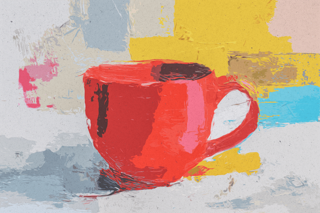
Spatial Thinking: How Seeing Everything at Once Improves Creativity It’s the final stretch of a crucial project. Your notes are scattered across a dozen digital documents and sticky apps. The initial spark of an idea feels distant, buried under layers of linear outlines and disconnected feedback. You switch between tabs, trying to hold the “big picture” in your mind’s eye, but the friction of navigating these silos fractures your focus. The creative flow stutters. This is the tyranny of linear thinking in a multidimensional creative process. We’ve been conditioned to organize ideas sequentially—in lists, documents, and slides—tools that force our thoughts into a single-file line, obscuring the rich web of connections between them. True creativity, however, is not linear; it’s spatial, relational, and emergent. It thrives when we can see the forest and the trees, the connections between the dots, not just the dots themselves. This cognitive shift—from linear processing to spatial thinking—is the key to unlocking higher-order creativity and strategic insight. Spatial thinking is the ability to perceive, manipulate, and reason about ideas and their relationships within a mental or physical space. It’s how architects envision buildings, how filmmakers storyboard scenes, and how strategists map competitive landscapes. In the digital realm, this translates to the power of an infinite, multimodal canvas where every element of thought—text, image, diagram, link—coexists visually, enabling a form of thinking that is holistic, associative, and profoundly more creative. Platforms like Lovart, with their ChatCanvas and AI Design Agent, are built to be the engine for this cognitive revolution . This guide will explore the science behind spatial thinking, contrast it with the limitations of linear tools, and demonstrate how adopting a spatial canvas can transform your creative process from fragmented guesswork into a coherent, insightful, and innovative practice. Part I: The Linear Bottleneck – Why Documents and Lists Stifle Creative Flow To understand the power of spatial thinking, we must first diagnose the inherent constraints of the tools that dominate our workflows. Linear tools are excellent for recording finalized thoughts but are poorly suited for the messy, non-linear journey of generating them. The “Tunnel Vision” Effect of Sequential Layout Word processors, note-taking apps, and presentation software enforce a top-down, left-to-right structure. This format is ideal for communicating a polished argument but terrible for developing one. It forces premature structure, locking ideas into a hierarchy before their relationships are fully explored . When brainstorming, an idea that appears at the “bottom” of a document feels less significant than one at the “top,” regardless of its actual merit. This artificial sequence creates cognitive blind spots, hiding lateral connections and alternative pathways that exist outside the single-file line. The Cognitive Load of Mental Mapping When ideas are trapped in separate files or apps, your brain must work overtime to serve as the integration hub. You expend precious cognitive energy on memory and navigation—remembering where a specific note is, recalling a relevant image, or trying to mentally overlay feedback from one document onto another . This “context switching” tax drains the mental resources needed for synthesis, connection, and original thought—the very essence of creative work. The tool becomes a cognitive obstacle, not an aid. The Death of Serendipitous Connection Breakthrough ideas often arise from unexpected associations: seeing a color palette next to a market trend, or a user quote adjacent to a technical diagram. Linear tools physically separate these elements. A note on customer pain points lives in a different “place” than the prototype sketch. The chance for a serendipitous “Aha!” moment is dramatically reduced because the elements never visually meet . Creativity relies on the collision of disparate concepts, a collision that linear formats actively prevent. Rigidity in the Face of Iteration Creative work is iterative. Ideas evolve, merge, and get discarded. In a linear document, moving a core concept or restructuring an entire section is a painful, manual cut-and-paste operation that often breaks formatting and flow. This friction discourages experimentation. You stick with a suboptimal structure because the cost of reorganizing feels too high . The tool punishes the very iteration that creativity requires. These limitations aren’t just minor inconveniences; they structurally bias our thinking toward the incremental and the obvious, while stifling the novel and the transformative. The solution is a workspace that mirrors the way our creative minds actually work: spatially, visually, and associatively. This is the foundational philosophy behind Lovart’s ChatCanvas . Part II: The Spatial Advantage – How a Unified Canvas Unlocks Higher-Order Creativity A spatial canvas like the ChatCanvas isn’t just a bigger page; it’s a different cognitive environment. It externalizes your mental model, allowing you to think with the canvas, not just on it. This shift provides several profound advantages. Holistic Perception: The “God’s Eye View” The primary benefit is the ability to see all components of a project simultaneously. A product launch plan can have the mood board, user personas, feature list, marketing copy drafts, and ad mockups all visible at once . This holistic view reduces cognitive load (your brain doesn’t have to remember everything) and enables pattern recognition at a glance. You can instantly spot gaps in the narrative, imbalances in a visual composition, or opportunities for synergy that were invisible when elements were isolated. Facilitating Associative Thinking Spatial arrangement makes relationships tangible. You can cluster related ideas, draw lines between connected concepts, or use proximity and color to create visual categories. Placing a customer testimonial quote directly next to the product feature it validates creates a powerful, immediate understanding that a written report would take paragraphs to explain . This environment actively encourages the making of connections, which is the core mechanism of creative insight. Embracing Non-Linear Process A spatial canvas has no imposed beginning or end. You can start anywhere—with an image, a keyword, a diagram—and build outward organically. Ideas can exist in a state of productive ambiguity before being forced into a rigid structure. This mirrors the natural creative process, which is exploratory and recursive, not a straight line from A to B.
Line Weight How Bold Lines vs. Thin Lines Affect the AI Output
Line Weight: How Bold Lines vs. Thin Lines Affect the AI Output In the visual language of design, line weight is a fundamental dialect. It is the thickness or thinness of a stroke, a seemingly simple attribute that carries profound communicative power. A bold, heavy line conveys strength, stability, and prominence; a thin, delicate line suggests elegance, precision, and lightness. For human artists, choosing a line weight is an intuitive decision that defines the character of an illustration, logo, or graphic. When collaborating with generative AI, this intuitive choice must become an explicit instruction. The AI has no inherent preference; it will generate based on statistical patterns in its training data, which includes everything from children’s book cartoons with thick outlines to technical engravings with hairline details. Therefore, the specific command regarding line weight becomes a critical lever for controlling the style, mood, and professional application of the output. A prompt for a logo that omits line weight specification might yield a result unsuitable for its intended use—a thick, playful mark when you needed a refined, scalable symbol. Lovart’s ChatCanvas and its Design Agent are highly responsive to these stylistic directives. Understanding how to command “bold lines” versus “thin lines” is not a minor detail; it is the difference between generating a children’s toy mascot and a corporate insignia, between a comic book panel and an architectural sketch. This guide explores the semantic and practical impact of line weight in AI generation, providing a framework for using this parameter to reliably achieve specific aesthetic and functional outcomes . The Semantics of Stroke: What Line Weight Communicates Before issuing commands, you must understand what you’re asking for. Line weight is rarely just a technical specification; it’s a carrier of meaning. Bold/Thick/Heavy Lines: Visual Impact: High contrast, strong presence, commands attention. Emotional Tone: Confidence, solidity, friendliness (in cartooning), power, durability. Common Associations: Children’s illustrations, comic art, street art, bold logos, posters meant to be seen from a distance. Functional Trait: Can simplify forms and reduce fine detail, aiding in clarity at small sizes but potentially appearing clumsy if overdone. Thin/Fine/Delicate Lines: Visual Impact: Subtlety, refinement, intricate detail. Emotional Tone: Elegance, sophistication, precision, fragility, high value. Common Associations: Technical drawings, fashion illustrations, luxury branding, detailed maps, engraved patterns. Functional Trait: Allows for high complexity and detail, but can become visually lost or reproduce poorly at very small scales if not handled carefully. The AI, when prompted with these terms, pulls from datasets tagged with similar descriptions, invoking entire genres of art. Commanding Line Weight for Specific Outcomes The key is to integrate line weight commands into your prompt’s stylistic clause. 1. For a Playful, Friendly Character or Logo: Prompt: “Design a cartoon mascot for a kids’ fruit snack brand. Use simple, bold black outlines, flat colors, and a cheerful expression. Line weight should be consistently thick to create a sturdy, friendly feel.” AI Interpretation: This directs the model towards styles like cel animation or modern vector cartooning, where thick outlines define forms clearly and create a jovial, accessible character. It avoids the model defaulting to a more realistic, shaded rendering. 2. For an Elegant, Luxury Brand Mark: Prompt: “Create a monogram logo for a high-end jewelry brand. Use thin, precise linework to form interlocking letters. The style should be minimalist and delicate, evoking craftsmanship and refinement. Avoid any bold strokes.” AI Interpretation: This pushes the model towards inspiration from engraving, fine line drawing, and luxury typography. The “thin, precise” descriptor is crucial to prevent the AI from generating a typical weight block letter monogram. 3. For a Technical or Architectural Illustration: Prompt: “Generate an exploded-view diagram of a mechanical watch movement. Use uniform, thin line weights for all components, with clean hatches for shading. Style: technical illustration, isometric perspective, highly detailed.” AI Interpretation: This aligns the output with blueprint and technical manual aesthetics, where line consistency and clarity of information are paramount. The command “uniform, thin line weights” is a specific constraint that overrides any artistic variation. 4. For a Dynamic Comic Book or Poster Art: Prompt: “Illustrate a superhero in a dynamic pose, ready for action. Use varying line weights—thicker lines on the downward side and shadow areas, thinner lines for details and highlights. Style: cel-shaded comic art with dramatic lighting.” AI Interpretation: This more advanced command asks for a professional illustration technique where line weight is used to simulate depth and lighting, not just define edges. It guides the AI to a more sophisticated, animated style. The Interaction with Other Style Tokens Line weight commands must be consistent with other style descriptors in your prompt, or they will be ignored or create conflict. Consistent Prompt: “A line art tattoo design of a dragon, using bold, flowing lines and dotwork shading.” (The style “line art” and “bold lines” are harmonious). Conflicting Prompt: “A watercolor painting of a flower, with bold black outlines.” (This creates a mixed-style request. The AI might produce a watercolor with outlines, but it could also prioritize one style over the other, leading to unpredictable results). For a pure watercolor, you’d want “soft, blurred edges, no outlines.” Functional Implications: Scalability and Reproduction Your line weight choice has direct practical consequences. Bold Lines for Scalability: A logo with bold lines will remain clearly visible and retain its form when scaled down for a business card or app icon. It reproduces well in single-color printing (e.g., for a stamp or embroidery). This is a key consideration for brand assets. Thin Lines for Detail and Premium Print: Thin lines are ideal for detailed patterns, fine typography, and applications where the viewer can appreciate intricacy up close, such as on print-ready stationery or high-resolution product packaging. They may require high-quality printing methods to reproduce accurately. AI Generation Tip: If you need a scalable logo, explicitly command: “Design a logo with bold, uniform line weights that will remain clear when printed very small or in a single color.” This functional instruction guides the AI’s approach beyond mere aesthetics. Iterative Refinement of Line Weight
Stop Struggling How to Command AI to Create Pro-Level Posters
Stop Struggling: How to Command AI to Create Pro-Level Posters The promise of AI design tools is tantalizing: describe your vision, and receive a perfect, professional poster. The reality for many, however, is a cycle of frustration. Vague prompts yield generic, off-brand results. More detailed prompts sometimes produce bizarre or irrelevant imagery. The user is left feeling like they’re speaking a foreign language to a capricious genie, struggling to translate their mental picture into the precise incantation that will make it real. This struggle stems from a fundamental misunderstanding of the interaction model. You are not asking a search engine; you are commanding a creative agent. The shift from passive querying to active, strategic commanding is the key to unlocking consistently professional results. Lovart’s ChatCanvas, interfacing with its multimodal Design Agent, is built for this kind of directive collaboration. It requires the user to assume the role of a creative director or art director, providing clear, structured, and context-rich instructions that guide the AI’s generative process toward a specific, high-quality outcome. This guide moves beyond basic prompting to explore the principles of effective AI command, providing a framework and advanced techniques to transform your interactions from struggles into a streamlined process for creating pro-level posters, on demand . Diagnosing the Struggle: Common Pitfalls in AI Communication Understanding why the struggle occurs is the first step to overcoming it. Most issues stem from a mismatch between human thought and AI processing. The “Keyword Soup” Fallacy: Users often list disjointed keywords, expecting the AI to infer the connection and artistic intent. “Poster, tech conference, futuristic, blue, people, networking.” This leaves too much open to interpretation. The AI might generate a blue-hued image of people standing near a futuristic building, but it misses the core message, tone, and compositional hierarchy needed for an effective conference poster . Over-Reliance on Subjective Adjectives: Using words like “cool,” “epic,” or “professional” without concrete visual anchors is meaningless to an AI. “Cool” is a cultural interpretation, not a design specification. The AI has no reference for what you specifically find cool, leading to a hit-or-miss outcome . Neglecting Composition and Hierarchy: A professional poster guides the viewer’s eye. A common struggle is generating an image where the background overwhelms the text or the focal point is unclear. Users must command the layout, not just the subject matter. They need to specify what is most important and how elements should relate spatially . Failing to Provide Brand or Style Context: Without context, the AI defaults to median outputs. A poster for a punk rock band and a poster for a financial seminar, if described only by their event names, could end up looking strangely similar in a bland, default style. The command must embed stylistic direction . The solution is to structure your communication as a creative brief, not a search query. The Framework of Command: Structuring Your Instructions for Pro Results Effective commanding follows a logical structure that mirrors how a human designer thinks. Use this framework within the ChatCanvas. Define the Core Objective and Audience (The “Why”): Start by setting the strategic context. Command: “Create a poster for the ‘Future of Fintech’ summit. The primary goal is to attract C-level executives and serious investors. The tone must be authoritative, innovative, and trustworthy—avoid anything playful or cartoonish.” Why it works: This immediately rules out vast swaths of inappropriate styles and tells the AI about the viewer’s expectations. Specify the Key Visual Subject and Style (The “What” and “How”): Be descriptively precise about the main imagery and its aesthetic treatment. Command: “The central visual should be a abstract, glowing data network or circuit board pattern, rendered in shades of deep blue and silver with accents of bright cyan. The style should be photorealistic with a clean, sharp focus, reminiscent of high-end tech product photography.” Why it works: It provides a clear subject, a color palette, and a specific visual reference point (“high-end tech product photography”) that the AI’s training data understands . Mandate the Layout and Typography Hierarchy (The “Structure”): Directly instruct how text and image should be organized. Command: “Use a clean, minimalist layout with ample negative space. Place the event title ‘FUTURE OF FINTECH’ at the top in a bold, modern sans-serif font. Below it, place the subtitle ‘Global Summit 2025’ in a thinner weight. Reserve a clear, high-contrast area at the bottom for the date, venue, and website.” Why it works: This proactively solves the problem of cluttered or unbalanced designs by defining the spatial plan . Incorporate a Clear Call-to-Action (The “Action”): Ensure the poster drives a specific response. Command: “Include a prominent, stylized QR code that links to the registration page. The text near it should read ‘Scan to Secure Your Seat.’” Why it works: It integrates a functional marketing element seamlessly into the design concept from the start. This structured command turns a vague wish into an executable design brief for the AI. Advanced Command Techniques for Specific Poster Genres Different poster types require tailored command strategies. Here’s how to command pro-level results for common needs. For a Music Concert or Festival Poster: Goal: Capture energy, artist identity, and genre vibe. Pro Command: “Design a poster for the indie rock band ‘The Echo Frontier’s’ album release tour. Use a gritty, screen-print aesthetic with a limited color palette of mustard yellow, black, and white. Feature a stylized, hand-drawn illustration of a desert landscape with a retro microphone. The band name should be the dominant, hand-lettered element. Include tour dates in a clean, legible block below.” This command specifies aesthetic (screen-print), color, illustration style, and text hierarchy, guiding the AI toward a cohesive, genre-appropriate result . For a Restaurant or Food Festival Poster: Goal: Stimulate appetite and convey atmosphere. Pro Command: “Create an appetizing poster for ‘Taste of Little Italy,’ a weekend street food festival. The poster should feel warm, bustling, and authentic. Use photorealistic imagery of steaming pasta plates and colorful produce. Incorporate a rustic wood texture as a background element. The
Raster (PNG) vs. Vector (SVG) When to Use Which
Raster (PNG) vs. Vector (SVG): When to Use Which In the digital realm, every image is encoded in one of two fundamental languages: the language of pixels or the language of mathematics. These correspond to the two primary graphic file formats: raster (exemplified by PNG, JPEG, GIF) and vector (exemplified by SVG, EPS, AI). Choosing the wrong language for a task leads to the digital equivalent of a mistranslation: pixelation, bloated file sizes, or loss of functionality. A PNG of a logo becomes a blurry mess on a large banner. An SVG of a photorealistic photograph is an inefficient, overly complex failure. The choice is not about quality in the abstract, but about fitness for purpose. Understanding the inherent properties, strengths, and limitations of each format is a fundamental literacy for anyone who creates, uses, or manages digital visuals. This guide provides a clear, actionable framework for selecting the right format, moving beyond vague advice to concrete principles based on the nature of the image content and its intended use. Furthermore, it examines how next-generation AI design platforms like Lovart are beginning to blur these traditional lines, offering intelligent workflows that provide the right output for the context, whether the need is for a richly detailed photorealistic scene or a crisp, infinitely scalable logo . Raster (PNG, JPEG): The Language of Pixels A raster image is a grid, a bitmap. It defines a visual space by assigning a color value to each cell (pixel) in a fixed, rectangular array. Think of it as a digital mosaic or a photograph. Key Properties: Resolution-Dependent: Quality is tied to pixel dimensions (e.g., 1920×1080). Enlarging beyond these dimensions forces interpolation, causing blurriness and pixelation. Photorealistic Detail: Excels at representing complex, non-geometric scenes with subtle gradients, textures, and color variations—anything captured by a camera or painted by a brush. Fixed Appearance: The image is a snapshot. Editing often involves altering or painting over pixels, which can degrade quality. Common Formats: JPEG (lossy compression, small size, good for photos), PNG (lossless compression, supports transparency, good for web graphics), GIF (limited color, supports animation), TIFF (high quality, large size, used in print). When to Use Raster (PNG/JPEG): Photographs and Photo-Realistic Art: Any image captured by a camera or generated by AI to mimic reality. This is the native domain of raster formats [[AI设计†21]]. Complex Digital Paintings and Textures: Artwork with brush strokes, smoke, water, hair, fur—where detail is organic and not based on simple shapes. Web Graphics where Scale is Fixed: Images for websites, social media posts, and digital ads that will be displayed at a predictable, limited size. PNG is ideal for logos on websites when you need transparency [[AI设计†7]]. Screenshots and Interface Mockups: Capturing the exact pixel arrangement of a screen. Vector (SVG, EPS): The Language of Mathematics A vector image is a set of instructions. It defines a visual space by describing geometric primitives—points, lines, curves, polygons—with mathematical equations. Think of it as a blueprint or a font. Key Properties: Resolution-Independent: Can be scaled to any size without loss of quality. The rendering engine simply recalculates the math. Geometric and Stylized: Excels at representing logos, icons, typography, diagrams, and illustrations based on clean shapes and solid colors or smooth gradients. Infinitely Editable: Since the image is made of objects, you can modify shapes, colors, and strokes without degradation. It is composed of distinct, selectable elements. Common Formats: SVG (Scalable Vector Graphics, web-standard), EPS (Encapsulated PostScript, traditional print standard), AI (Adobe Illustrator native file), PDF (can contain vector data). When to Use Vector (SVG/EPS): Logos and Brand Marks: Must remain sharp on a business card and a billboard. The primary use case for vectors [[AI设计†19]]. Icons and User Interface Elements: Need to be crisp at various screen resolutions and sizes. Typography and Lettering: Text is inherently vector; keeping it as vectors ensures perfect edges. Technical Illustrations, Diagrams, and Infographics: Require clean lines, scalability, and often, editability for revisions. Any Design that Requires Physical Production: Print-ready files for signage, apparel (screen printing, embroidery), vinyl cutting, and large-format printing must be vector-based to ensure quality [[AI设计†7]]. The Critical Misapplication and Its Consequences Using Raster (PNG) for a Scalable Logo: This is the most common and damaging error. It leads directly to pixelation when enlarged, forcing expensive redesigns or resulting in unprofessional marketing materials. The logo becomes a liability. Using Vector (SVG) for a Photograph: This is technically possible but highly inefficient. A vector file attempting to describe every nuance of a photo becomes astronomically complex, with millions of anchor points, resulting in a huge file size that is impractical for web use and impossible to edit meaningfully. The wrong tool for the job. The Lovart Synthesis: Intelligent Format Output Modern AI design platforms like Lovart are evolving to understand context and deliver the appropriately formatted asset. This is not just about generating an image; it’s about understanding its ultimate purpose. Context-Aware Generation: When you prompt Lovart’s Design Agent for a “logo,” the system inherently understands that the output must be scalable. Its workflow is geared towards creating clean, geometric forms that are vector-friendly, even if the initial preview is a raster render [[AI设计†21]]. Integrated Vectorization: The platform includes or is designed for functionality that bridges the AI generation and vector production. After creating a design, a process (conceptualized as a “Vectorize” function) can interpret the visual concept and output a clean SVG file, translating the AI’s idea into mathematical paths. This turns an AI concept directly into a print-ready vector asset [[AI设计†19]]. Purpose-Built Outputs: Lovart can generate different outputs for the same concept based on need. For example, from a single brand design session, it can provide: 1) A PNG of a product mockup for a website (fixed size), and 2) An EPS/SVG of the core logo for print and signage. The AI assists in producing the right format for the right job [[AI设计†7]]. Decision Framework: A Simple Checklist Ask these questions to choose the format: Does the image need to scale to any size without
Common Prompting Mistakes That Are Ruining Your AI Results (And How to Fix Them)**

The leap from a vague idea in your mind to a stunning, professional visual generated by AI should be a short one. Yet, for many, it feels like a chasm. You type a prompt, full of hope, only to be met with results that are generic, bizarre, or utterly missing the mark. The frustration mounts with each generation, leading to the belief that the tool is “unreliable” or “not smart enough.” However, in the vast majority of cases, the issue lies not with the AI’s capability, but with a fundamental miscommunication in the prompt itself. Generative AI is a powerful but literal collaborator; it interprets your words through the statistical patterns of its training data, not through human common sense or creative intent. A few subtle missteps in phrasing can lead the model far astray. Lovart’s ChatCanvas and its Design Agent are designed to bridge this gap through conversation, but mastering the initial prompt is the key to unlocking its full potential. By diagnosing and correcting five of the most common prompting mistakes, you can transform your workflow from a cycle of frustration into a reliable pipeline for professional-grade results . This guide will dissect these errors—from vagueness to conflicting commands—and provide clear, actionable fixes to ensure your AI outputs align perfectly with your vision. Mistake #1: The “Keyword Soup” – Throwing Concepts Without Context This is perhaps the most frequent error. Users list a series of nouns and adjectives, expecting the AI to intuitively assemble them into a coherent scene. The Mistake: “Poster, tech conference, futuristic, abstract, blue, glowing, network, people, elegant.” Why It Fails: This prompt is a bag of disjointed concepts. The AI has no guidance on how to relate them. Should “abstract” describe the “network” or the entire style? Is “blue” the dominant color or an accent? Are “people” the focal point or background elements? The model must guess, leading to statistically average but creatively muddled outputs where elements compete rather than compose. It’s like giving a chef a list of ingredients without a recipe . The Fix: Structure Your Prompt Like a Creative Brief. Organize your thoughts into logical clauses that define subject, style, composition, and details. Subject & Action: Start with the core. “A poster for a high-tech conference called ‘Nexus 2025.’” Style & Mood: Define the aesthetic. “The style should be sleek, futuristic, and slightly abstract.” Composition & Key Elements: Direct the layout. “The central visual is a glowing, interconnected data network in shades of deep blue and cyan. Silhouettes of diverse professionals are integrated subtly into the network.” Technical Details: Add finishing specs. “Use a clean, minimalist layout with ample negative space for text. Photorealistic rendering with soft glow effects.” This structured approach gives the AI a clear hierarchy of information, dramatically increasing the odds of a coherent, on-brief result. Mistake #2: Overusing Subjective or Vague Adjectives Words that carry strong emotional or cultural weight for humans are often meaningless noise to an AI model. The Mistake: “Make a cool, epic, and awesome poster for my gaming brand.” Why It Fails: “Cool,” “epic,” and “awesome” are subjective judgments. The AI’s training data contains millions of images tagged with these words across wildly different contexts—a “cool” sneaker ad, an “epic” fantasy landscape, an “awesome” scientific diagram. The model has no way of knowing your specific interpretation. It defaults to a generic, often youthful and energetic aesthetic that may lack the specificity you desire. Similarly, “make it pop” is a classic vague directive that offers no actionable path . The Fix: Replace Vague Adjectives with Concrete, Visual Descriptors. Ask yourself: what visual qualities make something “cool” or “professional” in this context? Instead of “cool,” try: “…with a gritty, textured background, neon cyan accents, and a dynamic, low-angle perspective.” Instead of “professional,” try: “…using a restrained navy and gray color palette, crisp typography, and balanced symmetrical layout.” Instead of “epic landscape,” try: “…a cinematic wide shot of a mountain range at twilight with dramatic rim light and volumetric fog.” By describing the tangible components of the feeling, you give the AI concrete data to work with, leading to more precise and satisfying outputs. Mistake #3: Ignoring Composition and “Negative Space” Users often describe the subject in detail but forget to instruct the AI on where to place it and, crucially, where to leave empty space for text and breathing room. The Mistake: “A detailed photorealistic image of a chef preparing sushi in a busy kitchen.” Why It Fails: This prompt will likely generate a beautiful, detailed scene—but one that is visually “busy” from edge to edge. The chef, counter, ingredients, and other kitchen elements will fill the frame, leaving no clear, uncluttered area for a headline, event details, or a logo. The resulting image is unusable as a practical poster or flyer without major, difficult cropping or editing . The Fix: Explicitly Command the Layout and Reserve Space. Direct the AI’s compositional thinking. “A photorealistic image of a chef expertly preparing sushi. Use shallow depth of field to blur the busy kitchen background, focusing sharply on the chef’s hands and the plate. Compose the shot with the chef on the left third of the frame, leaving the right half of the image as a clean, blurry background with ample negative space for overlaid text.” Use terms like “rule of thirds,” “central composition,” “left/right aligned,” and “clean background” to guide the model. This ensures the generated image is not just a picture, but a ready-to-use design template. Mistake #4: Including Conflicting or Anachronistic Details The AI will try to reconcile all elements of your prompt, even if they are logically or historically incompatible, often resulting in confusing “Frankenstein” images. The Mistake: “A Roman legionnaire checking a smartphone on a muddy battlefield, cinematic lighting.” Why It Fails: While the AI can generate this, the cognitive dissonance for the viewer is high. More subtly, prompts like “a futuristic city with thatched roofs” or “a watercolor poster with ultra-realistic skin detail” contain inherent stylistic conflicts. The model may
The Logic of a Bestseller Designing High-CTR Amazon Listings and A+ Content
In the vast, algorithmically-curated marketplace of Amazon, your product listing is not a passive storefront; it is a dynamic, data-driven salesperson competing in a split-second attention economy. The difference between a product that languishes on page 10 and a bestseller is often not the product itself, but the persuasive logic embedded in its digital presentation. A high-converting Amazon listing is a meticulously engineered system that addresses customer psychology, builds trust, overcomes objections, and guides the buying decision—all within the rigid framework of Amazon’s A9 algorithm. Traditionally, creating such a listing required a patchwork of skills: copywriting, conversion rate optimization (CRO), basic graphic design, and often expensive freelance photographers. This process is slow, inconsistent, and difficult to test. The emergence of AI design agents like Lovart is revolutionizing this space by acting as an integrated creative strategist and production studio. These platforms can generate not only the compelling copy but also the high-impact, brand-cohesive visuals that define top-tier A+ Content and main images. This comprehensive guide deconstructs the logical architecture of a winning Amazon listing, exposes the shortcomings of manual creation, and provides a detailed, AI-powered playbook for designing listings that convert browsers into buyers and climb the search rankings. Part I: The Algorithmic & Psychological Blueprint of a Winning Listing To design for Amazon, you must think like both a marketer and a data scientist. The listing must satisfy two masters: the cold logic of Amazon’s A9 algorithm (which determines visibility) and the warm, emotional psychology of the shopper (which determines conversion). Algorithmic Logic: The A9 Ranking Factors: Amazon’s primary goal is to maximize revenue per search. It rewards listings that demonstrate high click-through rates (CTR) and conversion rates. Key visual and textual elements that influence this include: Main Image CTR: The hero image must be so compelling and clear that shoppers click on it from search results. It needs a pristine white background, perfect lighting, and showcase the product’s primary benefit instantly. Keyword Relevance & Placement: Strategically placed keywords in the title, bullet points, and backend search terms must align with what the images and A+ Content visually communicate. If your bullet point says "easy to assemble," an infographic in your A+ Content should visually demonstrate the simple steps. Conversion Signals: High-quality images, videos, and informative graphics reduce return rates and increase customer satisfaction, which are positive ranking signals. Psychological Logic: The Shopper’s Decision Journey: A shopper scrolling through Amazon is in a state of "high-intent, low-trust." Your listing must systematically build trust and justify the purchase. Attention & Clarity (Main Image): Answer "What is it?" instantly. No ambiguity. Interest & Benefits (Additional Images & Title): Show the product in use, highlight key features, and state the core benefit in the title. Desire & Social Proof (Bullet Points & Customer Images): Use benefit-driven bullet points ("Saves you time…") and showcase positive customer photos/videos. Action & Trust (A+ Content & Video): Use A+ Content modules to tell a brand story, compare to competitors, provide detailed specs, and answer FAQs with professional graphics. A polished video can be the ultimate trust-builder, demonstrating use and quality [[AI设计†21]]. Manual creation struggles with this dual mandate. A photographer may take a beautiful image, but does it maximize CTR? A graphic designer may create a nice infographic, but does it directly support the top keyword? A copywriter may write great bullets, but do the visuals reinforce them? This disconnect leads to suboptimal listings. An AI design agent is trained on both data (what performs) and design principles, allowing it to generate assets that are algorithmically savvy and psychologically persuasive from the start [[AI设计†19]]. Part II: The AI-Powered Listing Factory – From Keyword to Checkout Lovart’s platform, with its ChatCanvas and Design Agent, allows a seller to architect an entire high-performance listing through a strategic conversation, ensuring every element works in concert. Strategic Foundation from a Single Prompt: The process begins with a comprehensive brief to the AI. "We are selling the ‘AeroBlend Pro’ high-speed blender. Key USPs: 1200W motor, 8 pre-programmed settings, noise-reduction technology, BPA-free pitcher. Target customer: health-conscious homeowners and smoothie enthusiasts. Primary keywords: ‘powerful blender,’ ‘quiet blender,’ ‘professional smoothie maker.’ Let’s design the complete Amazon listing to maximize CTR and conversion." The AI uses this to inform all subsequent asset generation [[AI设计†21]]. Generating the CTR-Optimized Main Image: The AI understands Amazon’s image guidelines. Prompt: "Create the main product image for the AeroBlend Pro. Isolated on pure white background, professional studio lighting, showing the blender pitcher full of a vibrant green smoothie, with a few berries on the side. The product must look premium and desirable." This generates the critical first-click asset. Creating a Cohesive Image Gallery: Follow up: "Now generate 5 additional lifestyle images for the gallery: 1) The blender making a smoothie (action shot). 2) Close-up of the control panel with settings. 3) The blender next to whole fruits and vegetables. 4) It stored neatly on a kitchen counter. 5) A comparison shot showing its smaller size vs. a bulky old blender." These images visually answer potential customer questions before they’re asked. Designing High-Impact A+ Content Modules: This is where AI excels. Instead of describing a graphic to a designer, you command the AI to build the module. For a Comparison Chart: "Design an A+ Content module comparing the AeroBlend Pro to a standard blender. Use icons and short text to highlight: motor power, noise level, preset programs, and warranty." For a Feature Breakdown: "Create an infographic module detailing the ‘PulseCrush Technology.’ Use a diagram of the blade assembly and explain how it creates a smoother blend." For Social Proof Integration: "Design a module that visually incorporates customer testimonials. Use quote graphics with star ratings and photos of customers with the product." [[AI设计†21]]. Producing a Converting Product Video: A seller can storyboard a video directly. Prompt: "Create a storyboard for a 60-second Amazon product video. Scene 1: Quick intro showing a frustrated person with a lumpy smoothie. Scene 2: Introducing the AeroBlend Pro with text overlays of key features. Scene 3:
Bubble Tea Branding Capturing Gen Zs Attention with AI-Powered Visuals
Bubble Tea Branding: Capturing Gen-Z’s Attention with AI-Powered Visuals The line snakes around the corner, a vibrant tapestry of Gen-Z fashion and eager anticipation. But this isn’t for a concert or a sneaker drop—it’s for a new bubble tea shop. In the hyper-competitive, visually-driven world of modern food and beverage, particularly for a demographic that lives and breathes through their smartphone screens, your product is no longer just a drink. It’s an experience, a statement, and, most critically, a shareable piece of visual content. The battle for Gen-Z’s loyalty (and their Instagram Stories) is won not just on taste, but on aesthetic. Traditional branding cycles, reliant on costly freelance designers and lengthy revision periods, are too slow, too rigid, and too expensive for the rapid pace of trend cycles. The solution lies in a paradigm shift: moving from static brand guidelines to a dynamic, AI-powered visual system that can iterate at the speed of culture. Platforms like Lovart, functioning as an all-in-one AI design agent, are redefining this space by empowering brands to generate cohesive, captivating, and culturally-relevant visuals on demand [[AI设计†21]]. This deep dive explores the unique visual language of Gen-Z, deconstructs why conventional design processes fail to capture it, and provides a comprehensive blueprint for leveraging AI to build a bubble tea brand that doesn’t just serve drinks, but dominates the visual feed. Part I: Decoding the Gen-Z Aesthetic – Beyond Millennial Pink To communicate effectively with Gen-Z, one must first understand that their visual preferences are a complex blend of nostalgia, digital-native fluency, and a demand for authenticity that rejects overly polished perfection. Maximalism & Digital Collage: While millennials embraced minimalist Scandinavian design, Gen-Z often leans into maximalism—bold, clashing patterns, layered graphics, and a "digital collage" aesthetic that feels native to apps like TikTok and Pinterest. Think vibrant neon gradients overlayed with grainy textures, 3D rendered fruit, and Y2K-inspired typography [[图†10|AI设计†21]]. This style feels energetic, creative, and personally expressive, resonating with a generation that curates their digital identity with intention. The "Authentic" Imperative: Highly polished, stock-looking imagery is often met with skepticism. Gen-Z values authenticity, which in visual terms translates to user-generated content (UGC) aesthetics, "behind-the-scenes" glimpses, and a sense of imperfection. This doesn’t mean low quality; it means relatable. An AI that can generate images that feel candid, playful, or uniquely stylized—rather than corporate—holds a significant advantage [[AI设计†19]]. Motion & Interactivity as Standard: A static image is just the starting point. For Gen-Z, short-form video (Reels, TikTok) is the primary content medium. Effective branding must extend seamlessly into motion, whether it’s a looping animation of tapioca pearls falling or a dynamic transition in a promotional video. The ability to generate video ad storyboards and cohesive motion assets from the same core concept is no longer a luxury; it’s a requirement for engagement [[AI设计†21]]. Community-Driven Aesthetics: Gen-Z brands are often built with their audience, not just for them. This means visual trends can emerge from the community itself. A flexible design system must be able to rapidly incorporate these emergent styles—a new color combo trending on social media, a specific meme format—into official branding without a six-week design turnaround. Traditional agencies and solo freelancers struggle with these demands. The maximalist style requires sophisticated layering and effects knowledge. Capturing "authenticity" on command is a paradoxical brief. And the need for rapid, high-volume output across static and motion formats is prohibitively expensive. This creates a gap where brand visuals feel either outdated, impersonal, or inconsistent across platforms. An AI design agent bridges this gap by internalizing these aesthetic principles and offering the speed and flexibility to execute them [[AI设计†17]]. Part II: The AI Branding Engine – From Concept to Feed in Real-Time Lovart’s approach transforms branding from a periodic project into a continuous, conversational process. At its heart is the ChatCanvas, an infinite workspace where strategy, mood, and execution collide, and the Design Agent that brings it all to life [[AI设计†21]]. Dynamic Brand World, Not a Static Guide: Instead of a PDF brand guide, imagine a living ChatCanvas project titled "Our Bubble Tea Universe." On it, you don’t just have a hex code for your primary color; you have an interactive palette that the AI understands. You have a cluster of images that define your "vibe": glitch art, Korean street fashion, vibrant night markets, close-ups of condensation on a cup. This canvas becomes the contextual foundation for every asset you create. When you prompt the AI, it references this world, ensuring everything from an Instagram post to a cup sleeve design feels inherently part of the same ecosystem [[AI设计†21]]. Generating the Core Visual Identity: The process begins conversationally. A founder can prompt: "We’re launching ‘Cloud Tea,’ a bubble tea brand focused on creamy, cloud-like cheese foam tops and surreal, dreamy flavors. Create a core brand identity: a wordmark logo that feels soft but modern, a color palette inspired by pastel sunsets and mist, and some key visual elements like swirling cream and abstract fruit shapes." The AI, acting as a collaborative partner, generates multiple directions for the logo, cohesive color schemes, and example applications—compressing weeks of foundational design work into a collaborative session [[AI设计†19]]. Campaign Creation at Cultural Speed: When it’s time to launch a limited-time "Mango Meteor Shower" drink, the workflow is seamless. In the ChatCanvas, you instruct the agent: "Create a launch campaign for our new mango drink. Generate: 1) A key visual of a glittering mango drink against a cosmic, starry background. 2) Three Instagram carousel slides explaining the unique ‘meteor’ jelly topping. 3) A 15-second TikTok teaser video storyboard with upbeat, viral-style editing. 4) A digital flyer for our loyalty app." Because the AI works from the established "Cloud Tea" brand world, all these assets are instantly recognizable as part of the brand, yet perfectly tailored for each platform’s format and audience [[AI设计†21]]. The Power of Precision Editing & Iteration: What if the client wants the mango to look more "glowing"? With features like Touch Edit, you point directly at the fruit in the
How Lovart Outperforms Freelancers, Templates, and Image Search
Fiverr vs. Lovart: Is It Better to Hire a Freelancer or Use an AI Agent? The eternal challenge for entrepreneurs, startups, and marketing managers is resource allocation: how to obtain high-quality creative work—logos, social media graphics, product mockups, video ads—without the budget for a full-time agency or in-house designer. For over a decade, the default answer for many has been online freelance marketplaces like Fiverr. They offer access to a global talent pool, fixed-price packages, and the promise of a human touch. However, this model comes with its own set of uncertainties: variable quality, communication delays, revision limits, and the inherent risk of misaligned vision. The rise of sophisticated AI design agents, exemplified by Lovart and its ChatCanvas, presents a compelling and fundamentally different alternative. It is not merely another service provider, but a new category of tool: an intelligent, conversational creative partner that operates on-demand, at the speed of thought. This comparison delves beyond surface-level cost analysis to examine the core trade-offs between delegating to a human freelancer and collaborating with an AI agent. It explores the dimensions of control, speed, consistency, cost predictability, and creative exploration to help you determine which approach—or what combination thereof—best serves your project’s needs in the modern digital landscape [[AI设计†19]] [[AI设计†21]]. The Freelancer Paradigm: Human Creativity with Human Constraints Hiring a freelancer on Fiverr is a process of human-to-human collaboration, with all its attendant strengths and complexities. Strengths: Subjective Judgment & Nuance: A skilled human designer can interpret abstract feedback (“make it feel more premium but also approachable”) and apply nuanced cultural and emotional understanding that AI still lacks. They can provide strategic advice beyond mere execution. Unique Artistic Voice: You can hire a freelancer specifically for their distinctive style, which can become a signature part of your brand identity. Complex, Multi-Step Projects: Projects requiring deep research, interviews, or the synthesis of disparate, non-visual information into a cohesive brand story are still firmly in the domain of human experts. The Inherent Constraints & Risks: The Quality Lottery: Even with portfolios and reviews, the final deliverable can vary. The freelancer having an “off day” or misunderstanding a subtle cue is a real risk. Communication Friction & Time Zones: Iteration requires back-and-forth communication, which can span hours or days due to asynchronous messaging and time zone differences. Each round adds latency to the project timeline. The “Vision Translation” Problem: Translating your internal vision into words a stranger can perfectly interpret is difficult. The first draft is often a misalignment, requiring revisions that consume the allocated rounds, sometimes incurring additional costs. Limited Exploration: Most packages offer 2-3 concepts. Exploring a dozen radically different directions is prohibitively expensive. The process favors convergence on a single idea rather than broad exploration. Scalability and Consistency Issues: Getting 50 variations of a product image or maintaining pixel-perfect consistency across 100 social media posts from a freelancer is logistically challenging and costly. Each new asset is a new transaction and potential point of inconsistency [[AI设计†19]]. The freelancer model is transactional and linear. You brief, wait, review, provide feedback, wait again, and hope to converge on a satisfactory result within the purchased scope. The AI Agent Paradigm: Programmable Creativity with Instant Execution Lovart’s Design Agent within the ChatCanvas represents a shift from delegation to direct, augmented creation. The user becomes the creative director, with the AI as an instantly responsive production team. Strengths: Instantaneous Speed & Iteration: The gap between idea and visual is seconds. You can generate 20 poster concepts in the time it takes to write a Fiverr brief. Revisions are conversational and near-instant via Touch Edit, collapsing the feedback loop from days to minutes [[AI设计†20]] [[AI设计†21]]. Total Creative Control & Exploration: You are not limited to 3 concepts. You can command: “Show me 10 completely different logo styles for a coffee shop: one minimalist, one vintage, one playful cartoon, one hand-drawn, etc.” This empowers fearless exploration without financial penalty. Perfect Consistency at Scale: Once a style is defined (e.g., a brand kit with specific colors and fonts), the AI can generate 100 perfectly consistent social media graphics, product mockups in 50 colors, or a series of animated videos with uniform visual language, all with zero deviation. This is transformative for e-commerce and content marketing [[AI设计†5]] [[AI设计†19]]. Predictable Cost & Unlimited Output: A monthly subscription to Lovart provides unlimited generations within its plan limits. The cost is fixed, regardless of whether you create 10 assets or 1000. There are no per-project fees, revision charges, or surprise upsells [[AI设计†21]]. Integrated Editing Superpowers: Tools like Edit Elements and Touch Edit allow you to decompose and modify images in ways that would require expensive, expert-level Photoshop skills from a freelancer. Changing a product color, isolating an object, or fixing a weird hand becomes a simple command [[AI设计†20]]. Considerations & Limitations: Lack of Deep Strategic Consultation: The AI executes brilliantly but does not (yet) proactively challenge your strategy or provide high-level business branding advice born from diverse human experience. The “Uncanny Valley” for Specific Realism: While excellent at photorealistic renders, extremely specific, nuanced human expressions or hyper-detailed, unique physical objects might still be better captured by a human photographer or illustrator. Dependence on Clear Articulation: The output is directly tied to the quality of your prompt. Vague instructions yield vague results. It requires the user to develop the skill of visual description [[AI设计†5]]. The AI agent model is conversational and exponential. You prototype visually in real-time, exploring a vast possibility space before committing to a final direction. Comparative Analysis: Scenario-Based Decision Making The best choice depends on the specific nature of your project. Scenario 1: Logo Design for a New Startup. Fiverr Path: You hire a mid-tier logo designer for $300. You receive 3 concepts in 3 days. You choose one direction and get 2 rounds of revisions. Total time: 5-7 days. Risk: The concepts may miss the mark, and revisions may feel rushed. Lovart Path: In the ChatCanvas, you prompt: “Generate 30 diverse logo concepts for a fintech startup called ‘Verde,’ focusing
AI Design Wars_ Spell-Check, Real Text, Brand Consistency, and Prompt Discipline

DALL-E 3 vs. Lovart: The Ultimate Spell-Check Battle In the realm of AI image generation, a subtle but critical frontier has emerged: the battle for textual accuracy within the image itself. For designers, marketers, and content creators, the ability to generate visuals containing legible, correctly spelled text—be it a logo, a poster headline, a product label, or a street sign—is not a luxury; it’s a practical necessity. A misspelled word on a generated storefront or a garbled logo font can render an otherwise stunning image unusable, undermining professionalism and brand integrity. Two major contenders define this space: OpenAI’s DALL-E 3, renowned for its integration with ChatGPT and improved text rendering, and Lovart, the AI design agent built around the ChatCanvas and multimodal reasoning. While both can attempt to render text, their approaches, underlying philosophies, and effectiveness in the crucial “spell-check” differ fundamentally. This isn’t just about which model draws prettier letters; it’s a battle between a general-purpose text-to-image model and a purpose-built design agent that understands text as an editable, integral component of a larger creative workflow. This analysis will dissect the text-generation capabilities of DALL-E 3 and Lovart, moving beyond simple prompt compliance to examine which platform truly delivers reliable, editable, and professionally accurate text within generated visuals . The DALL-E 3 Approach: Improved, but Still a Rendering Engine DALL-E 3 represents a significant leap forward from its predecessors in understanding and rendering text prompts. Its integration with ChatGPT allows for more nuanced interpretation of user requests. In essence, DALL-E 3 is a brilliant illustrator that can draw text very well, but it treats words as immutable visual objects, not as editable content. The Lovart Approach: Text as an Editable Design Element Lovart is built on a different premise: the ChatCanvas is an infinite workspace where every element, including text, is part of a structured, editable composition guided by the Design Agent. For Lovart, text is not just a visual effect; it’s a functional, malleable component of the design, subject to precise correction and iteration. The “Spell-Check” Battle: A Scenario-Based Analysis Consider a common task: “An image of a cafe chalkboard menu. The header says ‘Today’s Specials’ and lists ‘Artisanal Soup – $8’ and ‘Fresh Salad – $10’.” In this battle, DALL-E 3’s “spell-check” is the regeneration lottery. Lovart’s “spell-check” is a dedicated, guaranteed editing function. Beyond Correction: The Workflow Implications The difference in text handling cascades through the entire design process. Conclusion: The Victor in the Battle for Accuracy The “ultimate spell-check battle” is decisively won by Lovart, not because it has a better dictionary, but because it has a fundamentally different architectural philosophy. DALL-E 3 is a magnificent text-to-image renderer. It paints words with impressive accuracy compared to past models, but it operates in the domain of pixels. A spelling error requires repainting the entire canvas and hoping for the best. Lovart is a design agent. It operates in the domain of structured compositions and editable elements. Its Text Edit feature is not an add-on; it is a core manifestation of its understanding that text is information to be manipulated, not just a texture to be applied. When accuracy and editability are non-negotiable—as they are in professional design, marketing, and e-commerce—the ability to command an AI to correct a spelling mistake without disturbing the rest of the image is not just an advantage; it is a transformative capability. For the generation of images where text must be perfect and subject to change, Lovart’s integrated, editable approach provides a reliable solution where general-purpose renderers can only offer a hopeful gamble.
How Lovart’s “Edit Elements” Outpaces Photoshop, DALL‑E 3, and Outdated Design Habits
Photoshop’s “Object Selection” vs. Lovart’s “Edit Elements”: Which is Faster? In the digital design workflow, time is the ultimate currency. A task that takes minutes instead of hours can be the difference between meeting a deadline and missing an opportunity. For decades, Adobe Photoshop has been the undisputed industry standard for image manipulation, and its suite of selection tools—from the humble Magic Wand to the sophisticated “Object Selection Tool”—has been the primary method for isolating elements within a raster image. This process, however, has always involved a degree of manual skill, trial and error, and meticulous refinement, especially around complex edges like hair, fur, or translucent materials. The emergence of generative AI has introduced a paradigm shift, not just in creation, but in the fundamental act of deconstruction. Lovart’s Edit Elements feature, powered by its multimodal Design Agent, represents this new frontier. It promises to understand an image semantically and separate its components with a single command, challenging the very notion of what “selection” means. This comparison isn’t merely about which tool clicks faster; it’s a fundamental examination of two different philosophies: one rooted in manual pixel-level control, and the other in AI-driven contextual understanding. The question of speed extends beyond raw seconds to encompass the entire workflow—from the initial intent to a finished, isolated asset ready for use. This analysis will dissect the processes, strengths, and inherent limitations of both Photoshop’s Object Selection and Lovart’s Edit Elements to determine which approach truly delivers professional results with greater efficiency in the age of AI-driven design . The Traditional Workflow: Photoshop’s Object Selection Tool Photoshop’s approach is iterative and tool-based. The user must actively guide the software to the desired outcome through a series of manual steps. This process values precision and control, but its speed is directly proportional to the user’s expertise and the image’s inherent complexity. For a simple product on a white background, it can be quick. For a person with flyaway hair against a busy street, it can be a lengthy, technical endeavor. The AI-Native Workflow: Lovart’s “Edit Elements” Lovart’s approach is conversational and intent-based. The user communicates a goal, and the AI executes the complex task of decomposition within the unified ChatCanvas environment. This process values understanding and automation. Its speed is less dependent on the user’s manual dexterity and more on their ability to clearly articulate the desired outcome. The AI handles the technical complexity of edge detection. Head-to-Head Analysis: The True Meaning of “Faster” To determine which is faster, we must compare them across the entire journey from “having an image” to “using an isolated object.” Beyond Speed: The Strategic Implications The choice between these tools isn’t just about a single task; it shapes your entire creative process. Conclusion: The Velocity of Understanding In a direct, simplistic race to click a button, Photoshop’s refined tools can be incredibly fast for straightforward tasks. However, when evaluating real-world speed—the total time from intention to a usable, high-quality result within a modern design workflow—Lovart’s Edit Elements represents a fundamentally faster paradigm. Its velocity does not come from a quicker mouse click, but from eliminating the vast middle ground of manual technique, tool switching, and meticulous refinement. By translating user intent (“isolate that”) directly into a finished mask through semantic understanding, it bypasses the need for the user to learn and execute complex manual procedures. For complex objects, the time savings are dramatic. For teams and individuals who need to iterate quickly, manage brand assets, and integrate isolation into a fluid design process, the AI-native, conversational approach of Lovart’s Design Agent within the ChatCanvas is not just faster in practice; it is faster by design, turning a technical chore into an instantaneous conversation.